The Life of Flight Font
Free for personal useAbout
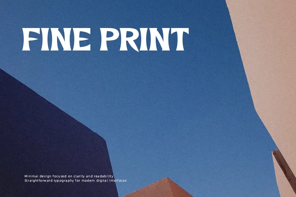
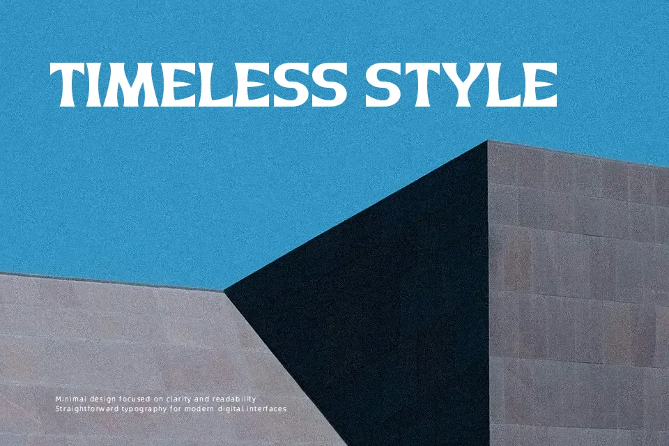
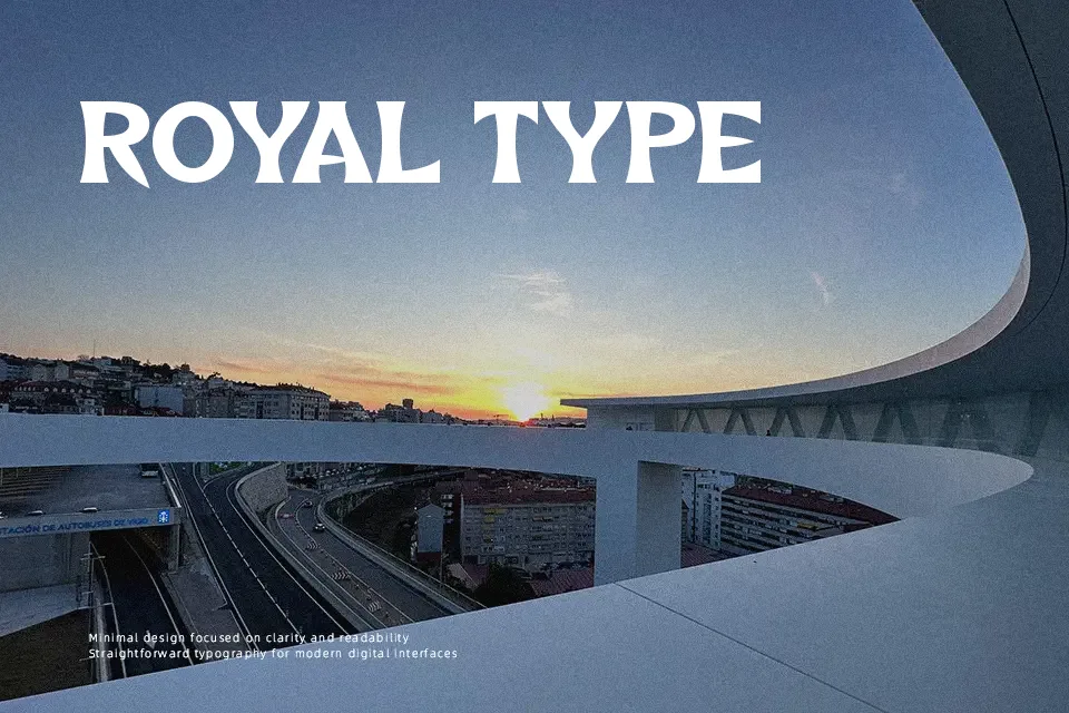
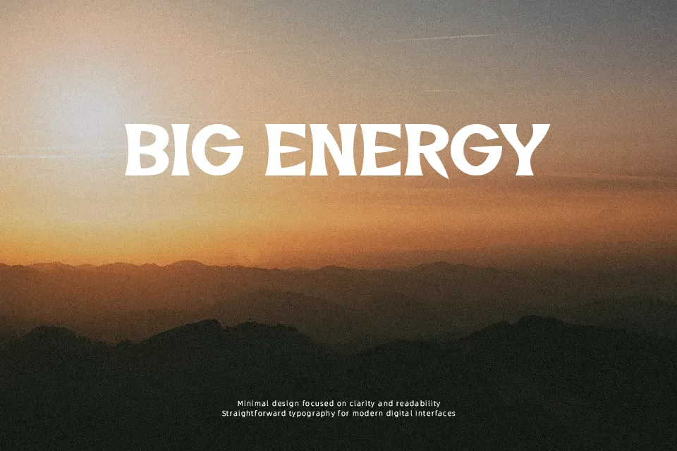
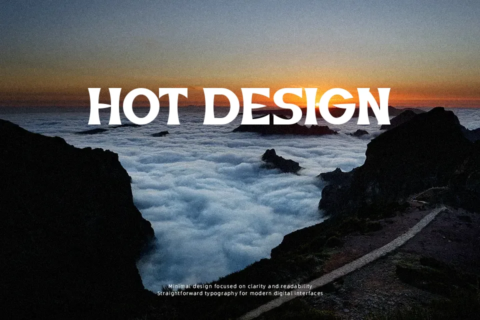
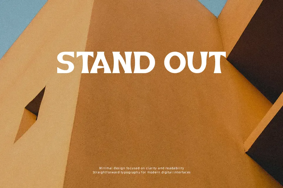
The Life of Flight introduces a dramatic display style built from sharp diagonal cuts, solid geometric weights, and stark stroke contrast. Its uppercase glyphs maintain an upright, assertive rhythm, while the tight letter spacing delivers immediate visual impact in short titling arrangements. Numerals follow the same angular construction, keeping figures uniform alongside text. Because the dense shapes and stylized terminals prioritize graphic punch over delicate body reading, extended paragraphs quickly suffer from visual fatigue. The design proves most effective when deployed at scale across dynamic headlines, event promotional flyers, and punchy packaging marks where forceful silhouettes command attention.
Best For:
esports team logos
music festival posters
apparel graphics
website hero headlines
Not Ideal For:
long paragraph text
dense editorial layouts
spreadsheet data
small interface labels
Perfect for branding, headline, and logo, with a bold and decorative style.
License
Gallery