The Fruit Star Font
Free for Commercial UseAbout
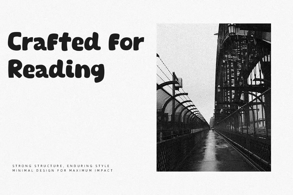
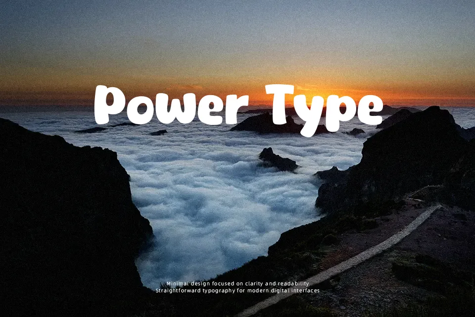
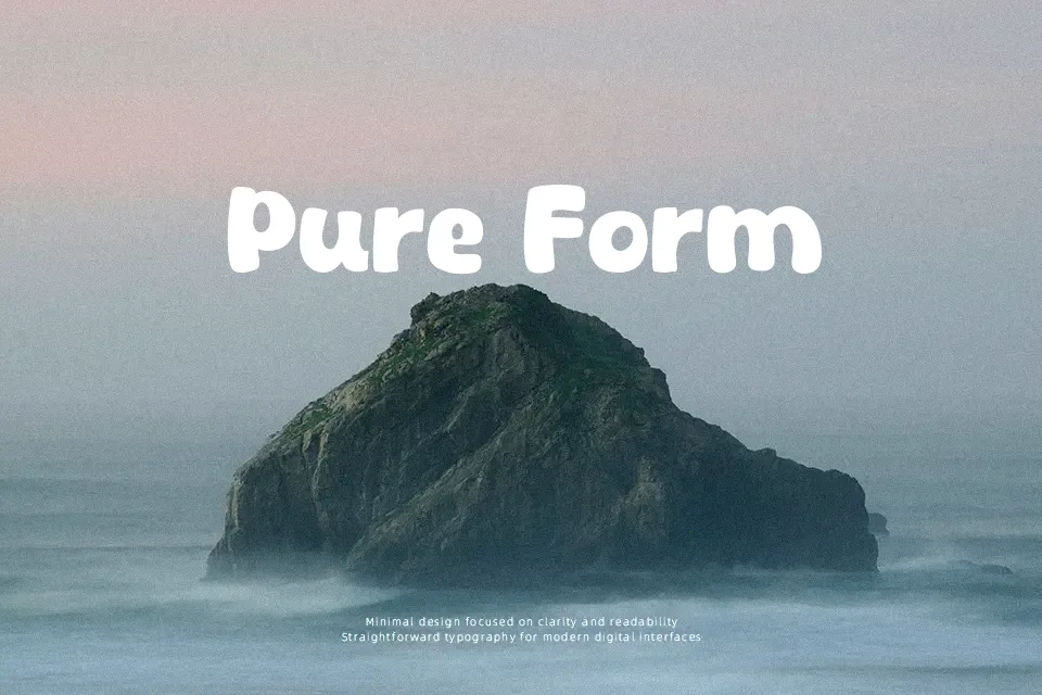
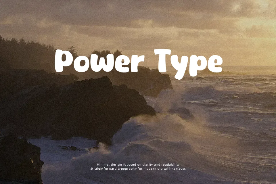
The Fruit Star features extra-bold display proportions constructed with swollen, rounded strokes and minimal internal counter spaces. Consistent curvature across both uppercase and lowercase glyphs establishes an animated rhythm, while closely kerned character spacing keeps headlines compact and impactful. Because the heavier stems dominate the letterforms, the design retains clear distinction in oversized headings, promotional banners, and juvenile product labels. Extended paragraph text remains impractical, however, as the dense strokes cause smaller counters to fill in quickly at reduced scales. The letterforms excel when deployed in short bursts of high-visibility titling rather than continuous body copy.
Best For:
children’s book covers, animated series titles, snack packaging, toy branding
Not Ideal For:
continuous paragraph text, small interface labels, dense editorial layouts, corporate reports
Perfect for headline, kids, and logo, with a bold and cartoon style.
License
Gallery