The Bandido Font
Free for personal useAbout
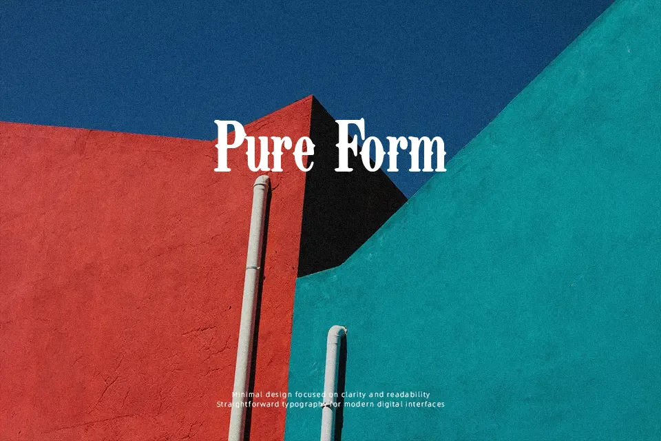
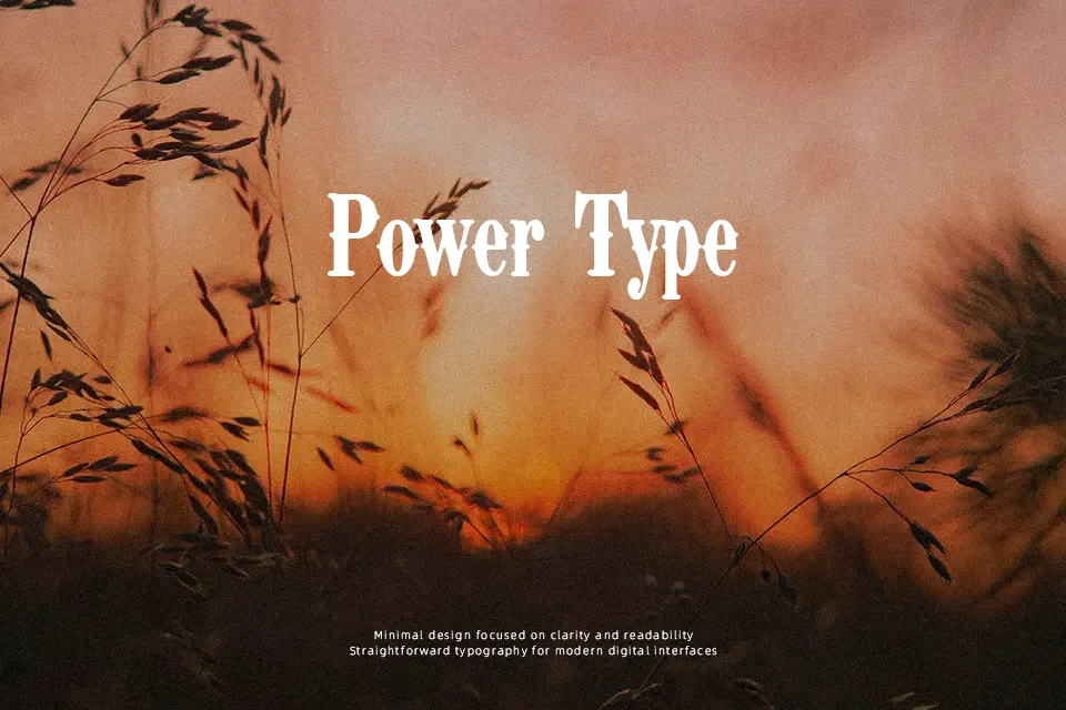
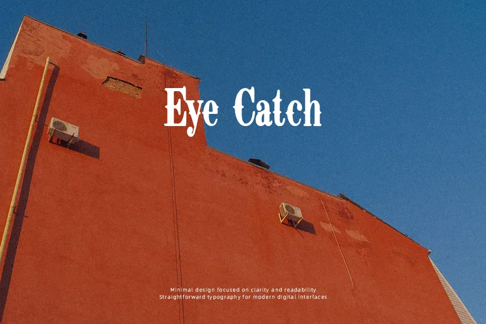
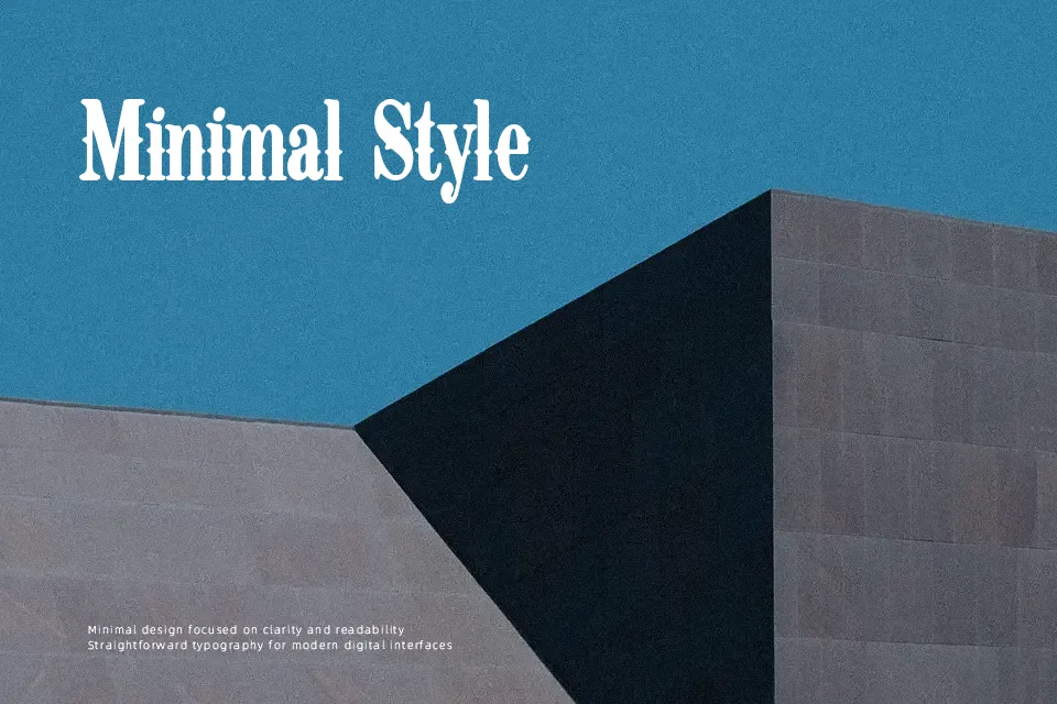
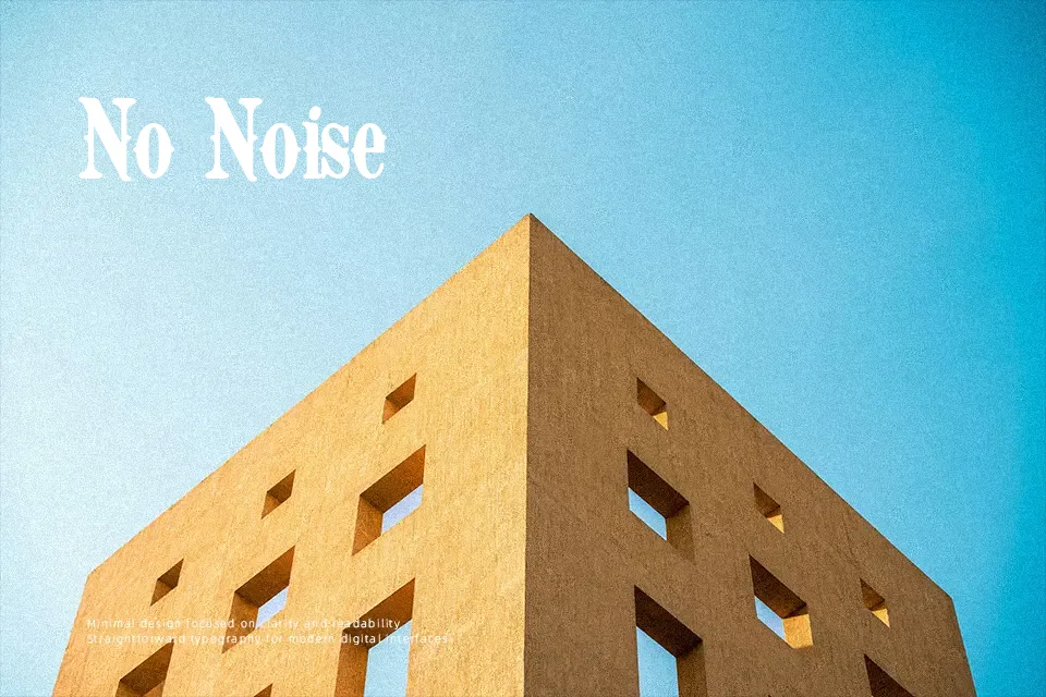
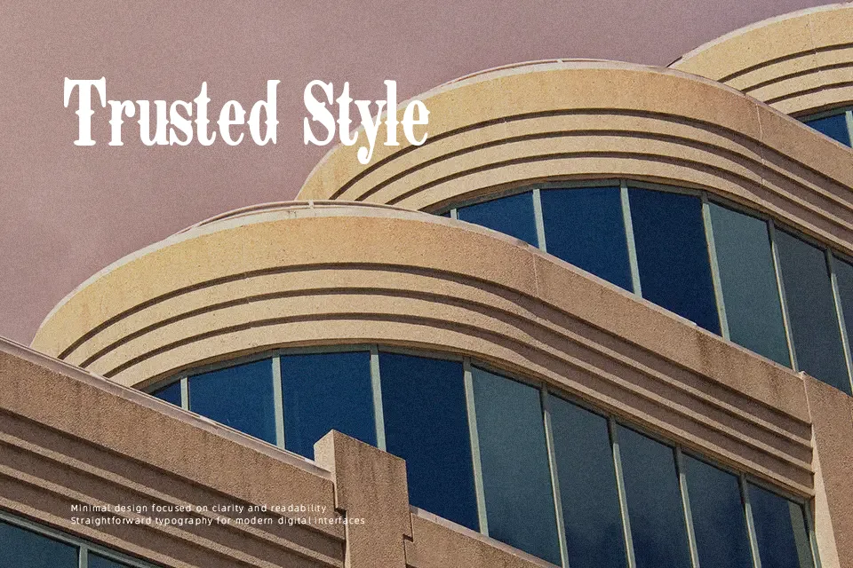
The Bandido Font commands immediate attention through sturdy slab serifs, heavy block proportions, and sharp center spurs along the vertical stems. Its uppercase characters exhibit generous widths with stable horizontal baselines, while the generous stroke weight ensures high visibility across large display formats. Character spacing remains moderately wide to prevent the dense geometric serifs from colliding in punchy headlines. However, the thick monoline stems and decorative side spurs cause internal counters to close up rapidly when scaled down, rendering the letterforms illegible in continuous body copy.
Best For: saloon style storefront signs, rustic beverage packaging, rodeo event posters, western movie title cards
Not Ideal For: dense body paragraphs, technical instruction manuals, mobile interface menus, multi-column print editorial
Perfect for branding, headline, and logo, with a bold and decorative style.
License
Gallery