Swistblnk Monthoers Font
Free for Commercial UseAbout
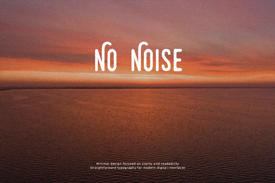
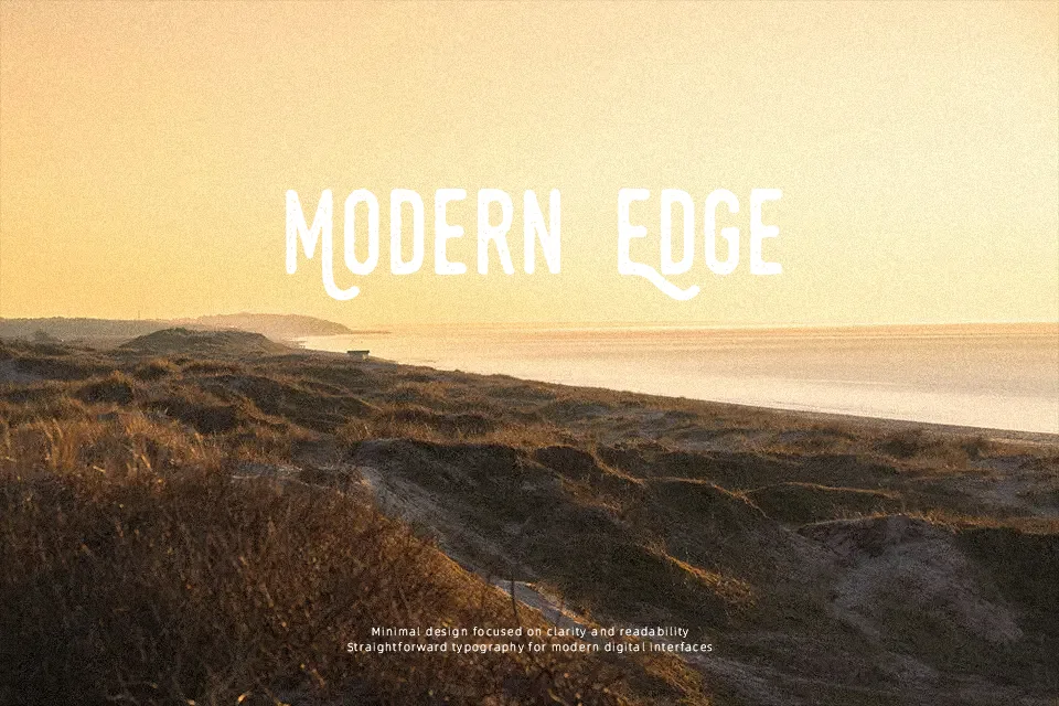
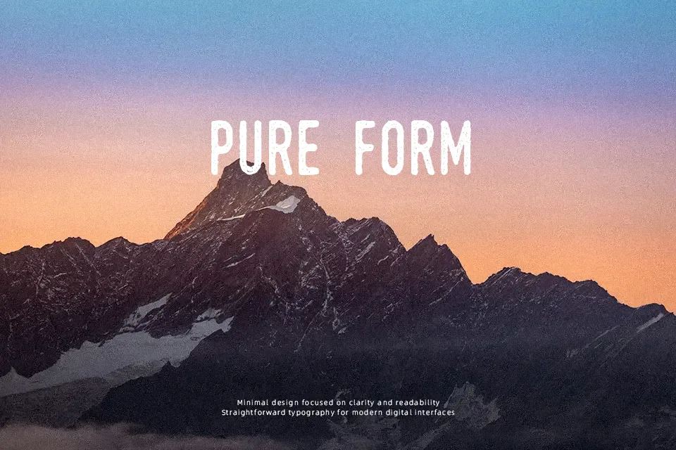
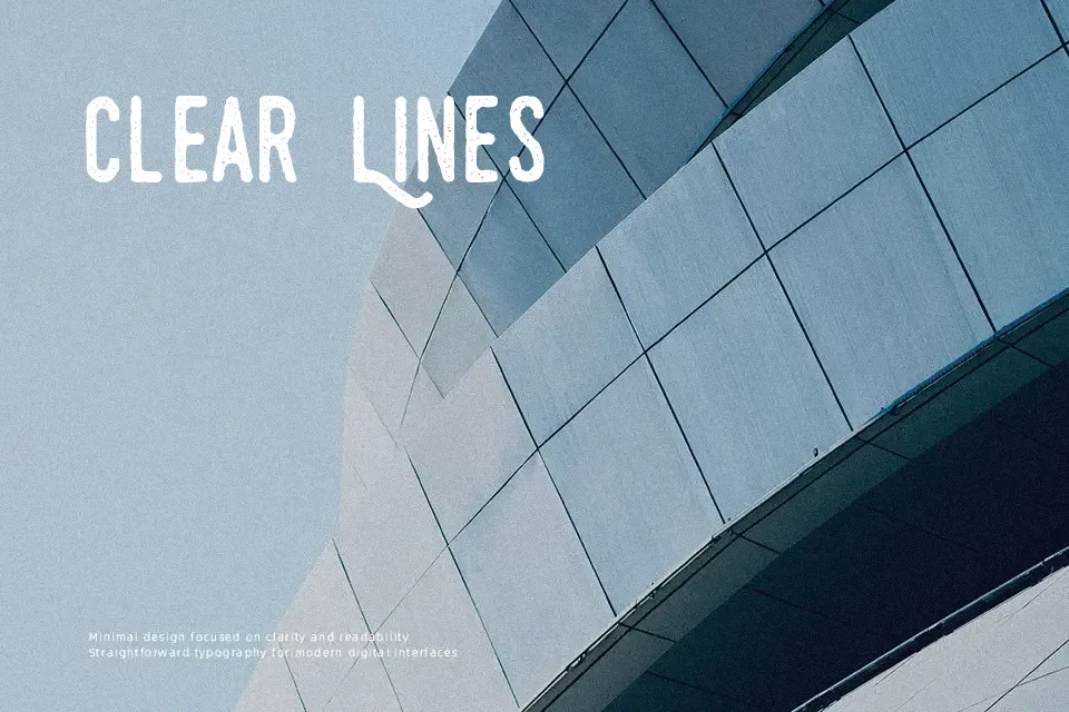
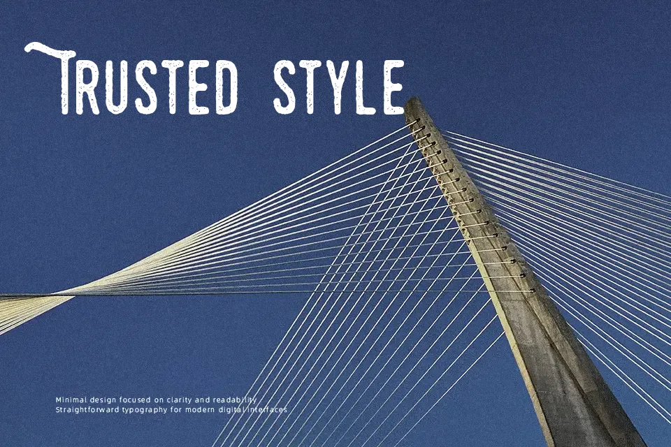
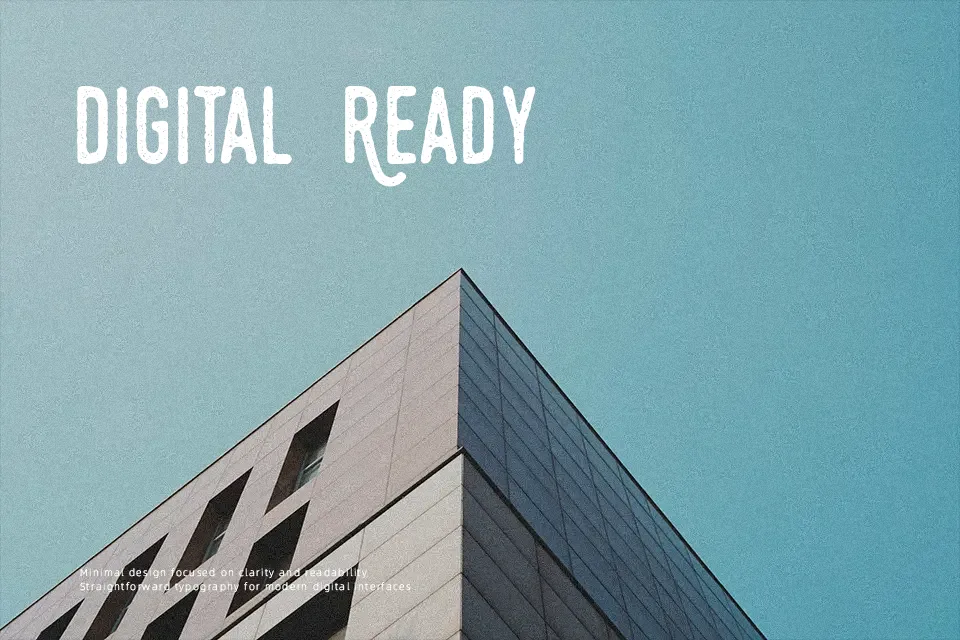
Swistblnk Monthoers Font works best as prominent display lettering, using sturdy, mostly upright forms with visibly distressed edges and irregular texture. Its strokes appear broadly consistent in weight, while the weathered treatment gives each character a rougher silhouette than a clean sans serif. The alphabet includes both uppercase and lowercase forms alongside numerals, but the decorative surface is the main visual feature. Spacing feels most effective when the type is given room in a headline or short wordmark. The texture adds character at large sizes; in smaller captions or dense settings, those broken details can make the letterforms harder to scan.
Best For: vintage poster headlines,apparel graphics,product packaging,restaurant signage
Not Ideal For: long paragraph text,small interface labels,legal documents,dense editorial layouts
Perfect for advertising, branding, and headline, with a bold and decorative style.
License
Gallery