Summeron Font
Free for personal useAbout
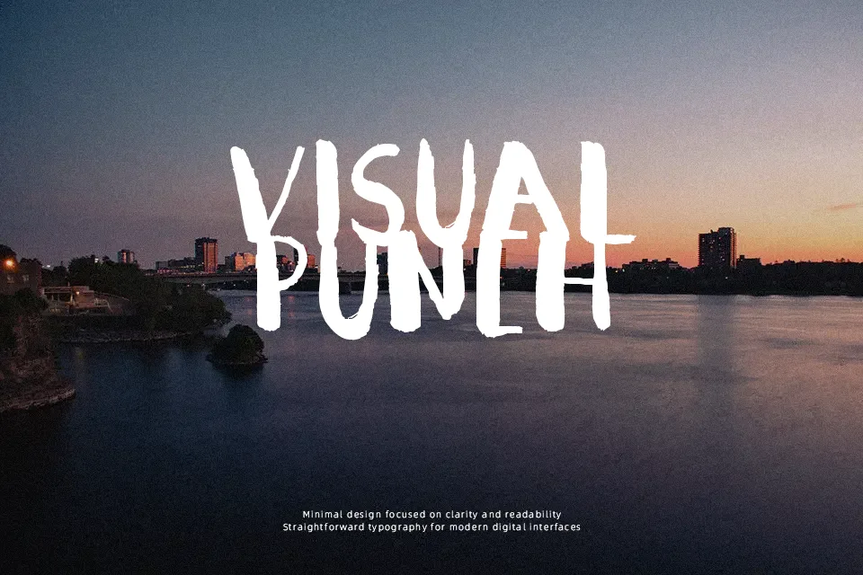
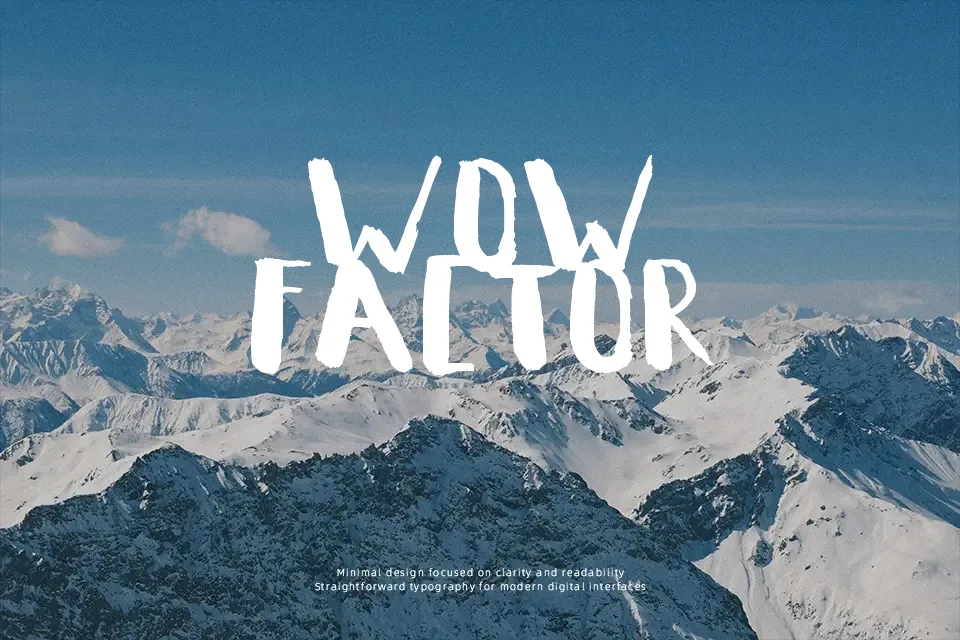
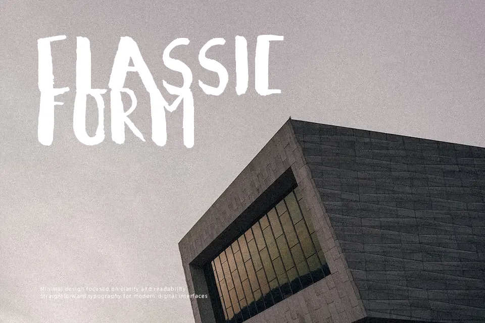
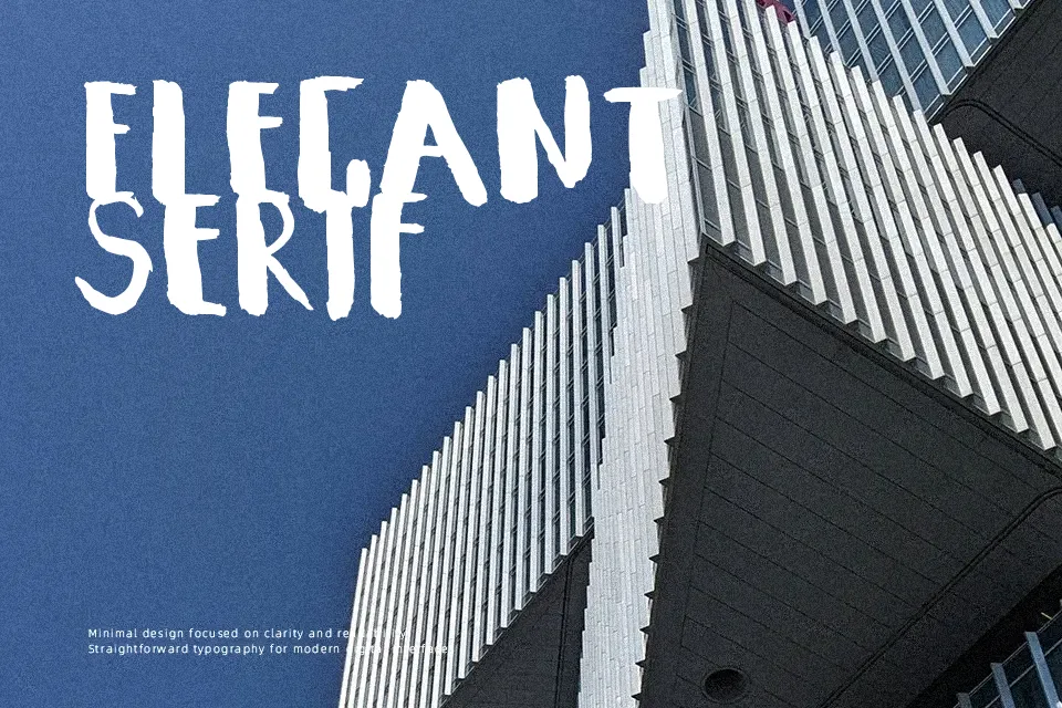
Summeron Font works as a bold comic display face built around thick, rounded strokes and uneven, hand-drawn-looking proportions. The letterforms have a compact, weighty rhythm that gives short words a casual, energetic presence, especially in large headlines and simple graphic layouts. Uppercase and lowercase characters retain a deliberately playful feel rather than a formal text structure. Spacing appears close enough to keep titles visually solid, though dense settings can reduce separation between characters. The font reads most comfortably at display sizes, where its rounded forms remain distinct. It is less effective for long passages, small captions, or information-heavy layouts that need steady reading comfort.
Best For: kids event posters,playful product packaging,children’s social media graphics,casual logo designs
Not Ideal For: long paragraph text,small interface labels,corporate reports,dense editorial layouts
Perfect for headline, kids, and logo, with a bold and comic style.
License
Gallery