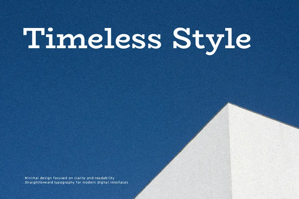
BioRhyme Font
Free for Commercial UseAbout
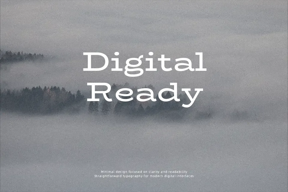
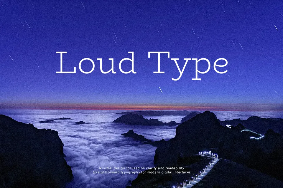
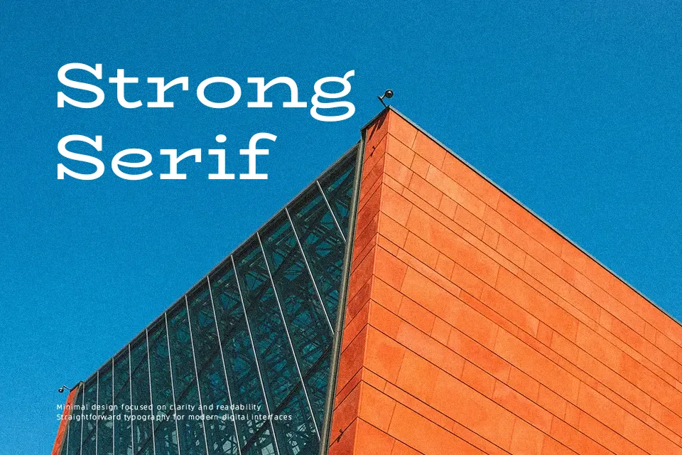
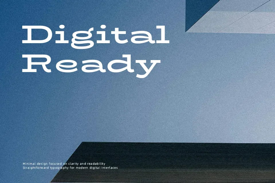
BioRhyme is a slab serif family with pronounced, sometimes exaggerated serifs, moderate contrast, and open counters that keep heavier weights from feeling claustrophobic. In the lighter cuts it reads reasonably well at medium sizes, while the wider, bolder styles push strongly into display territory for attention-grabbing titles. Spacing feels measured rather than tight, so it carries a calm, steady rhythm instead of a hurried one. It suits projects where you want structure and personality at the same time—think editorial feature spreads, posters, or friendly institutional branding—though it can feel too characterful for very sober corporate decks or dense book pages. If you like confident slabs such as Rockwell but want something more contemporary and open, BioRhyme is worth trying.
Best For:
display headlines
editorial titles and pull quotes
characterful branding systems
poster-style layouts
Not Ideal For:
long-form body text
highly formal corporate documents
tiny UI labels or captions
Perfect for branding, editorial, and headline, with a artistic and display style.
License
Gallery