Stamping Nico Font
Free for personal useAbout
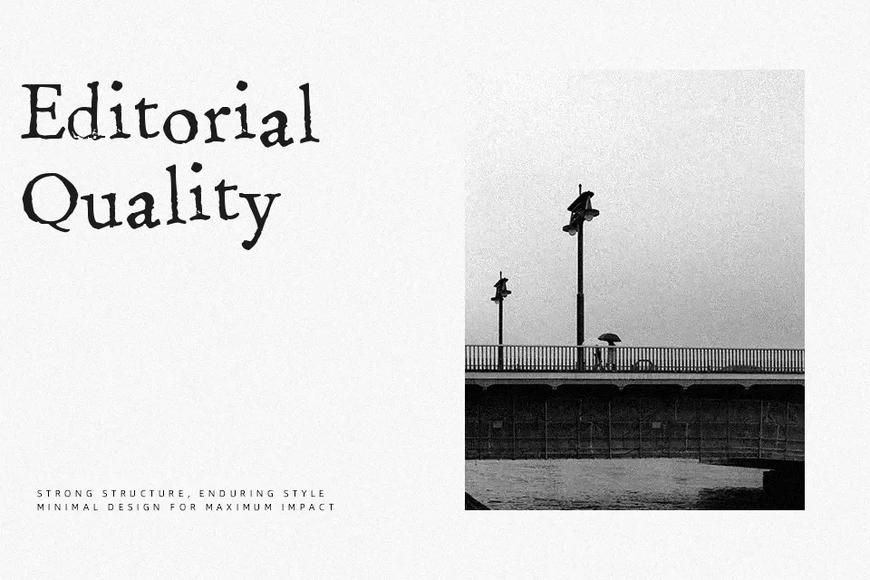
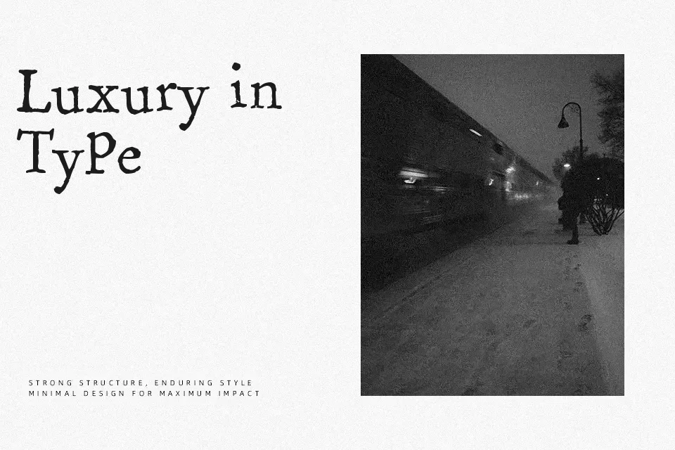
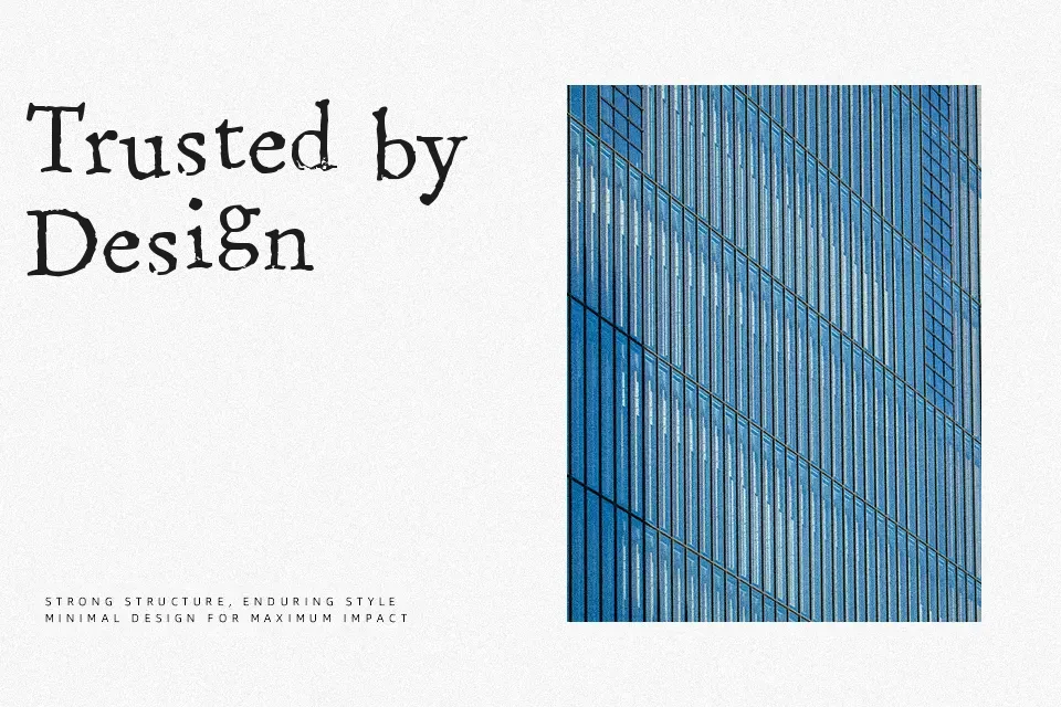
Stamping Nico Font showcases a rugged mechanical structure inspired by vintage typewriter keys and distressed ink stamps. The letterforms display modest slab serifs with intentionally irregular stroke contours, simulating organic ink bleed and varying strike pressure across glyphs. Proportions remain relatively uniform with open internal counters, while loose character spacing ensures individual letter distinctiveness in short phrases. The typeface excels across display contexts such as craft packaging, thematic event flyers, and retro album covers. However, the heavy textural irregularities create visual noise in continuous body text. The uneven ink edges maintain compelling rustic character when set at medium to large headline sizes.
Best For: vintage product packaging, retro poster headlines, artisanal food labels, music festival flyers
Not Ideal For: continuous body text, mobile interface labels, corporate legal documents, spreadsheet data
Perfect for advertising, branding, and headline, with a artistic and decorative style.
License
Gallery