Stamp Empire Font
Free for personal useAbout
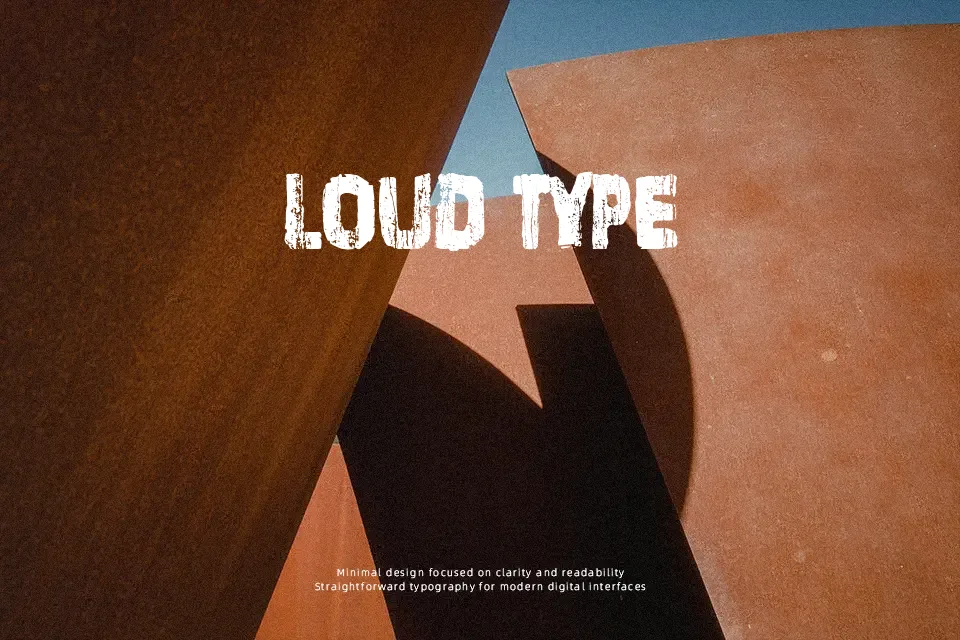
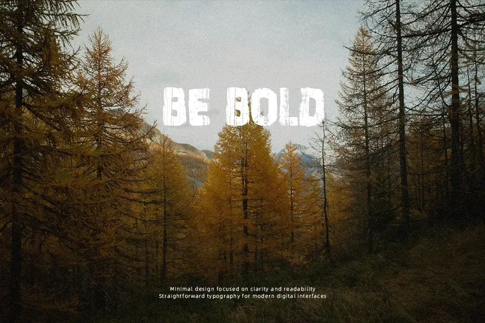
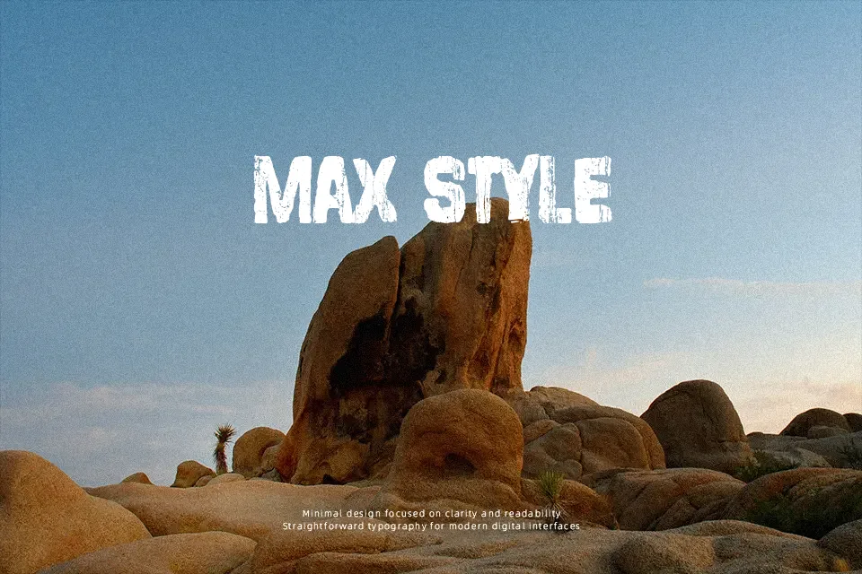
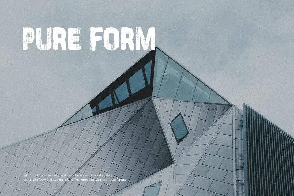
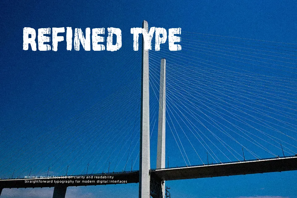
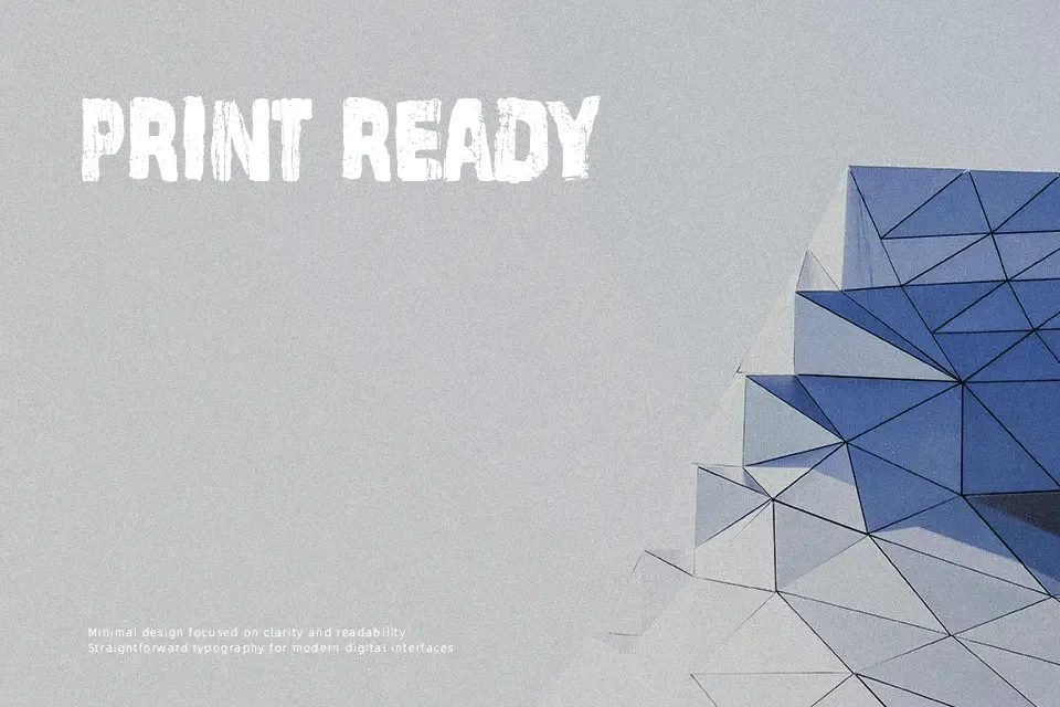
Stamp Empire Font uses thick, block-like uppercase letterforms disrupted by irregular distressed marks and rough edges. The strokes appear largely uniform in weight, while the broad proportions and forceful silhouette give short words a stamped, weathered presence. Spacing is reasonably open enough to keep individual characters distinguishable in large settings, although the broken texture softens clarity at smaller sizes. It works well for bold titles, graphic merchandise, and rugged packaging accents. In practice, the distressed surface carries the design, so it is most effective when used sparingly rather than as continuous text.
Best For: apparel graphics,poster headlines,product labels,album artwork
Not Ideal For: long paragraph text,small interface labels,legal documents,dense editorial layouts
Perfect for advertising, logo, and music, with a bold and decorative style.
License
Gallery