Springwood Display Font
Free for personal useAbout
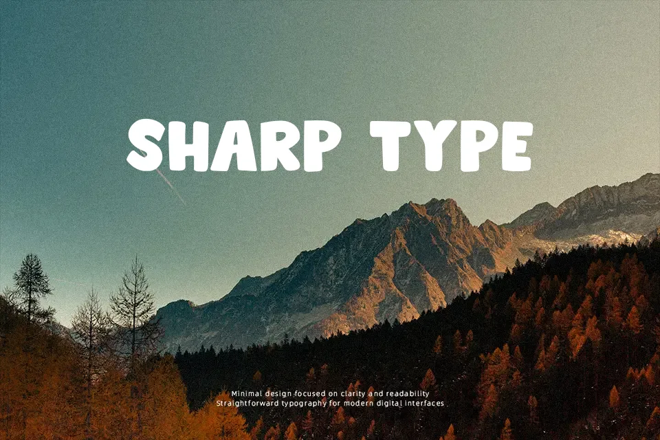
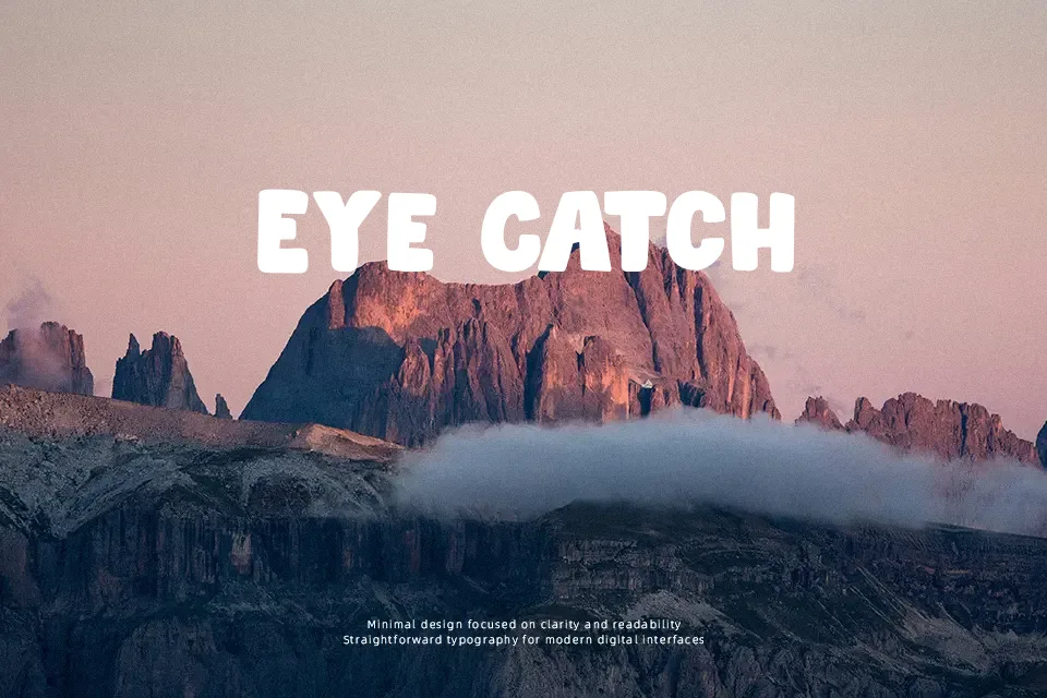
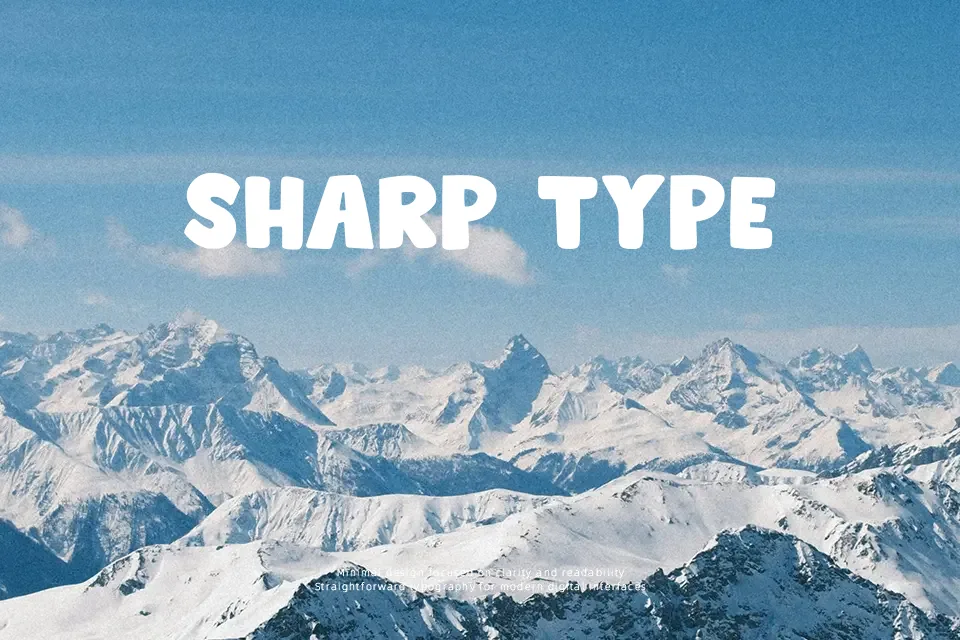
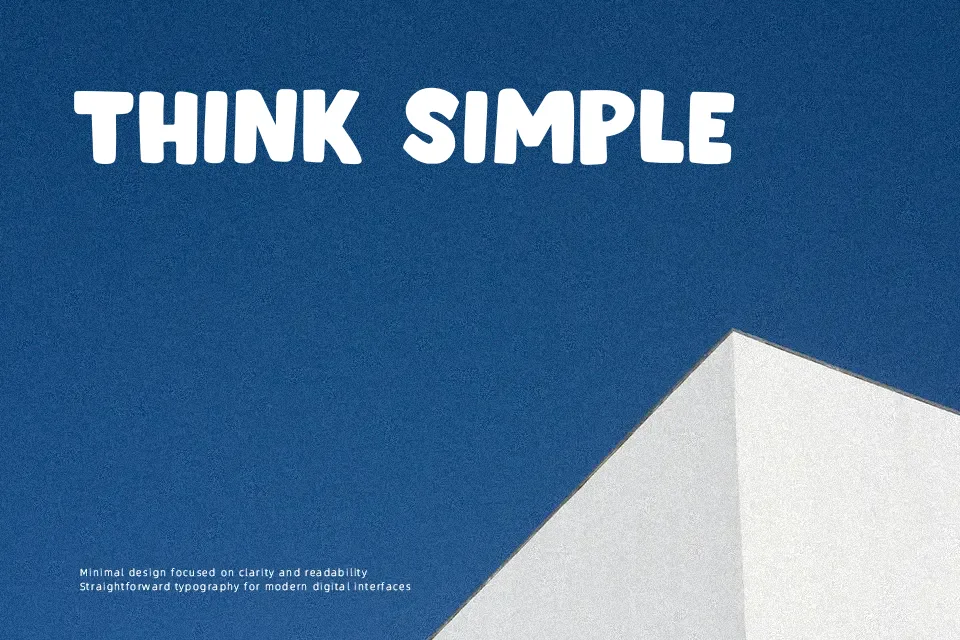
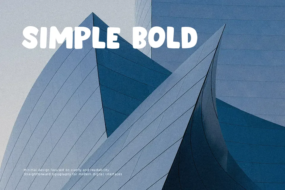
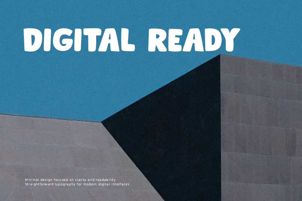
Crafting vibrant headlines for youth oriented media benefits significantly from the chunky geometry of Springwood Display Font. The typeface features robust, softened strokes with minimal contrast and rounded terminals that convey an approachable demeanor. Consistent baseline proportions and tight character tracking generate solid word blocks that draw immediate attention across billboards and merchandise labels. While the generous letter width maintains strong legibility at substantial display scales, the dense inner counters severely reduce reading comfort in continuous text settings. The letterforms deliver remarkable punch in short compositions but lack the open apertures required for small captions. Consequently, designers should restrict its application to brief promotional statements.
Best For: children’s book covers, playful product packaging, animated video titles, festival poster headlines
Not Ideal For: long paragraph text, dense editorial layouts, formal business documents, small interface labels
Perfect for headline, kids, and logo, with a bold and comic style.
License
Gallery