Skedaddle Font
Free for Commercial UseAbout
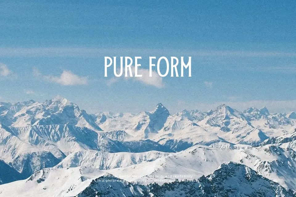
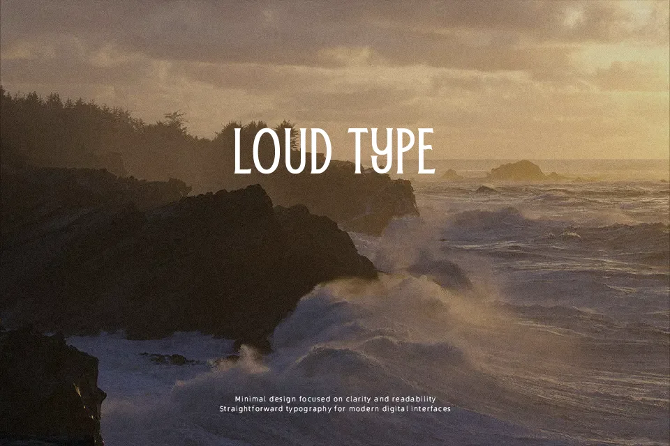
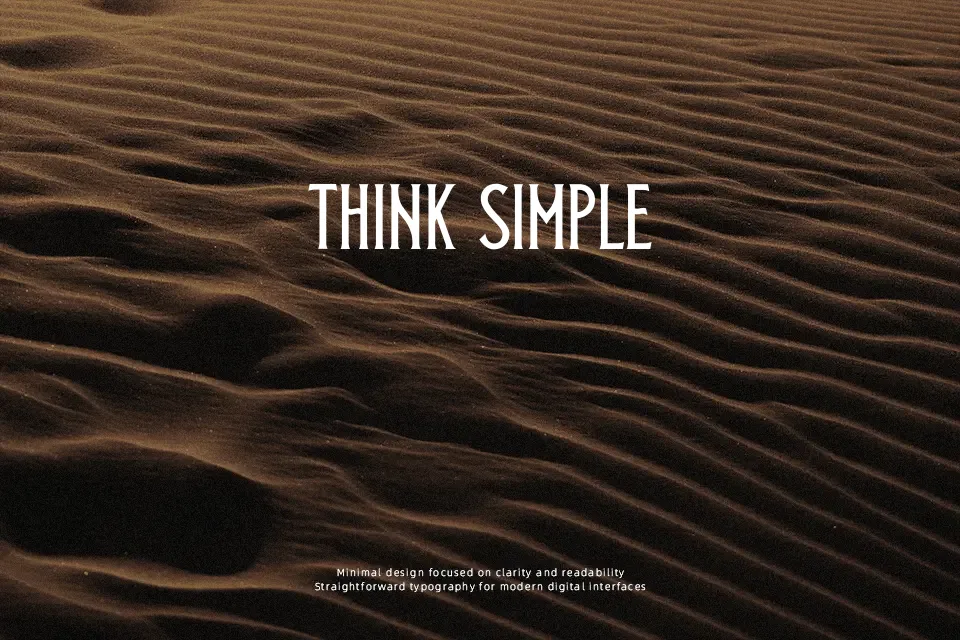
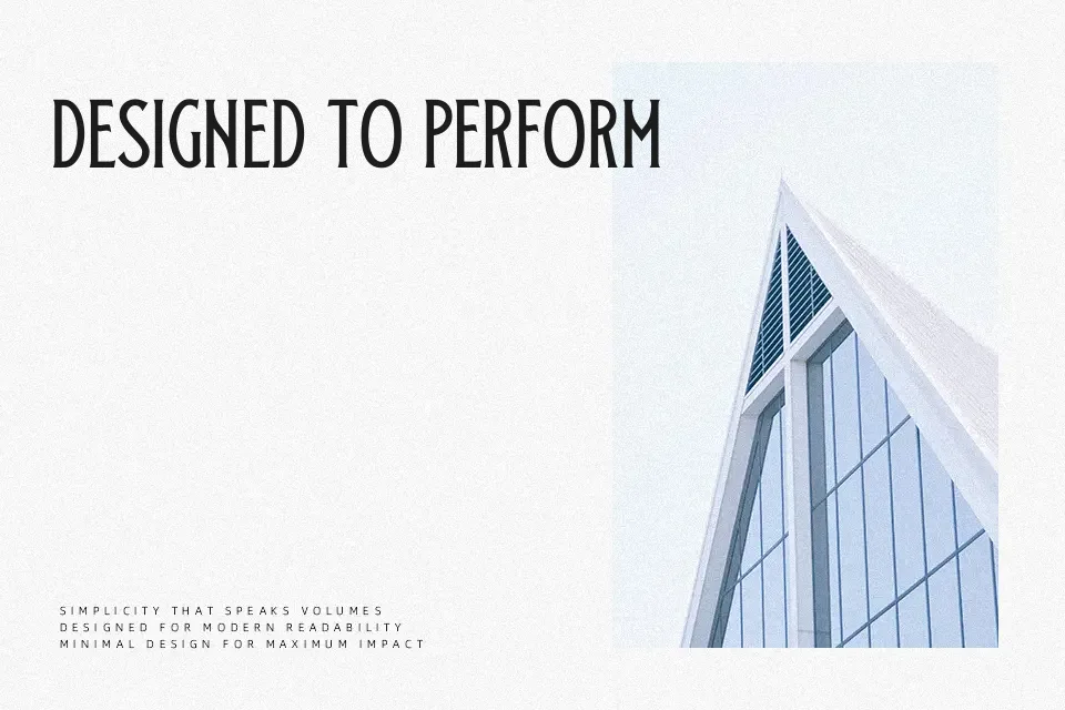
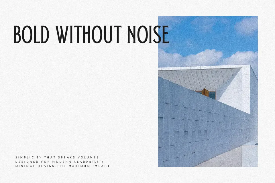
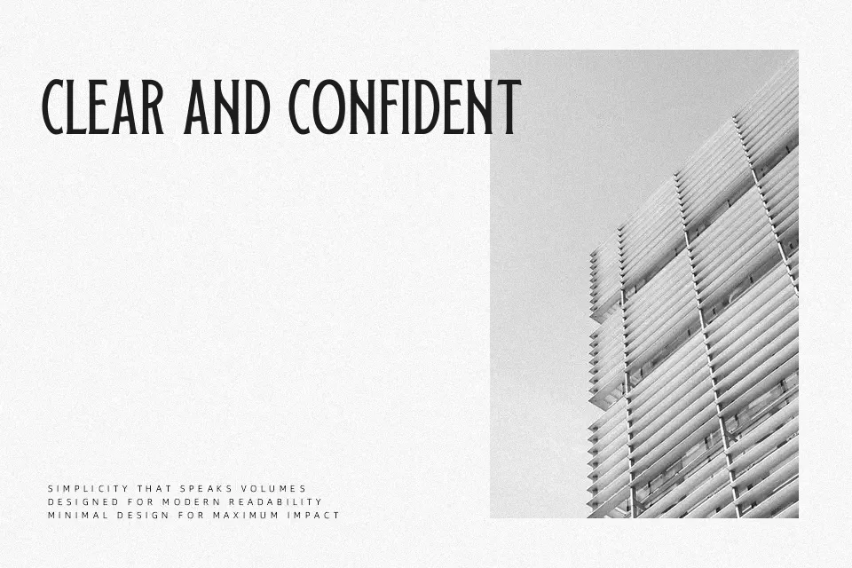
Characterized by slender vertical proportions and subtle terminal flares, Skedaddle Font introduces a stylized take on condensed display lettering. The design features moderate stroke contrast with crisp, clean joins that give each glyph an upright presence. Balanced spacing keeps uppercase and lowercase characters legible in short phrases, though the tight letter tracking performs best when set at large scale. Prominent ascenders and sculpted terminals make the typeface effective for decorative signage, product labels, and editorial headlines. However, the compact letter structures reduce comfort in extended reading, making the design unsuitable for continuous body text. Overall, the typeface provides striking visual punch across prominent display compositions.
Best For: vintage poster headlines, retro product packaging, storefront signboards, craft beverage labels
Not Ideal For: continuous book paragraphs, mobile application body text, dense spreadsheet data, small technical footnotes
Perfect for branding, headline, and logo, with a classic and condensed style.
License
Gallery