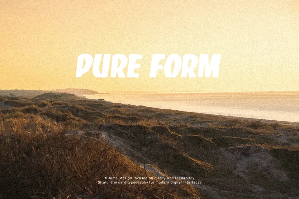
Skateboarding Club Font
Free for personal useAbout
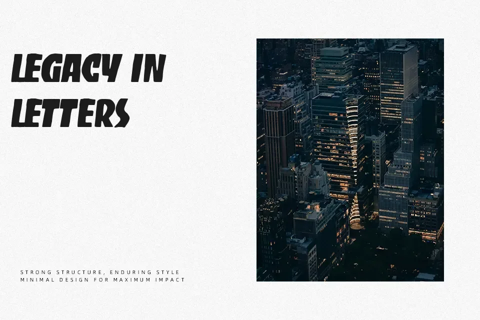
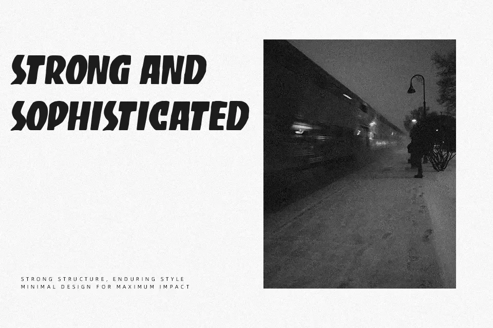
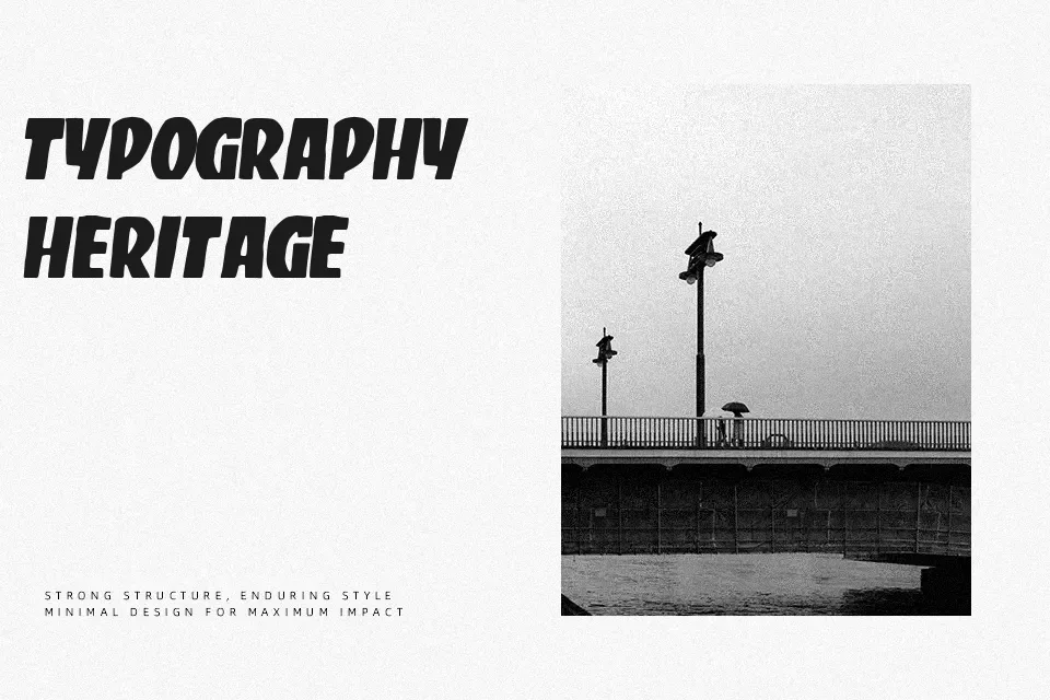
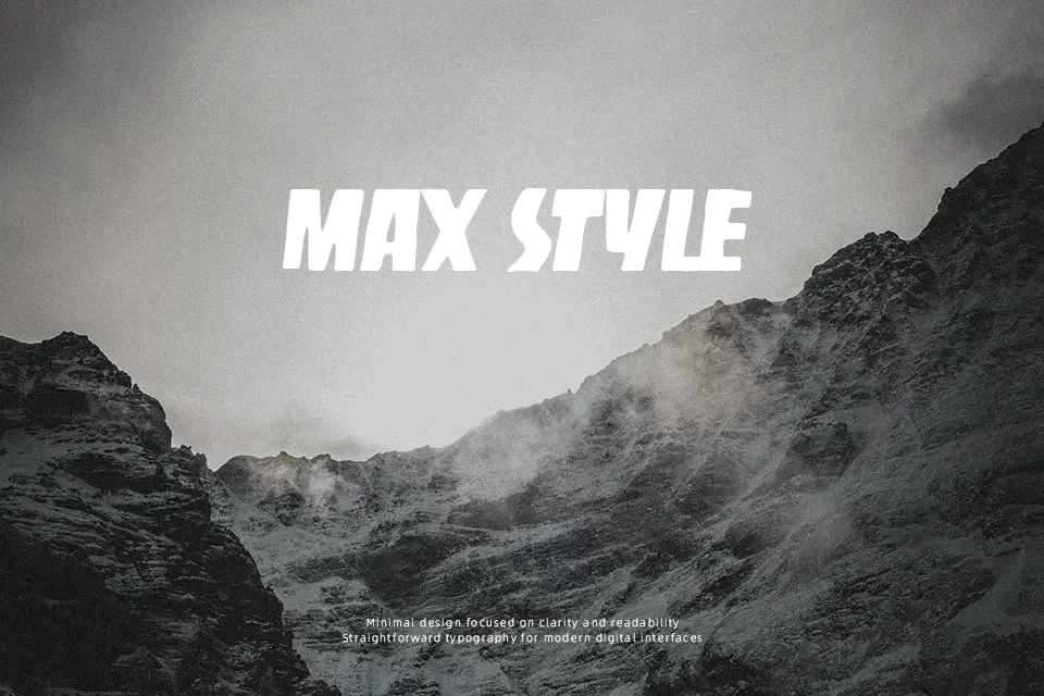
Designed with heavy visual weight and raw energy, Skateboarding Club Font immediately stands out in high-impact display scenarios. The typeface features thick, expressive strokes paired with tight character spacing, giving each glyph a dense and punchy presence. Proportions lean wide and sturdy, ensuring strong recognition across large banners, streetwear graphics, and merchandise packaging. However, the compact negative space and prominent structural heft make continuous text difficult to read comfortably. Letterforms tend to blur together at smaller sizes, meaning body paragraphs and fine print should be avoided entirely. The design functions at its absolute best when limited to brief headlines or standalone titles where its distinctive urban character can dominate without compromising layout clarity.
Best For: streetwear apparel graphics, action sports posters, merchandise branding, event headlines
Not Ideal For: long paragraph text, mobile UI body copy, legal documents, dense editorial layouts
Perfect for branding, headline, and logo, with a bold and decorative style.
License
Gallery