Sixty Niners Font
Free for personal useAbout
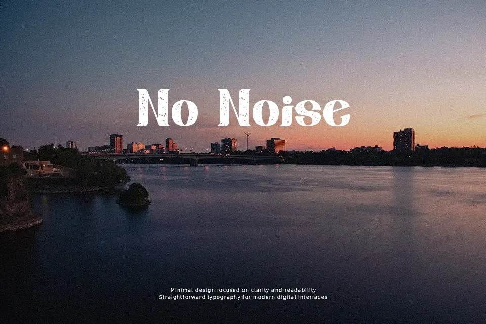
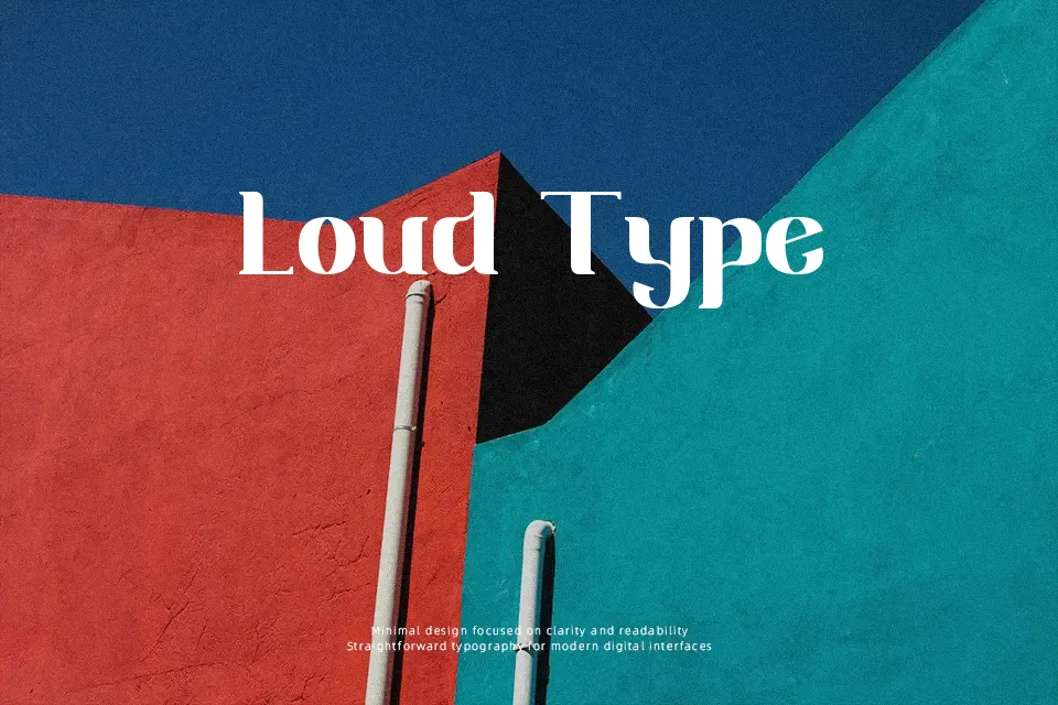
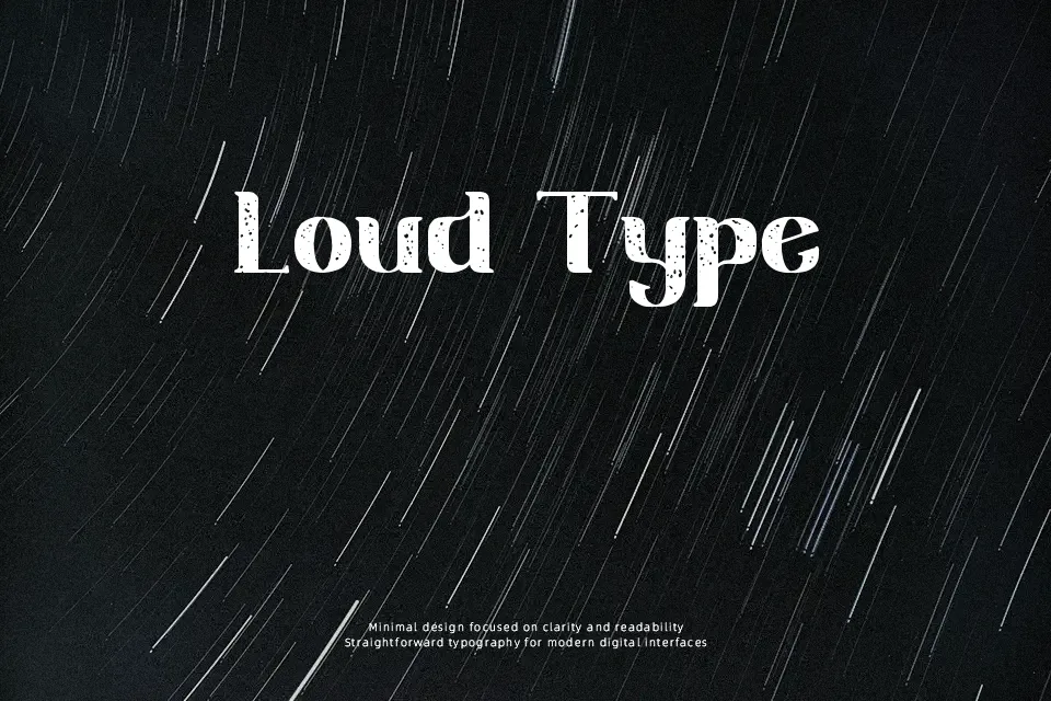
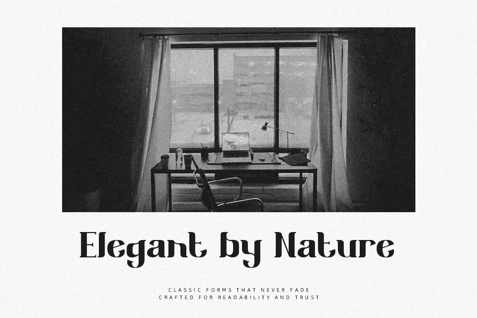
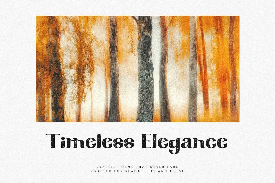
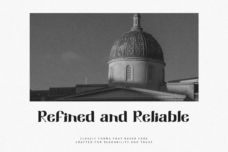
Featuring heavy main stems paired with fluid bracketed serifs, Sixty Niners Font exhibits an eccentric sixties-inspired aesthetic with generous internal counters. The letterforms display substantial stroke contrast and tight tracking that generate strong visual rhythm across horizontal text strings. At larger display dimensions, the balanced proportions ensure that individual characters remain striking and readable in editorial mastheads, vintage merchandise, and promotional banners. However, the exaggerated decorative curves and compact character spacing reduce reading comfort across dense multi-line paragraphs. The typeface functions most effectively as a focal display element rather than utilitarian text.
Best For: retro apparel graphics, vintage magazine covers, music event posters, craft beverage labels
Not Ideal For: long body text, technical documentation, mobile app interfaces, dense tabular data
Perfect for branding, headline, and logo, with a bold and decorative style.
License
Gallery