Sistemas Font
Free for Commercial UseAbout
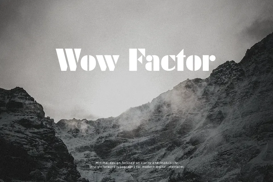
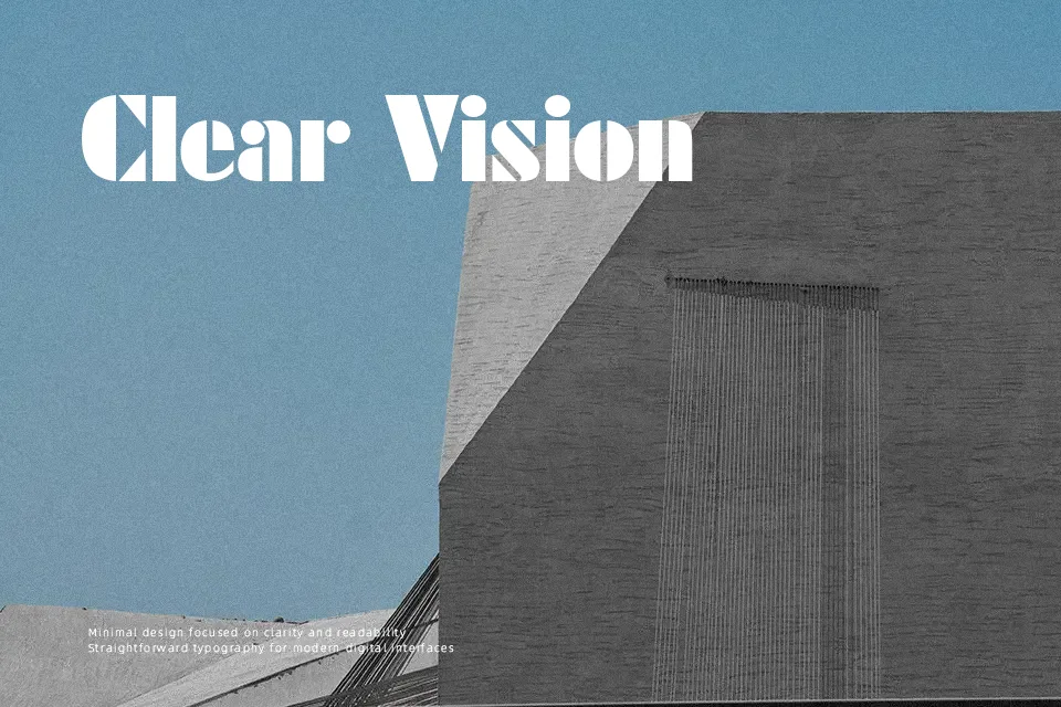
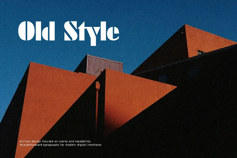
Sistemas Font establishes a powerful visual presence through heavyweight geometric letterforms defined by sharp stencil incisions and substantial solid strokes. The glyphs feature circular geometry combined with vertical segments, separated by deliberate negative spaces that preserve character distinction. Consistent stroke thickness and balanced letter spacing give the design an orderly cadence when arranged in compact title blocks. While the typeface demonstrates remarkable clarity across display signage, editorial headers, and bold merchandise, the heavy black weight reduces legibility in continuous paragraphs. The letterforms maintain strong visual impact at large scales, but dense counters become difficult to navigate within small text environments.
Best For: music festival posters, industrial packaging labels, streetwear apparel graphics, editorial title sequences
Not Ideal For: long paragraph text, mobile interface labels, technical documentation, dense editorial layouts
Perfect for advertising, headline, and logo, with a bold and display style.
License
Gallery