Simpleness Font
Free for Commercial UseAbout
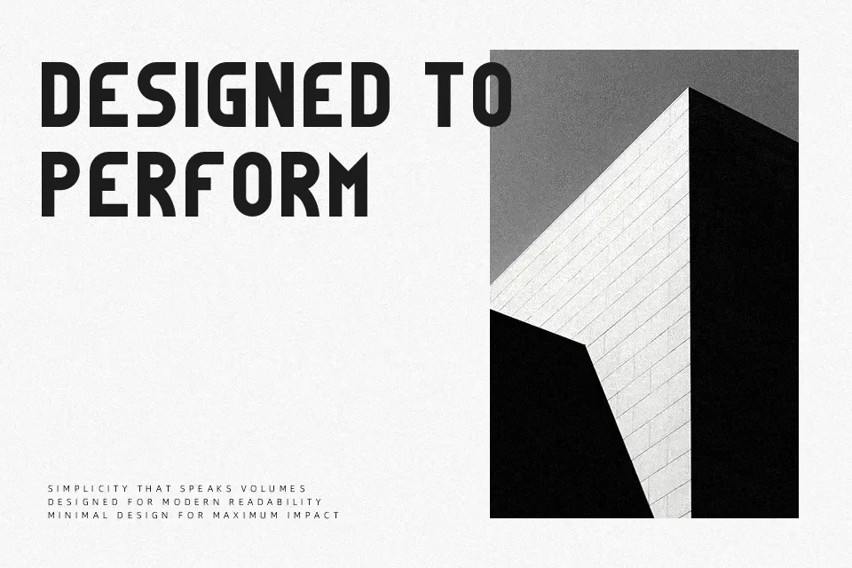
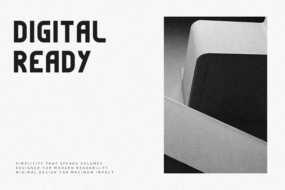
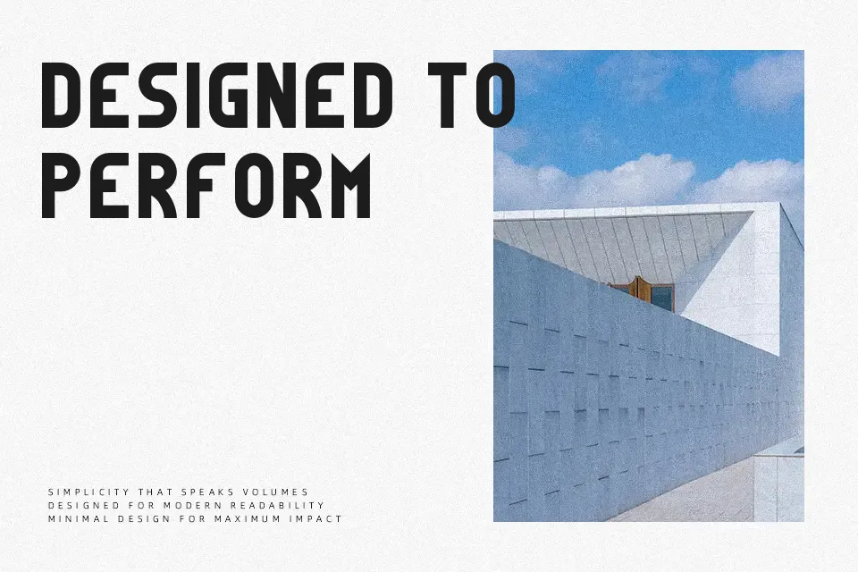
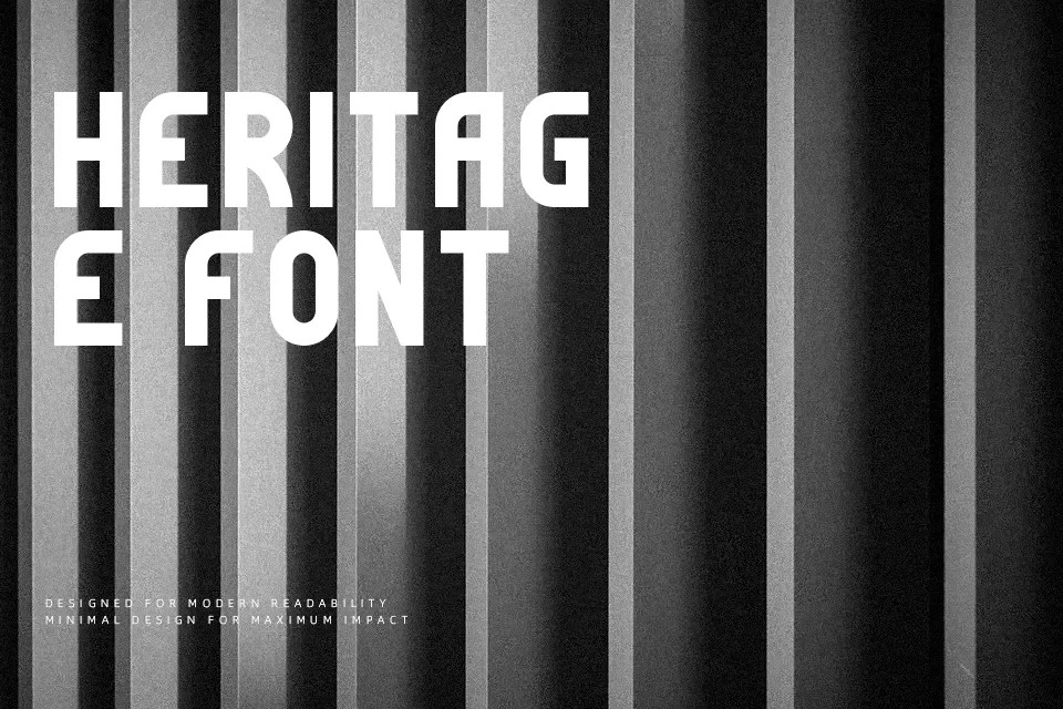
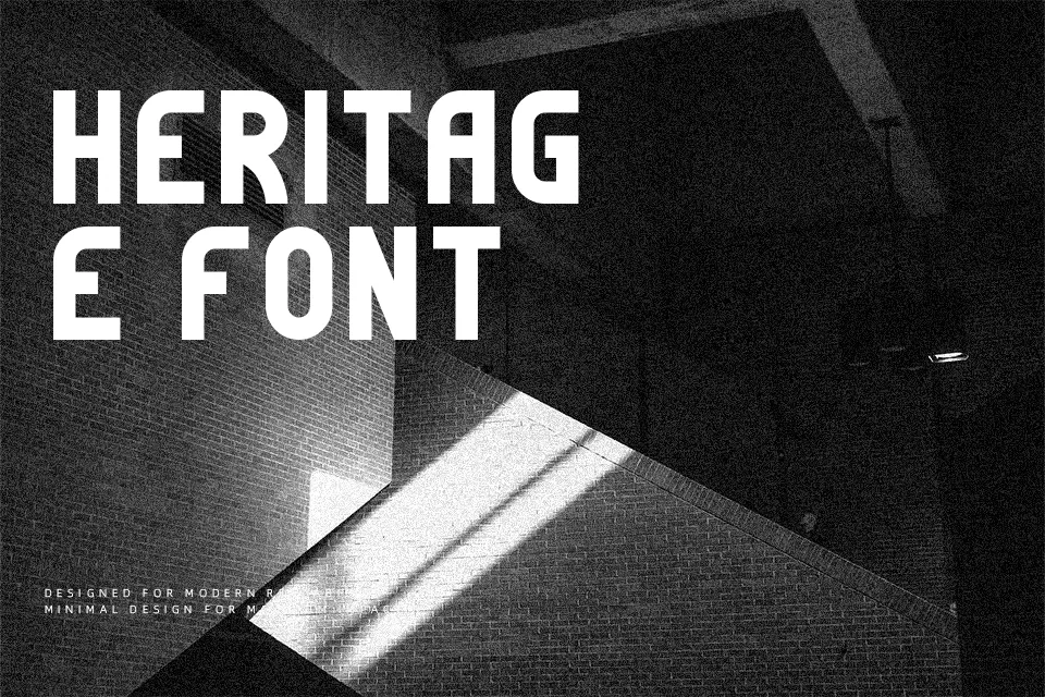
Simpleness Font commands attention through uniform stroke weights, strict circular curves, and unyielding geometric proportions across its uppercase character set. The typeface balances consistent terminal cuts with expansive interior spacing, creating an uncluttered rhythm that stands out in large-scale applications. In practical design environments, the letterforms excel across exhibition posters, striking title cards, and contemporary brand identities where structural clarity is essential. However, the rigid geometry and absence of lowercase glyphs make it poorly suited for dense paragraphs or continuous reading layouts. Overall, the design functions as a dependable display tool when deployed with generous tracking.
Best For: exhibition posters, architectural identity titles, magazine headline covers, product packaging headers
Not Ideal For: long body text, multi-page editorial layouts, dense mobile user interfaces, small footnote captions
Perfect for advertising, headline, and logo, with a clean and display style.
License
Gallery