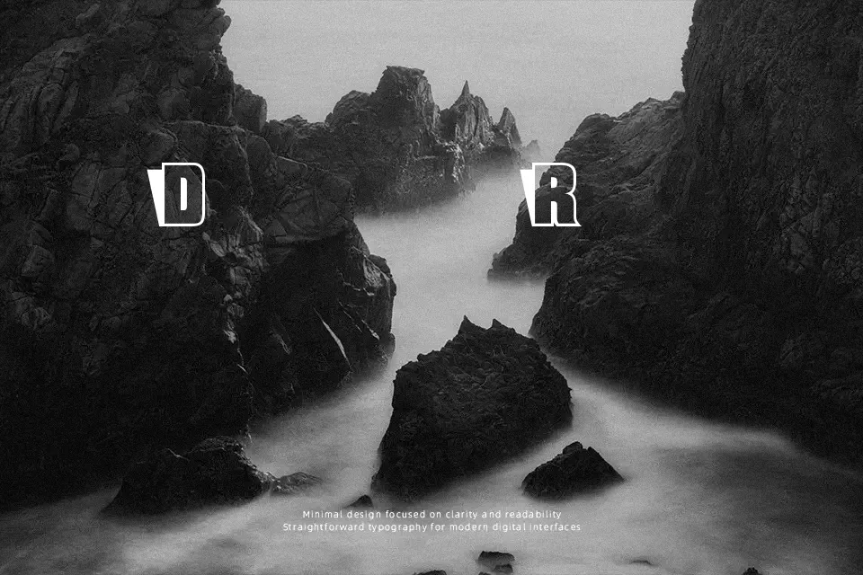
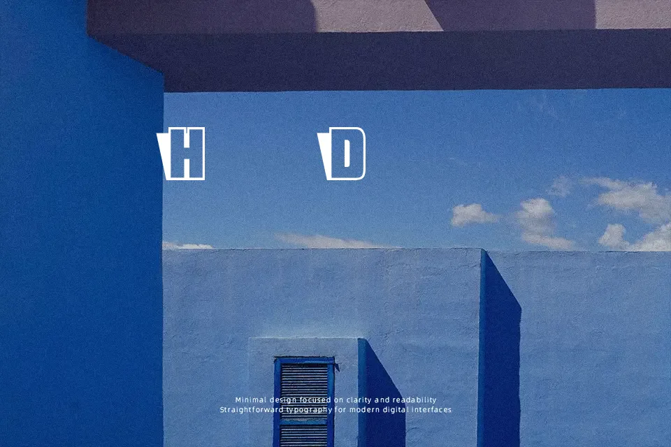
Sho-Card-Caps Font
Free for Commercial UseAbout
Sho-Card-Caps Font commands attention through solid, heavyweight capital letterforms accented by stark cast-shadow outlines. The structure relies on uniform geometric proportions and consistent, unbracketed stroke widths that evoke traditional hand-painted showcard lettering. Tight character spacing reinforces the dense, compact rhythm across titles, ensuring maximum visual punch at large display scales. While the robust silhouettes maintain immediate legibility in short headlines, festival posters, and packaging labels, the heavy ornamentation causes glyphs to blur when reduced in scale. Consequently, the typeface is less suitable for dense body text or multi-line paragraphs where continuous reading comfort is necessary.
Best For:
vintage festival posters, retro packaging headers, storefront signage, bold merchandise branding
Not Ideal For:
extended editorial body text, mobile user interface labels, dense financial spreadsheets, long paragraph reading
Perfect for advertising, headline, and logo, with a bold and decorative style.
License
Gallery