Clam Dip Font
Free for personal useAbout
Best For:
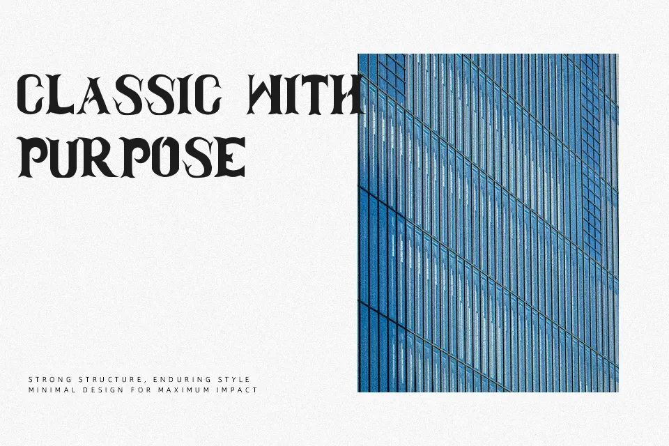
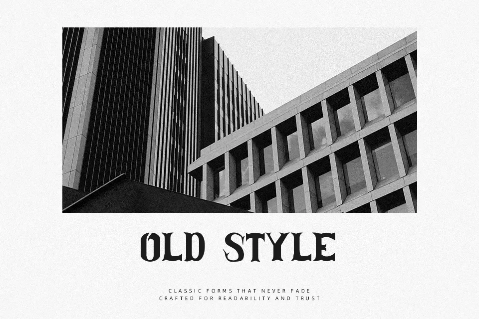
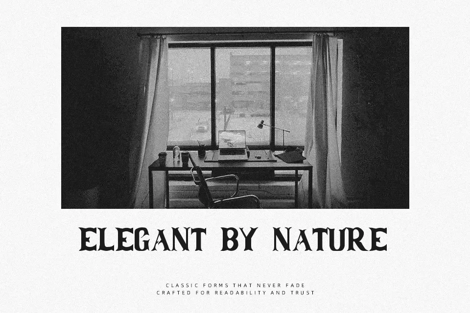
Not Ideal For:Clam Dip Font commands immediate attention with its flared triangular serifs, sharp center spurs, and pronounced decorative terminals reminiscent of historic frontier typography. The letterforms display moderate stroke contrast paired with slightly condensed horizontal proportions, creating a distinct vertical emphasis across headlines. Generous internal counters preserve letter separation, though the tight character spacing requires careful tracking in crowded layouts. In practical testing, the typeface excels across rustic product packaging, themed restaurant signage, and large display banners. However, the ornate contours and aggressive serifs significantly reduce reading comfort in extended paragraph settings, making the design unsuitable for continuous text.
Best For: rustic product packaging, themed restaurant signage, vintage event posters, apparel graphics
Not Ideal For: continuous body text, mobile interface copy, small caption labels, dense editorial layouts
Perfect for headline, logo, and packaging, with a dramatic and decorative style.
License
Gallery