Benne Font
Free for Commercial UseAbout
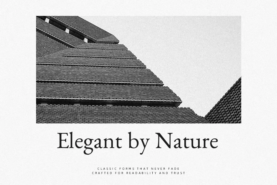
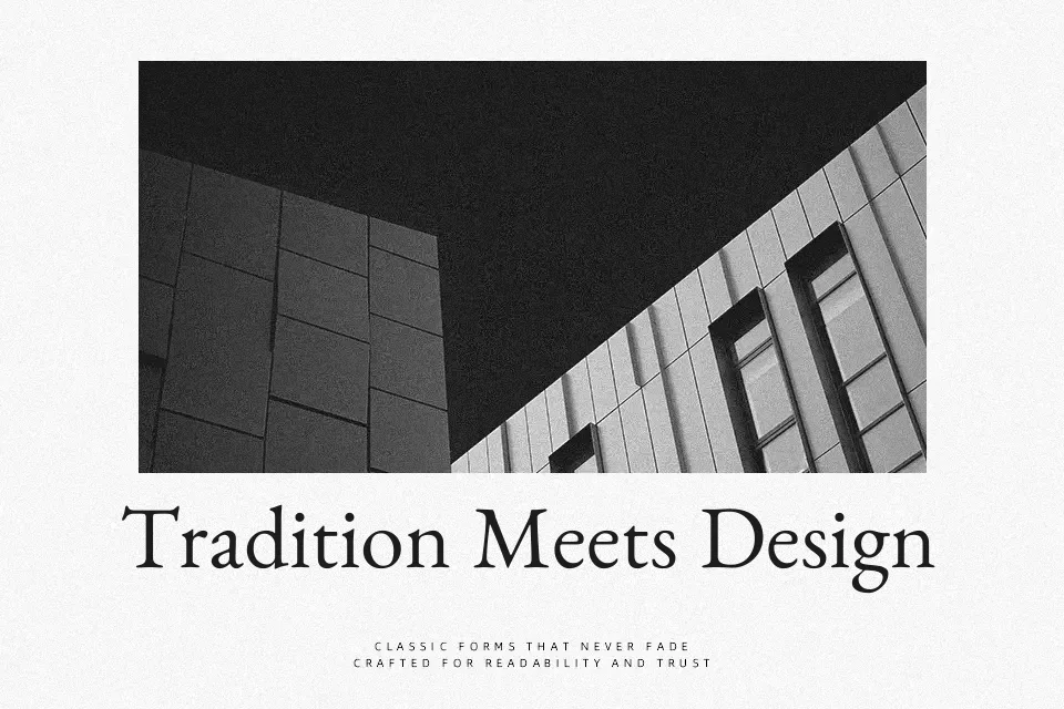
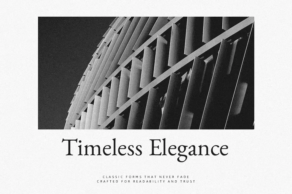
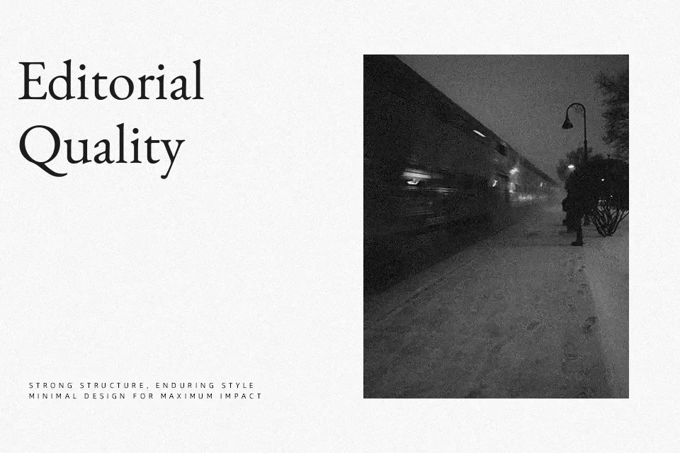
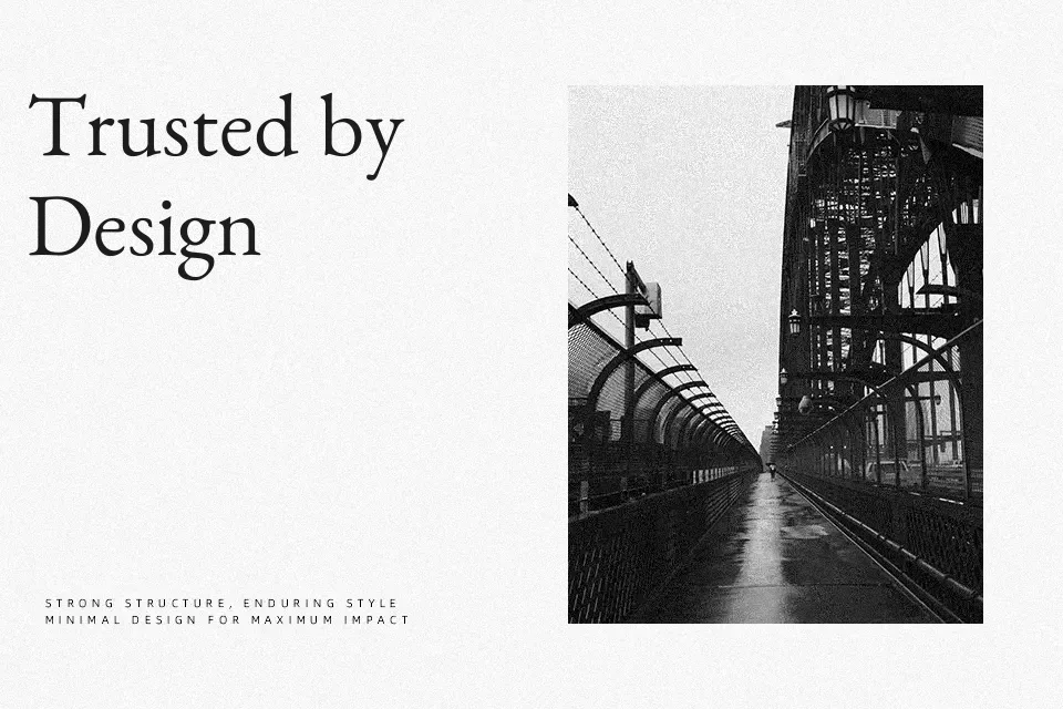
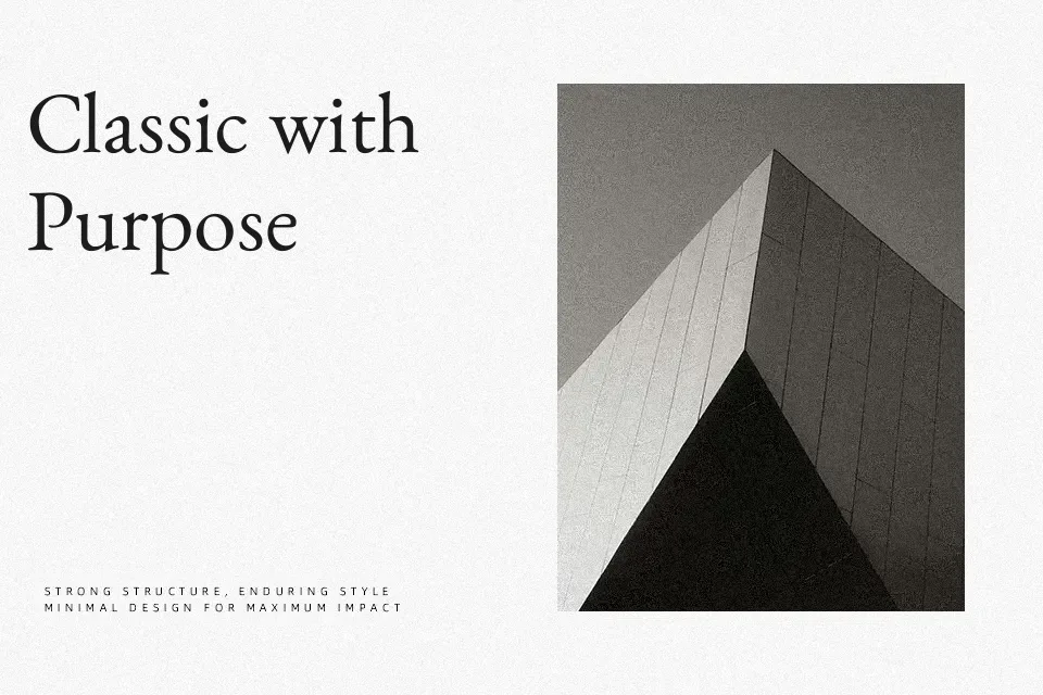
Benne is a calm, old-style serif with moderate contrast, open counters, and carefully spaced text proportions that stay readable even at small sizes. The Kannada and Latin designs are drawn to sit comfortably next to classic book faces like EB Garamond, so paragraphs feel familiar rather than ornamental. Strokes feel sturdy but not heavy, giving body copy a slightly literary flavor that suits essays, cultural content, and thoughtful product storytelling. It shines when you need a continuous reading experience across scripts, but it will not carry highly expressive branding on its own. If you like traditional Garalde serifs and need Kannada support, this is a reliable workhorse rather than a display stunt.
Best For:
editorial layouts with kannada text
long-form articles and blogs
multilingual book-style interfaces
quiet branding for cultural projects
Not Ideal For:
loud display logos
highly geometric design systems
ultra-minimal tech branding
very tight all-caps headlines
Perfect for body text, branding, and editorial, with a calm and serif style.
License
Gallery