Chicago House Font
Free for personal useAbout
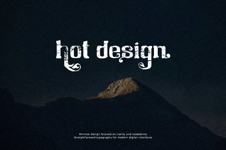
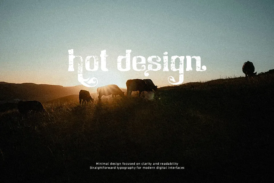
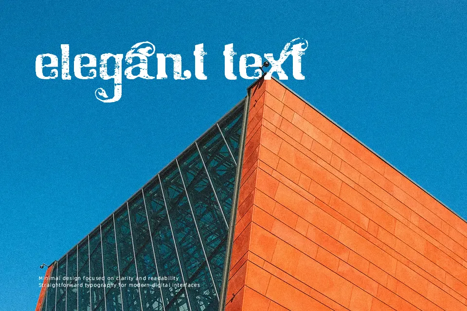
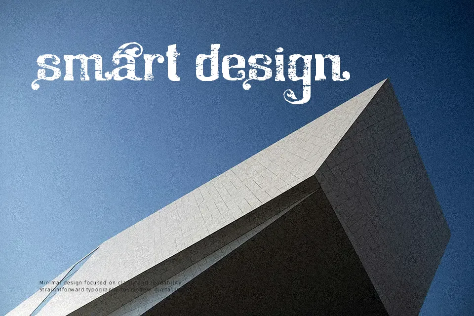
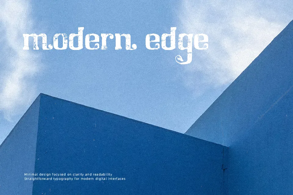
Chicago House Font demonstrates its greatest visual strength when deployed at prominent display scales where its distressed surfaces can be fully appreciated. The letterforms feature solid, heavy stroke weights interrupted by irregular erosion marks that create an authentic weathered texture. Moderate character proportions and balanced spacing keep individual glyphs distinct in short headlines, title sequences, and event banners. However, the heavy visual distressing and compact internal counters compromise legibility at smaller sizes, making the typeface unsuited for dense paragraph layouts or continuous body reading. In practice, the rugged aesthetic provides an energetic, tactile quality that works reliably across packaging labels and underground music branding.
Best For: music festival posters,urban streetwear apparel,underground album covers,skate brand packaging
Not Ideal For: long paragraph text,corporate reports,mobile app body copy,legal documents
Perfect for fashion, headline, and logo, with a bold and decorative style.
License
Gallery