Chicago Font
Free for Commercial UseAbout
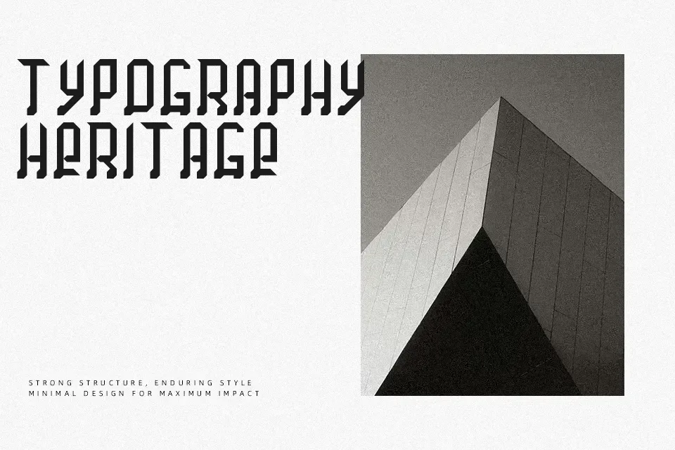
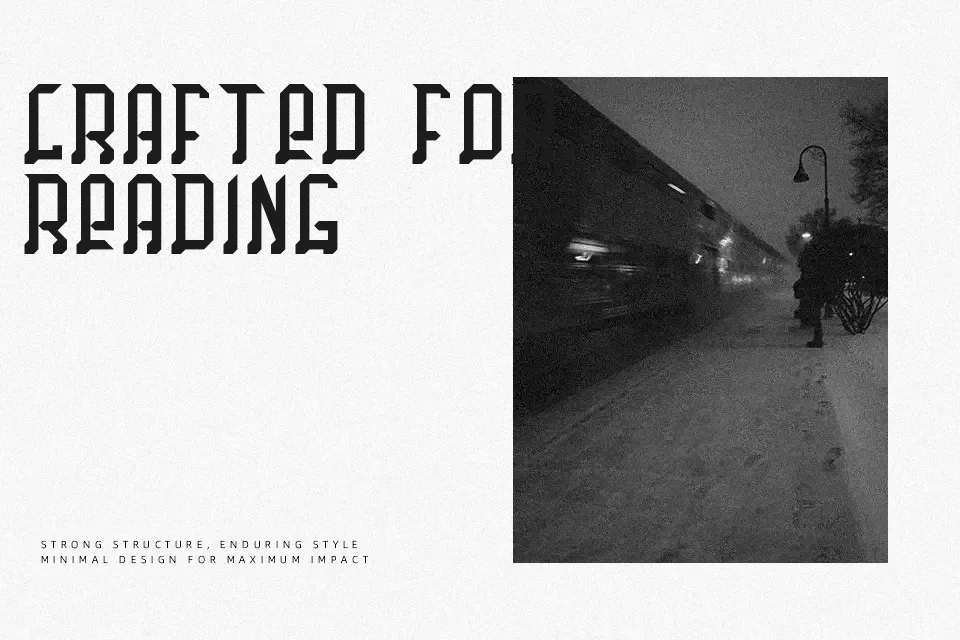
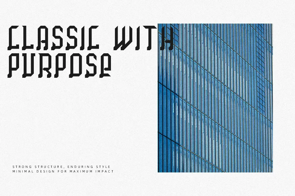
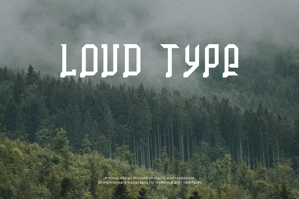
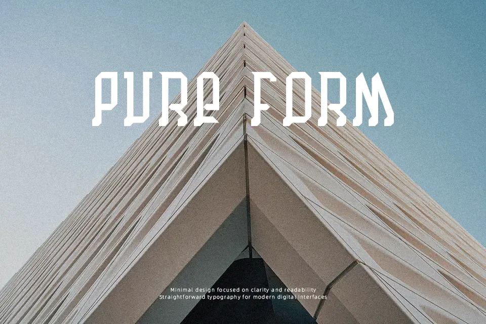
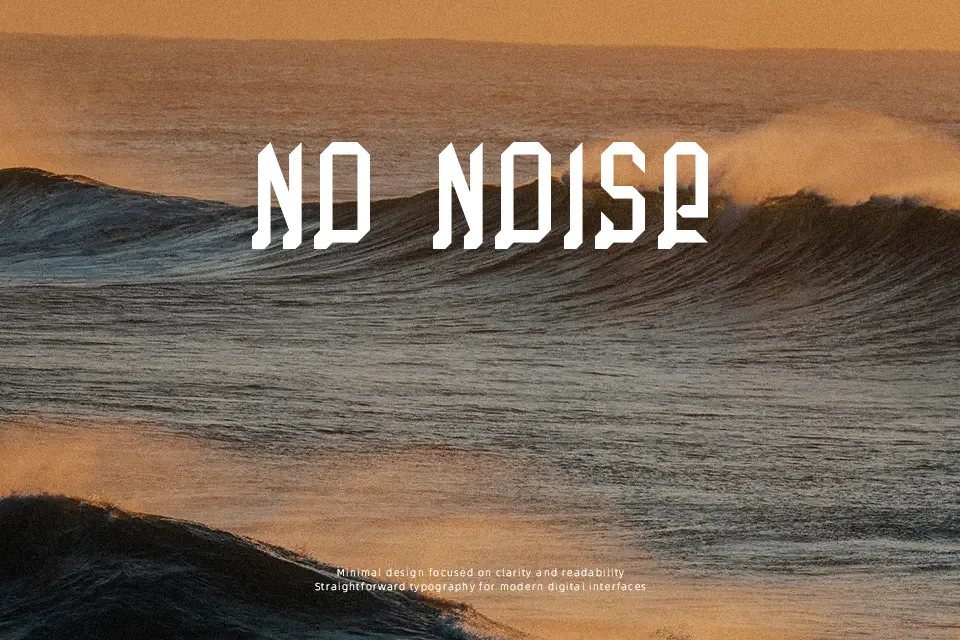
Chicago Font delivers an assertive modular structure built from heavy geometric strokes and sharp right-angled contours. Each character emphasizes uniform line weight and wide horizontal proportions, creating an unmistakable retro-digital aesthetic across uppercase and lowercase sets. Spacing remains tightly structured yet consistent enough to preserve distinct letterforms when scaled up. The typeface performs best when displayed at larger sizes where its bold architectural silhouettes command visual focus. However, the heavy density and rigid construction significantly reduce reading comfort in continuous body copy or small interface captions, making it less suitable for long editorial paragraphs.
Best For: music festival posters,video game title screens,streetwear apparel graphics,electronic album covers
Not Ideal For: continuous book paragraphs,mobile app body text,dense spreadsheet tables,formal legal documents
Perfect for gaming, headline, and logo, with a bold and decorative style.
License
Gallery