Cheap Potatoes Font
Free for personal useAbout
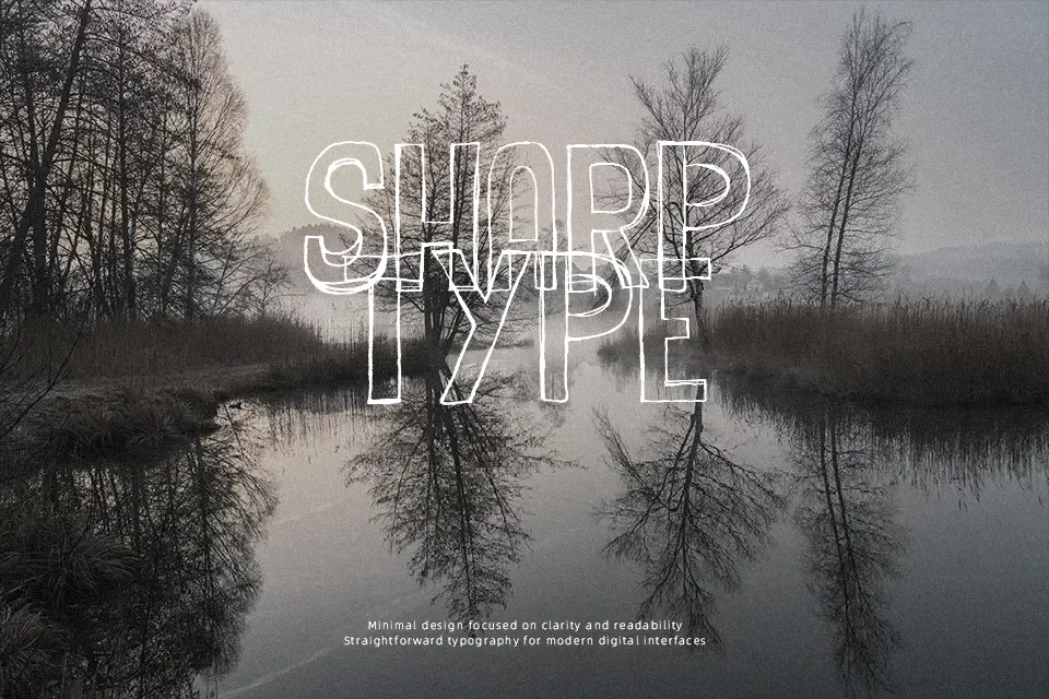
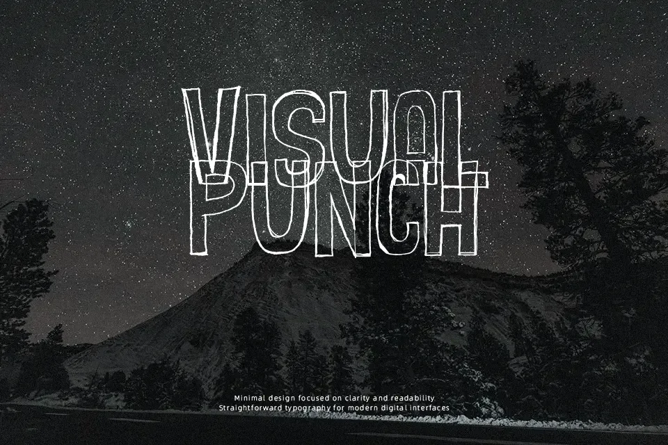
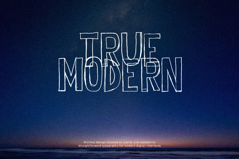
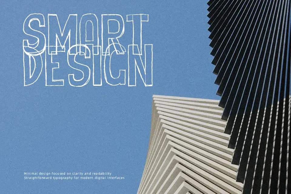
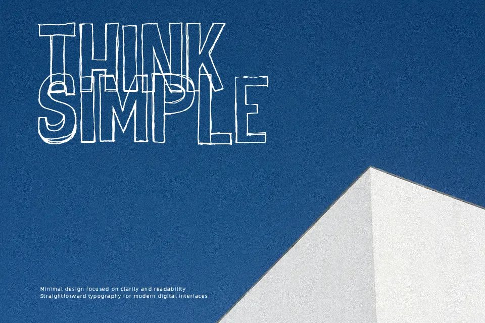
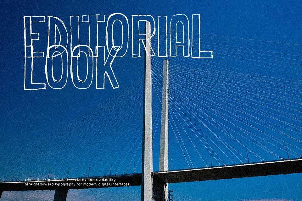
Cheap Potatoes Font showcases an organic, cutout aesthetic defined by uneven stroke weights, jagged contours, and varied character proportions. Each glyph carries an offbeat, hand-crafted structure with tight spacing that enhances visual weight in large titles. The bold forms deliver high visual impact across apparel graphics, indie album covers, and energetic event signage. However, the irregular silhouettes and dense letter spacing make the typeface less suitable for continuous body text, as small paragraphs quickly lose legibility. In practical testing, the letterforms remain easy to distinguish in short display text while maintaining an authentic, handcrafted presence in headline layouts.
Best For: music festival posters, indie album art, street apparel graphics, craft food packaging
Not Ideal For: long paragraph body text, mobile application interface labels, formal corporate documents
Perfect for headline, logo, and music, with a artistic and decorative style.
License
Gallery