Charles S. Font
Free for personal useAbout
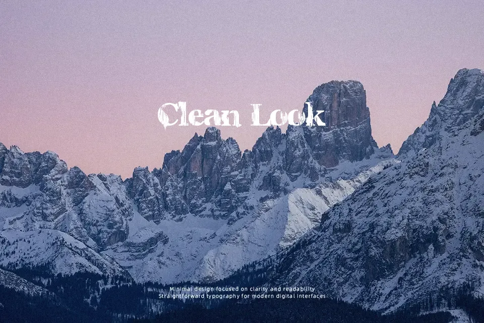
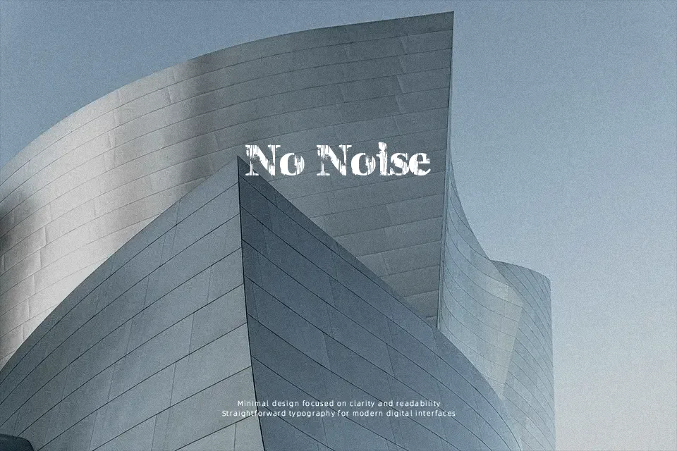
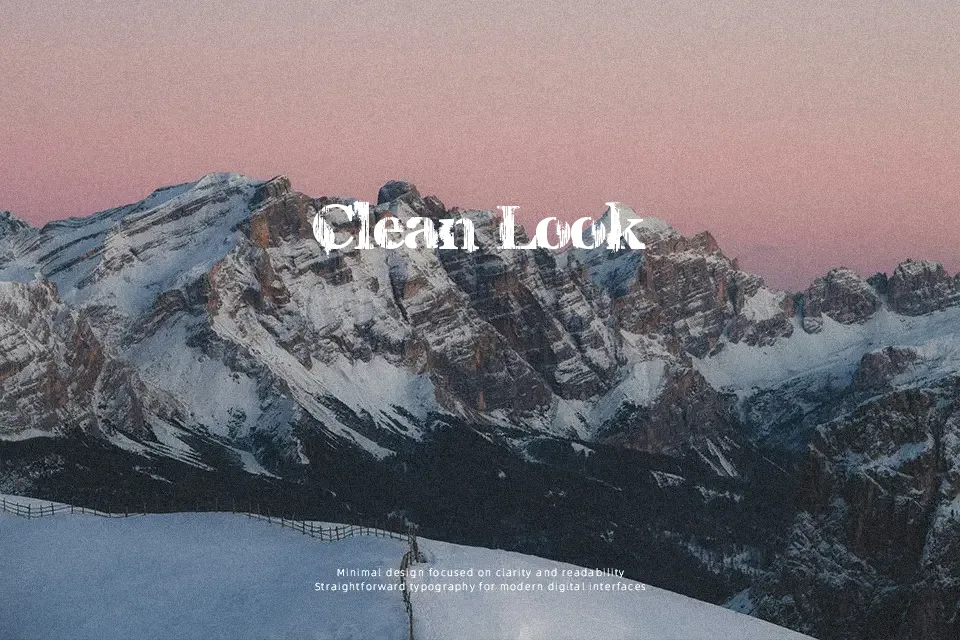
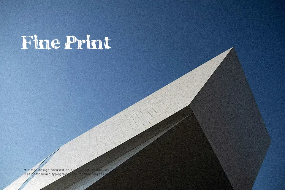
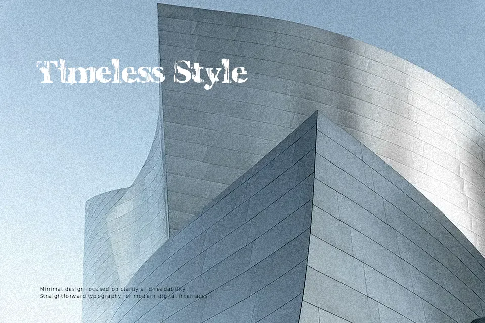
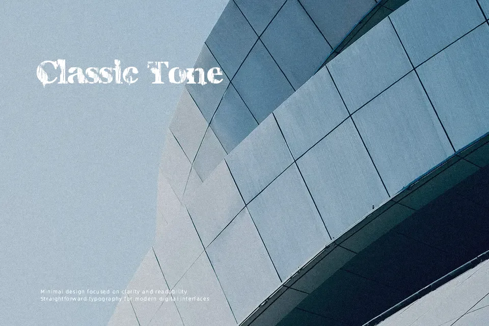
Charles S. Font presents an aggressively textured display structure marked by fragmented outlines, inconsistent edge erosion, and heavy stroke weight. The letterforms display tight spacing and irregular proportions that produce an intense, chaotic rhythm across short lines of text. Readability remains sharp at prominent display scales, making the design particularly effective for underground album artwork, video game teasers, and distressed apparel graphics. However, the dense decorative deterioration causes individual characters to blur together when set at small sizes. The typeface works best when restricted to brief, punchy titles where its raw energy reinforces the theme without compromising reading comfort.
Best For: horror film title cards, music festival posters, underground apparel graphics, video game banners
Not Ideal For: continuous editorial paragraphs, small interface button labels, legal documentation, dense data tables
Perfect for film, gaming, and headline, with a bold and decorative style.
License
Gallery