Seventies Groovy Font
Free for personal useAbout
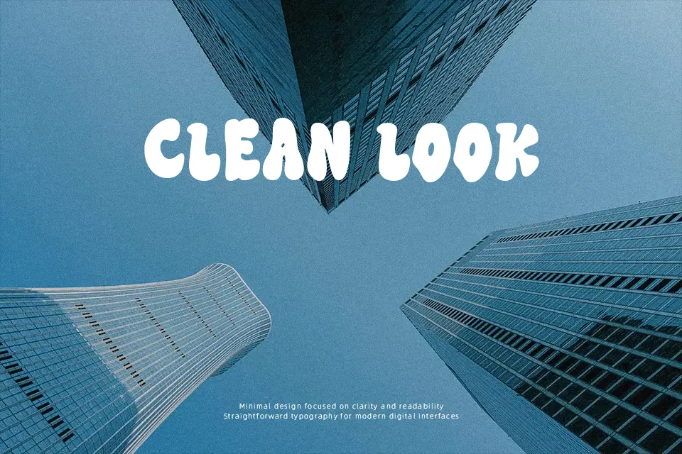
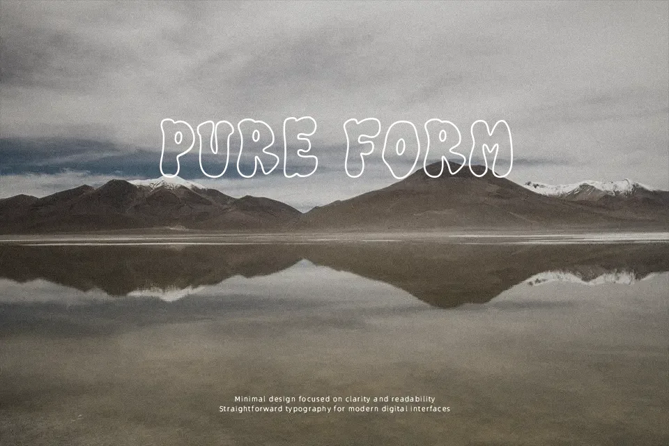
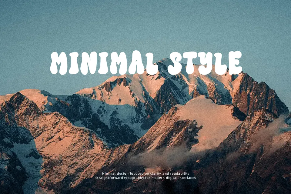
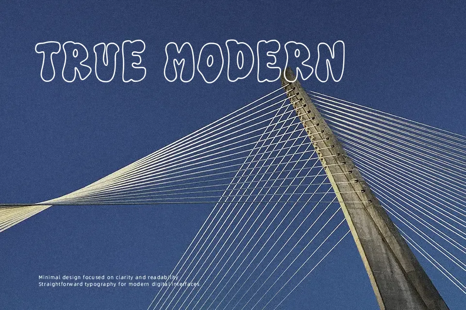
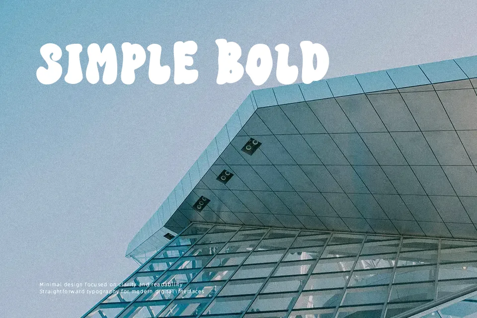
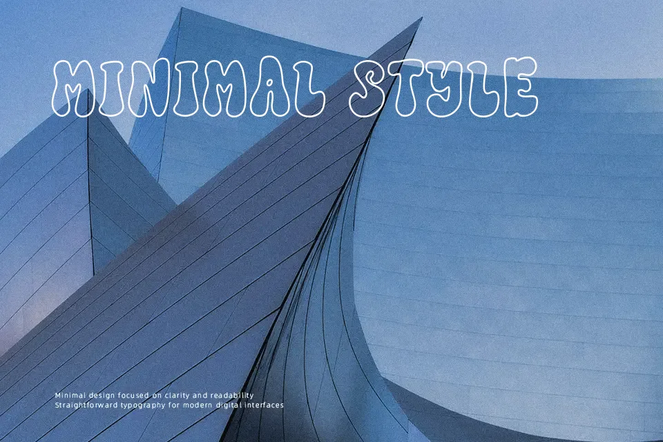
Heavy stroke weights and organic swollen curves define the visual structure of Seventies Groovy Font. The typeface pairs bulbous terminals with tight character spacing, generating an unmistakable rhythm that commands attention across short headline compositions. Proportions lean heavily toward bold display settings where generous ascenders and rounded counters remain clearly legible at substantial scales. However, the dramatic stroke contrast and dense counters quickly become cluttered when set in multi-line paragraphs or smaller subheadings. The letterforms create maximum impact on screen-printed t-shirts, vinyl record sleeves, and thematic event flyers, though extended reading layouts should rely on a simpler neutral companion.
Best For: retro apparel graphics, music festival posters, vinyl record packaging, headline lettering
Not Ideal For: long paragraph text, dense editorial layouts, small interface labels, corporate reports
Perfect for headline, logo, and music, with a bold and decorative style.
License
Gallery