Santup Font
Free for personal useAbout
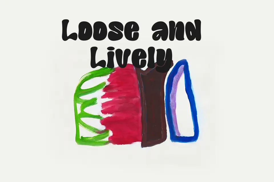
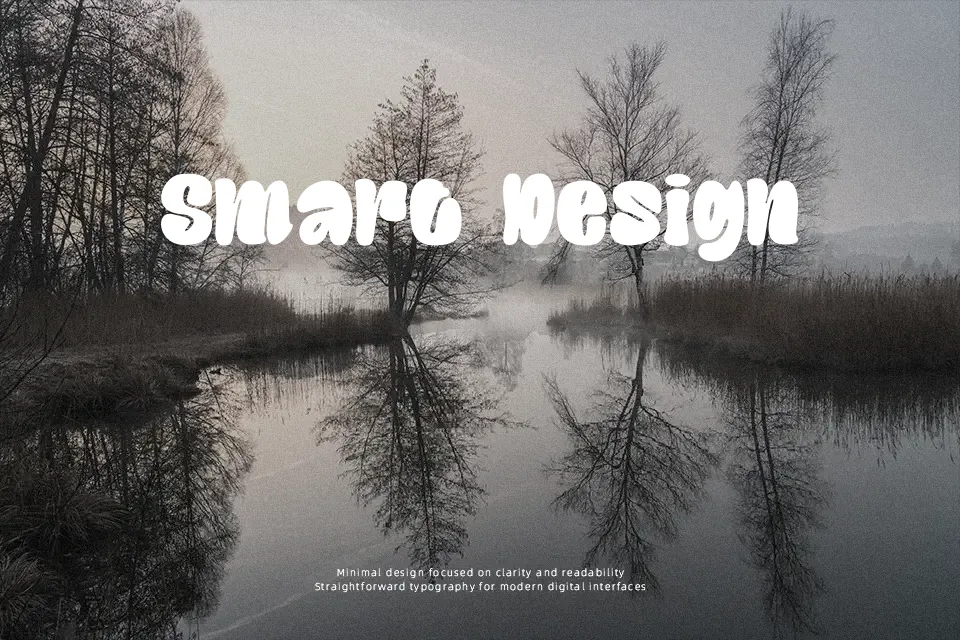
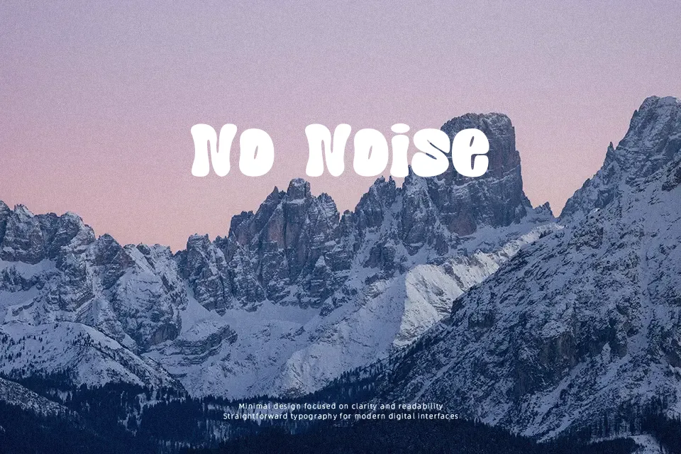
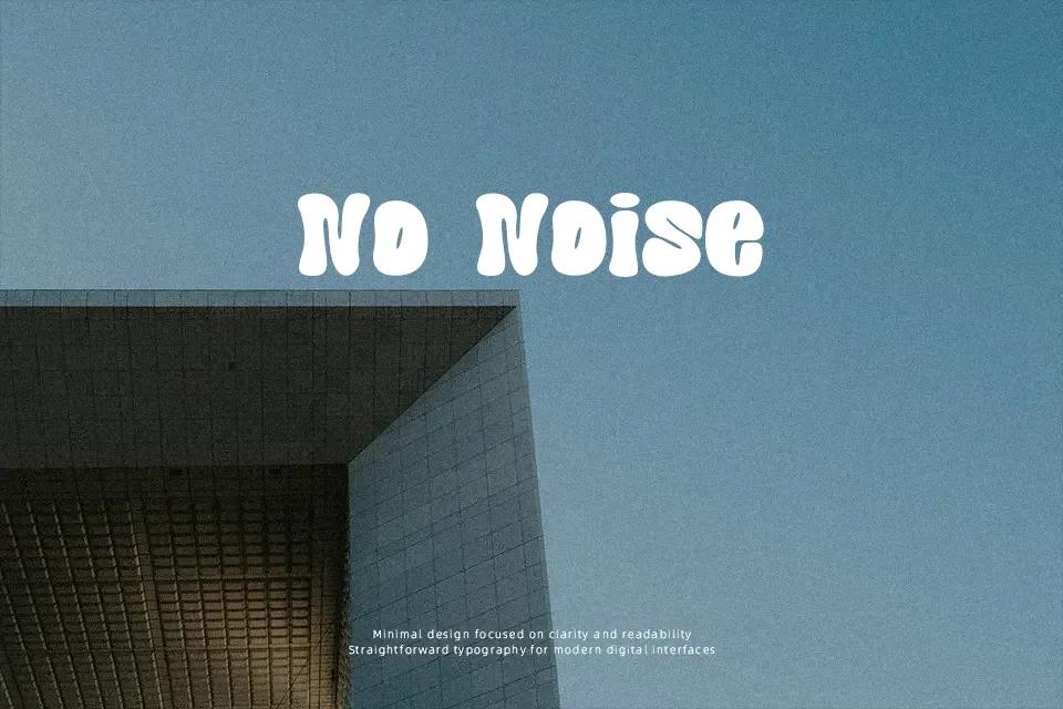
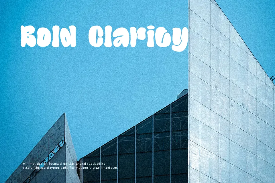
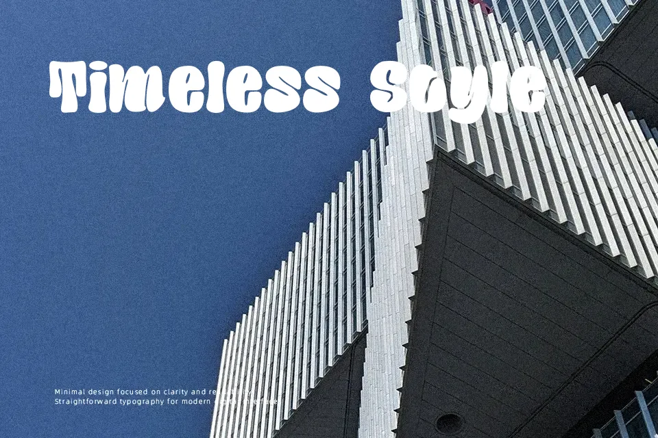
Santup Font establishes an energetic visual presence through extra-bold stroke weight, tight letter spacing, and fluid curved geometry. The design features soft, bulbous terminals and minimal stroke contrast, producing compact word shapes that capture attention instantly in large headlines. Uppercase and lowercase characters maintain a consistent organic rhythm across short display phrases. However, the thick strokes and condensed internal counters reduce clarity when rendered at small sizes, making the typeface impractical for lengthy paragraphs. The font performs best in oversized layout applications where its warm, expressive shapes can stand out cleanly.
Best For:
music festival posters
retro product packaging
apparel graphic tees
event banner headlines
Not Ideal For:
continuous paragraph text
mobile interface captions
corporate documentation
dense editorial layouts
Perfect for headline, music, and packaging, with a bold and decorative style.
License
Gallery