SA Cinta Font
Free for personal useAbout
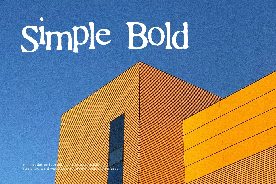
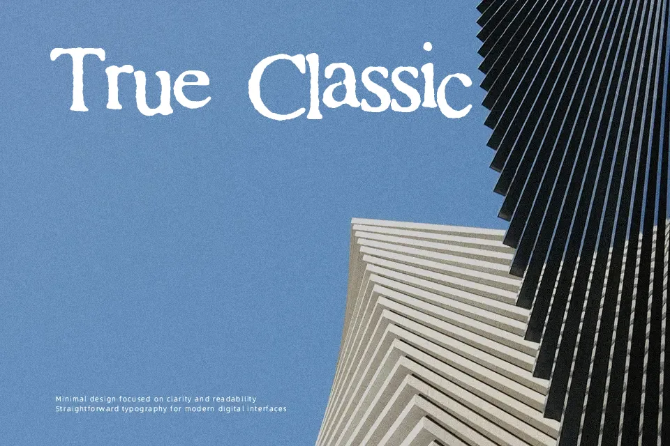
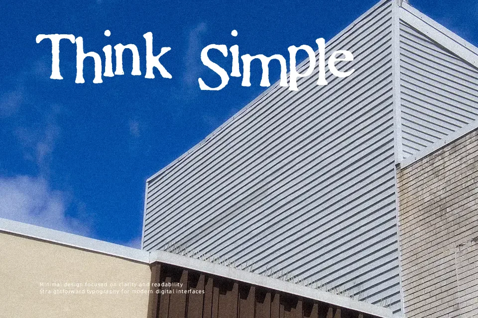
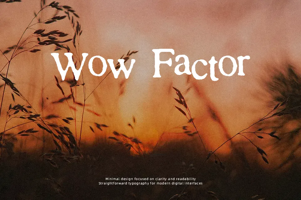
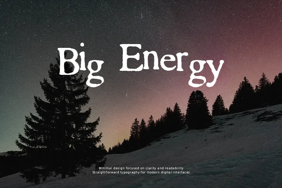
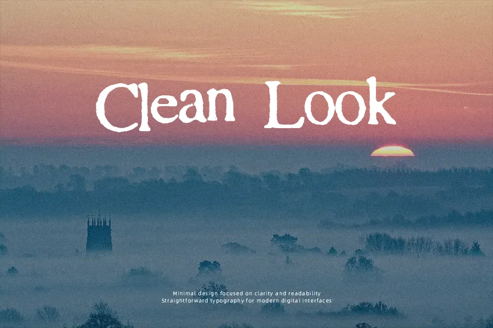
SA Cinta Font immediately establishes a chaotic and raw visual presence through its heavily textured strokes and erratic letter proportions. The deliberately irregular outlines and uneven character widths create a distressed rhythm that refuses to sit neatly on a conventional baseline. Open spacing between the letterforms attempts to balance the structural damage, preventing the heavier black areas from completely merging. The bold, unpolished strokes maintain striking visibility in large display text, providing an aggressive energy for alternative album artwork. However, the excessive decorative distortion becomes a significant obstacle at smaller sizes. Dense forms reduce comfort during extended reading, making the typeface entirely unsuitable for continuous paragraphs or detailed editorial columns.
Best For:
alternative album artwork
grunge festival posters
distressed streetwear graphics
rebellious brand identities
Not Ideal For:
long paragraph text
small interface labels
dense editorial layouts
corporate reports
Perfect for fashion, headline, and music, with a dramatic and decorative style.
License
Gallery