Balsamiq Sans Font
Free for Commercial UseAbout
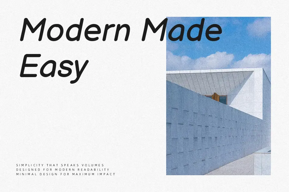
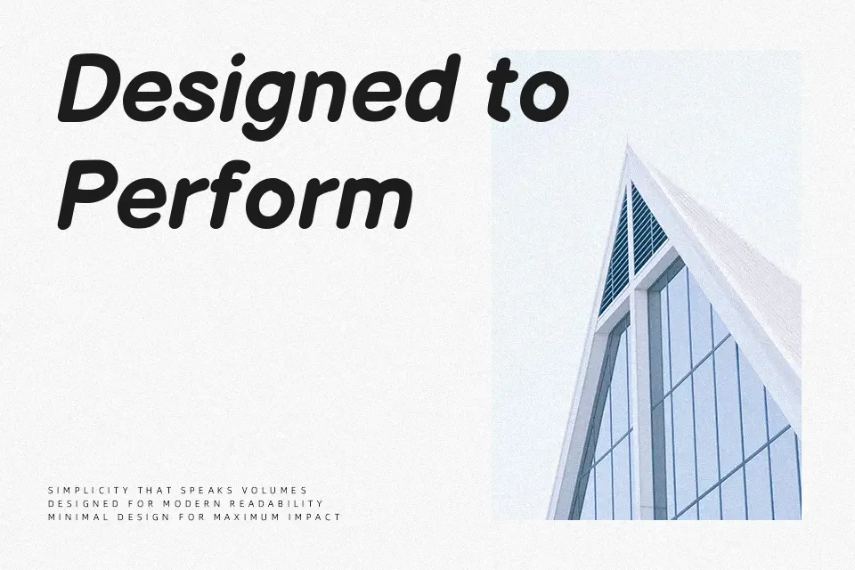
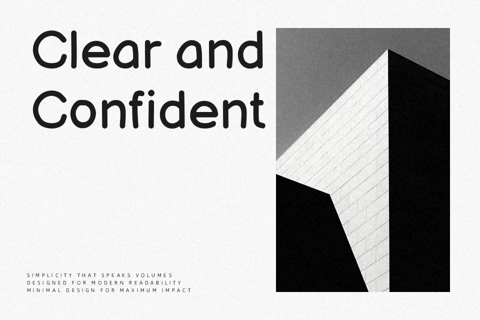
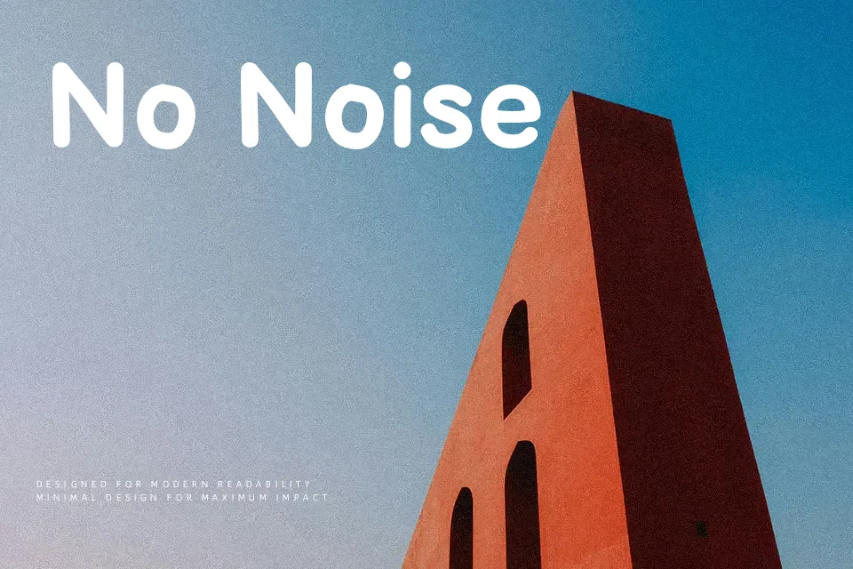
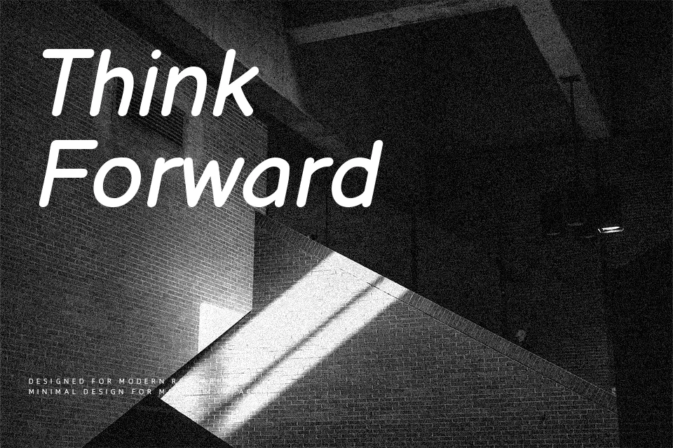
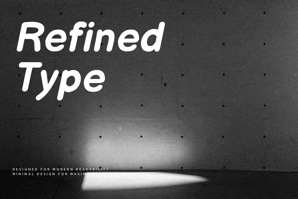
Balsamiq Sans looks like neat whiteboard handwriting: rounded terminals, slightly shaky strokes, and loose spacing that keeps lines airy even at smaller sizes. It stays readable because the structure is closer to a sans serif skeleton than to decorative doodles, so letters don’t collapse into each other in dense layouts. The tone is informal and sketchy, which works nicely for wireframes, concept decks, kids’ digital products, and interfaces where you want to signal “work in progress” rather than polished final design. However, that same roughness can undermine serious branding, long-form reading, or anything that needs a highly professional, neutral voice. If you’re torn between a comic-style font and a standard UI typeface, this lands comfortably in the middle.
Best For:
wireframe annotations
prototype UI labels
informal presentation slides
kids app interfaces
Not Ideal For:
long paragraphs
formal business documents
serious corporate branding
academic publishing
Perfect for branding, headline, and kids, with a creative and handwritten style.
License
Gallery