Royal Font
Free for Commercial UseAbout
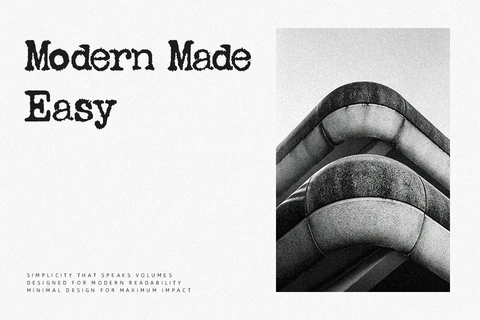
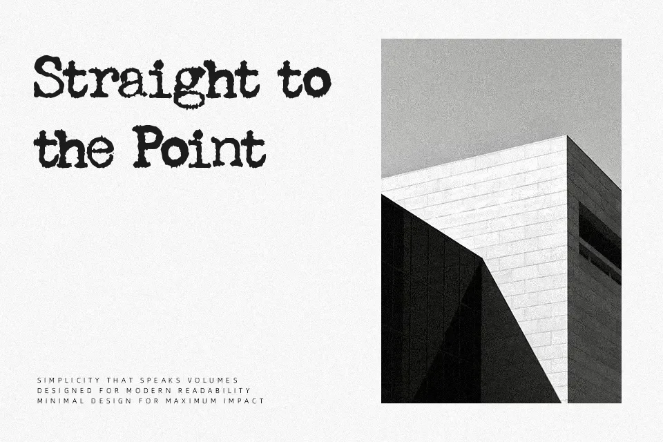
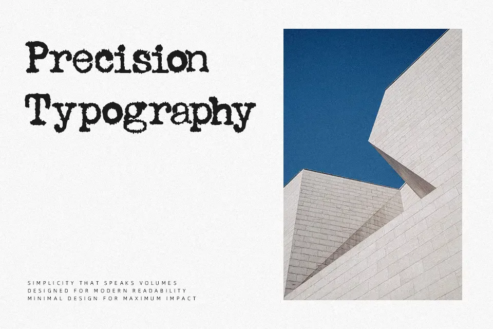
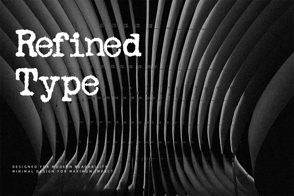
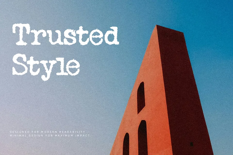
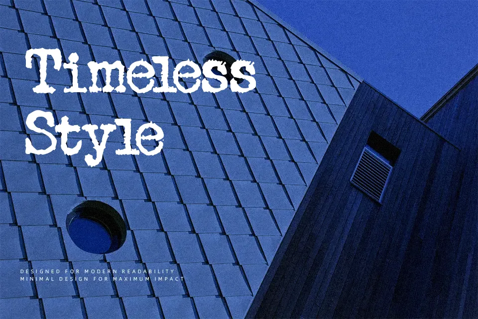
Royal Font performs best when displayed at medium sizes where its textured, mechanical details can be fully appreciated. The letterforms deliver the authentic charm of an analog typewriter, complete with distressed strokes and slightly irregular baseline alignment that emulate uneven ink impressions. These stamped structures maintain clarity in short display text while providing a strong nostalgic atmosphere. The organic spacing helps maintain visual interest in vintage posters, rustic packaging, or retro editorial layouts. However, the heavy grunge texture and rough edges reduce continuous reading comfort, making this design less suitable for long paragraphs.
Best For: vintage product packaging, retro poster headlines, rustic brand identities
Not Ideal For: long paragraph text, corporate reports, small interface labels
Perfect for branding, editorial, and packaging, with a classic and decorative style.
License
Gallery