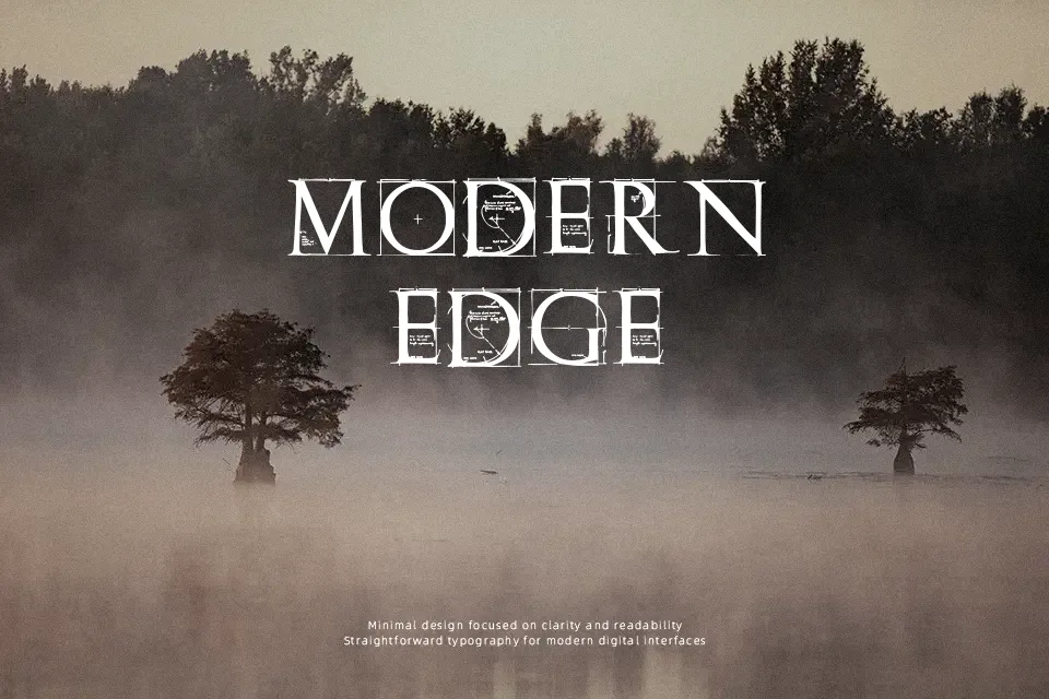
Roman Grid Caps Font
Free for Commercial UseAbout
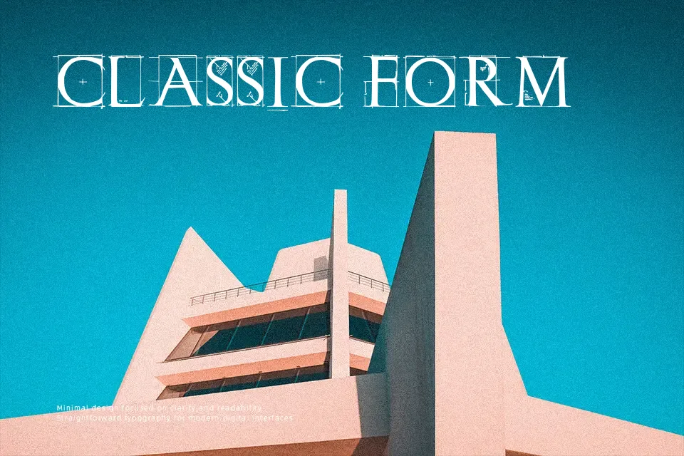
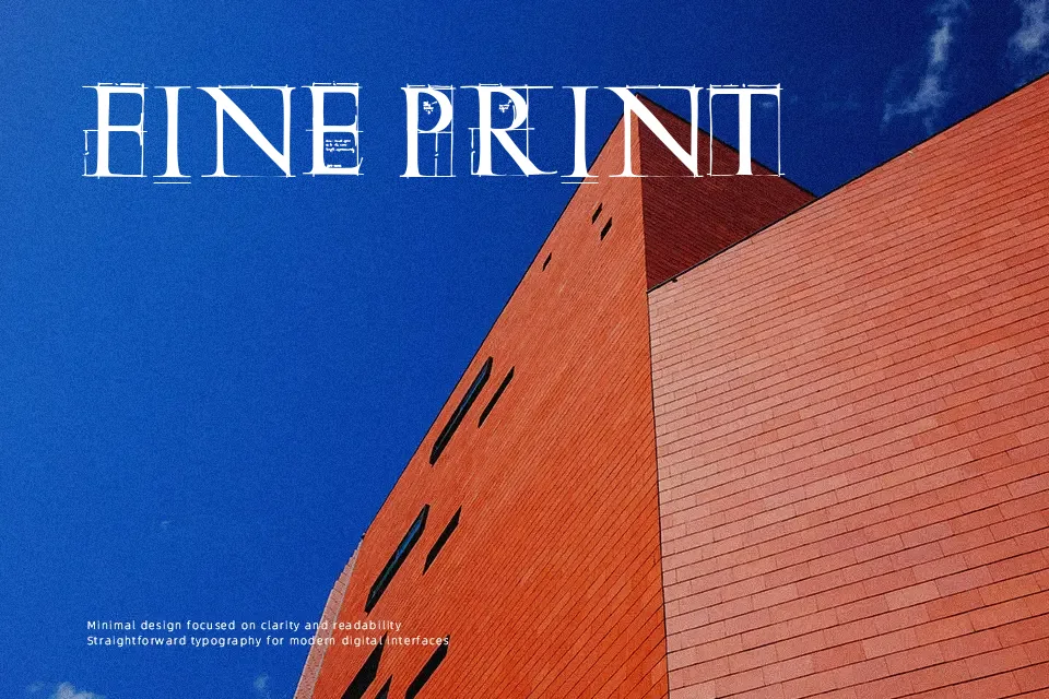
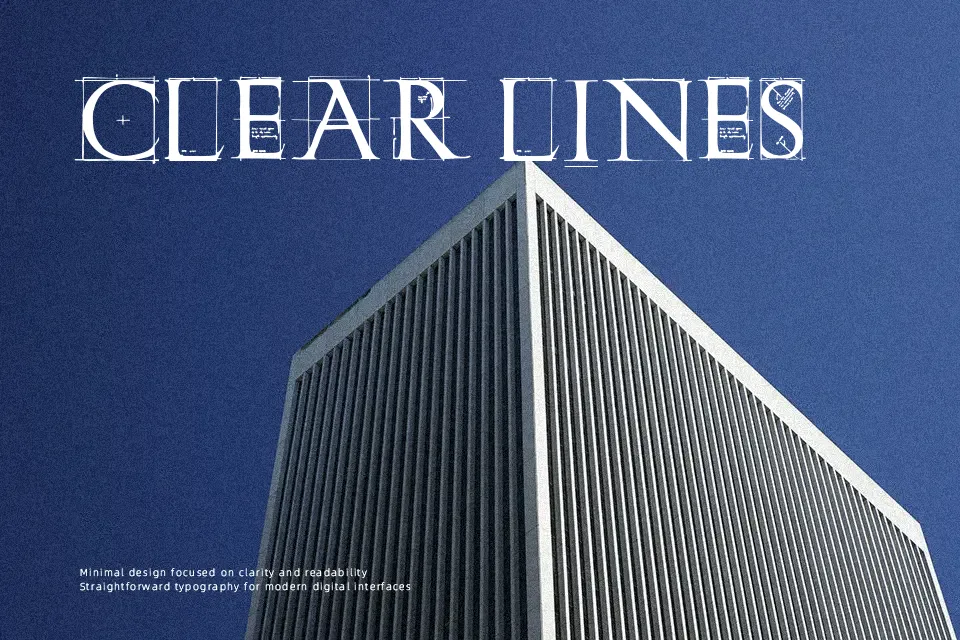
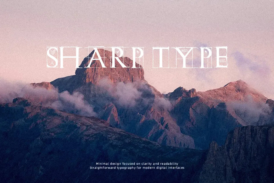
Exploring a highly structured aesthetic, the Roman Grid Caps Font constructs classic uppercase letterforms using a visible geometric framework. The intricate intersecting lines and precise grid patterns give each character a technical, architectural appearance while preserving traditional proportions. Because the strokes rely on thin intersecting grid lines rather than solid masses, the letterforms remain visually airy and open. This structural complexity creates high visual impact in large display headers, technical branding, and poster designs. However, the delicate linework and dense internal patterns drastically reduce legibility at smaller sizes, making it entirely unsuitable for continuous body text or small interface labels. The rigid grid spacing helps maintain an orderly, calculated rhythm across bold headlines.
Best For:
architectural exhibition posters
technical company branding
geometric logo marks
structured magazine headlines
Not Ideal For:
long paragraph text
small interface labels
dense editorial layouts
spreadsheet data
Perfect for branding, headline, and logo, with a classic and decorative style.
License
Gallery