Rita Slab Font
Free for Commercial UseAbout
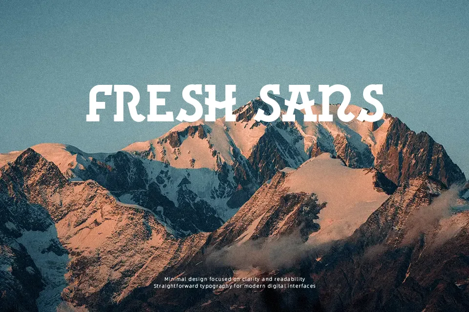
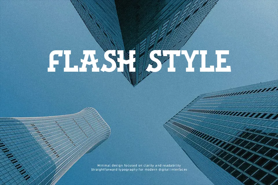
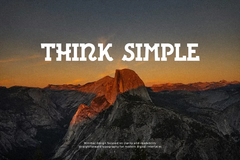
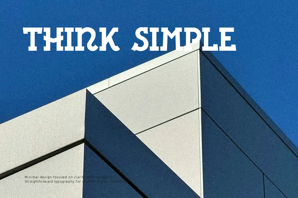
Rita Font introduces a traditional Galician aesthetic through heavy, slab-like letterforms that demand attention in display environments. The sturdy strokes and confident proportions create a solid rhythm across large headlines and cultural event posters. Its thick visual weight ensures excellent visibility at larger sizes, drawing inspiration from historic stone-carved lettering. The substantial serifs and compact spacing help maintain a cohesive block of text in short titles. However, these same heavy characteristics can cause the forms to feel overly dense when reduced to small captions. The robust letterforms perform best when displayed at larger scales, where their rugged personality remains fully readable without sacrificing artistic impact.
Best For: cultural event posters, restaurant signage, heritage branding, festival headlines
Not Ideal For: dense editorial layouts, small interface labels, corporate reports, long paragraph text
Perfect for branding, headline, and poster, with a ancient and decorative style.
License
Gallery