Baloo Bhai 2 Font
Free for Commercial UseAbout
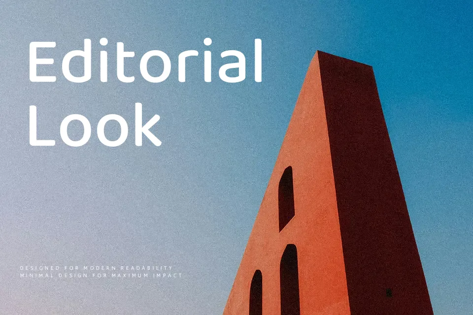
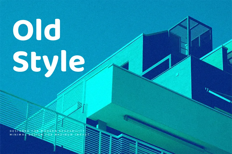
Baloo Bhai 2 keeps the heavy, bubble-like shapes of the original Baloo family but tightens the drawing, giving you bold letters with smoother curves, wide counters, and steady vertical rhythm. It reads as casual and friendly rather than goofy, so it works nicely on kids product packaging, education apps, regional branding, and thumb-stopping social media titles. On small body copy or dense editorial layouts, the weight and rounded terminals can start to feel cramped, so it’s better reserved for display sizes and short UI strings. If you like fonts such as other rounded display sans families, this one feels more rooted in Indian scripts, which adds character when you mix Gujarati and Latin in the same design.
Best For:
bold headlines
kids branding and products
Gujarati and Latin UI text
social media graphics
Not Ideal For:
long paragraphs
formal corporate documents
dense editorial layouts
very small captions
Perfect for branding, headline, and kids, with a bold and display style.
License
Gallery