Retro Lines Font
Free for personal useAbout
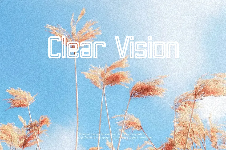
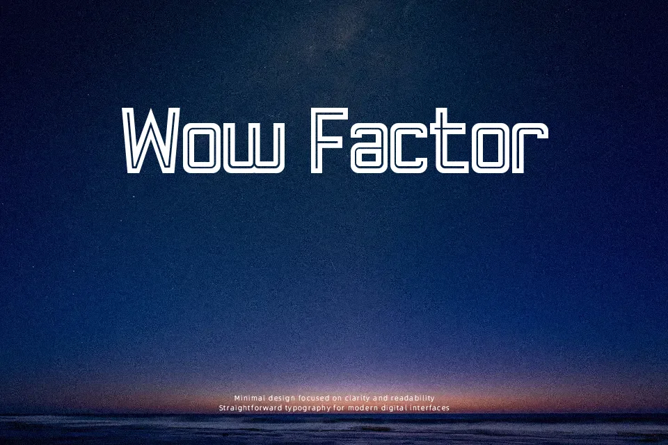
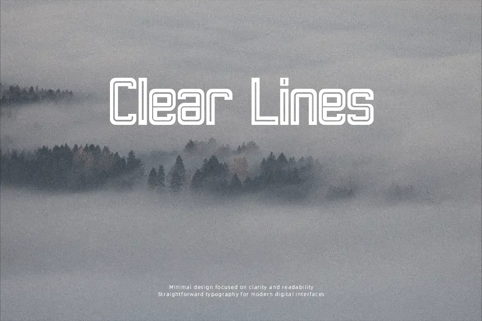
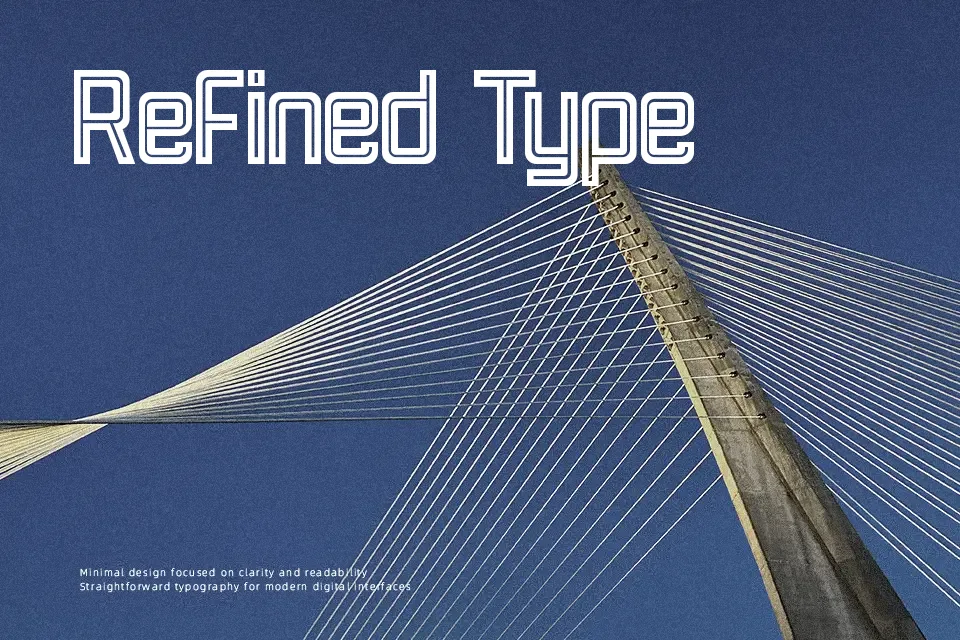
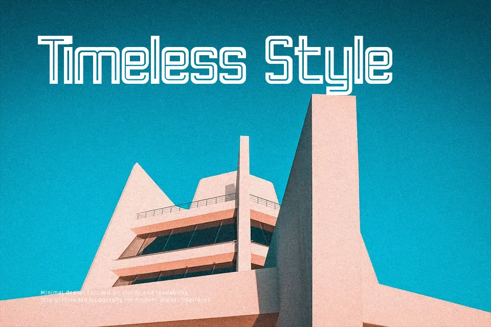
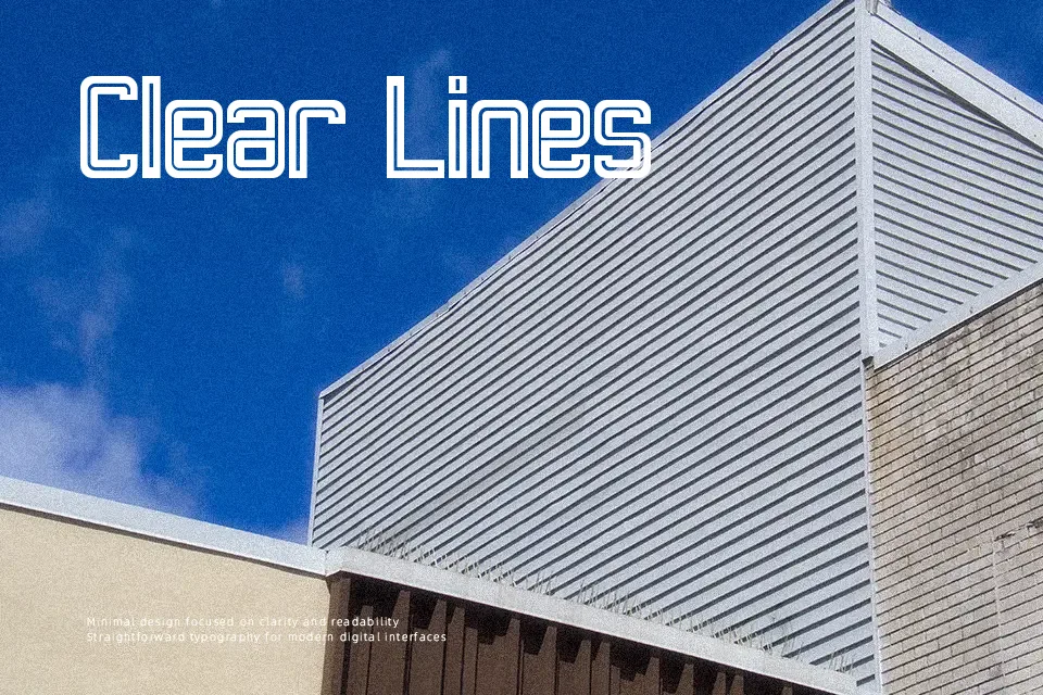
The geometric structure of Retro Lines Font is defined by its distinct parallel strokes and consistent character widths. The letterforms are built using multiple continuous lines that form bold, striking shapes with a balanced internal spacing. This multi-line approach gives the typeface a dynamic, rhythmic quality that feels simultaneously nostalgic and precise. The tight tracking and heavy visual weight make it a standout choice for vibrant event posters, retro-themed apparel, and impactful logo designs. However, the complex decorative nature of the striped letters means it is completely unsuitable for long paragraphs or small captions. Ultimately, the intricate line work performs best when displayed at much larger scales where the internal spacing remains clearly legible.
Best For:
retro event posters, vintage apparel graphics, music festival branding, large display headlines
Not Ideal For:
long paragraph text, small interface labels, dense editorial layouts, technical manuals
Perfect for branding, headline, and poster, with a bold and decorative style.
License
Gallery