Quincento Font
Free for personal useAbout
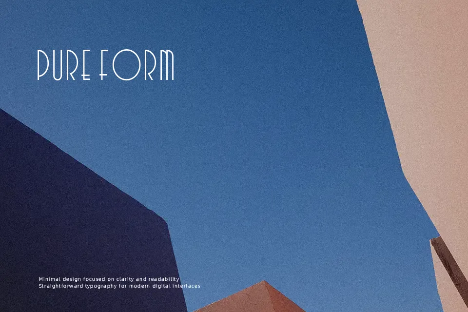
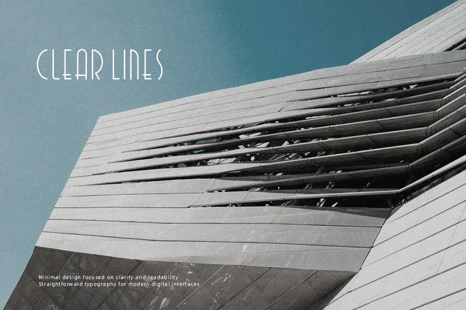
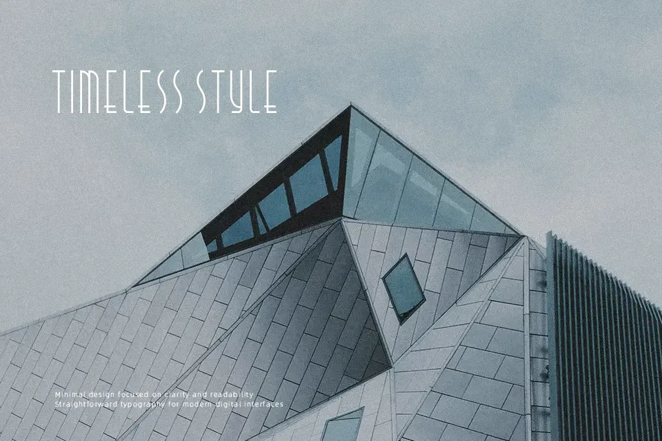
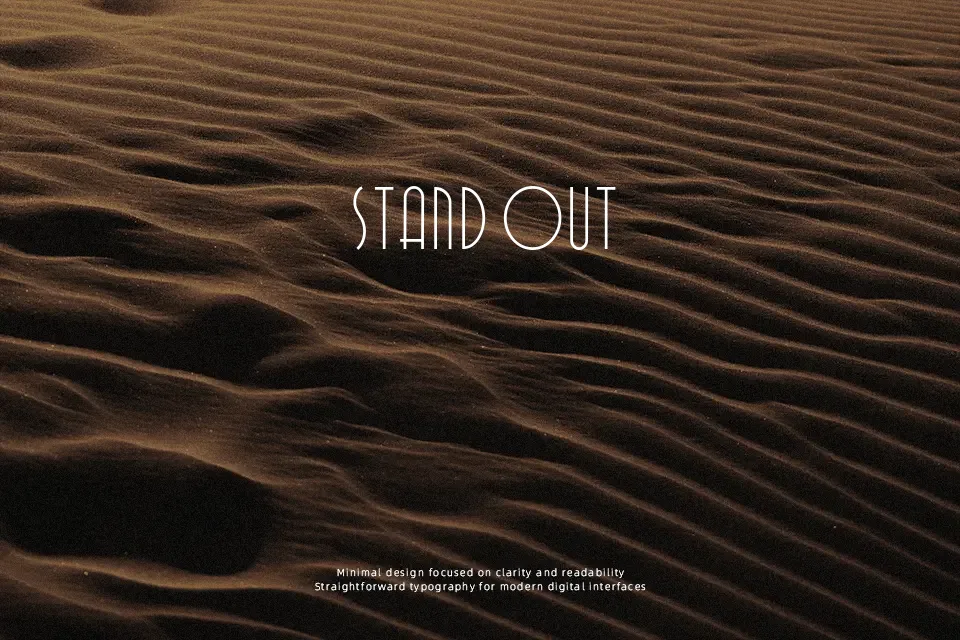
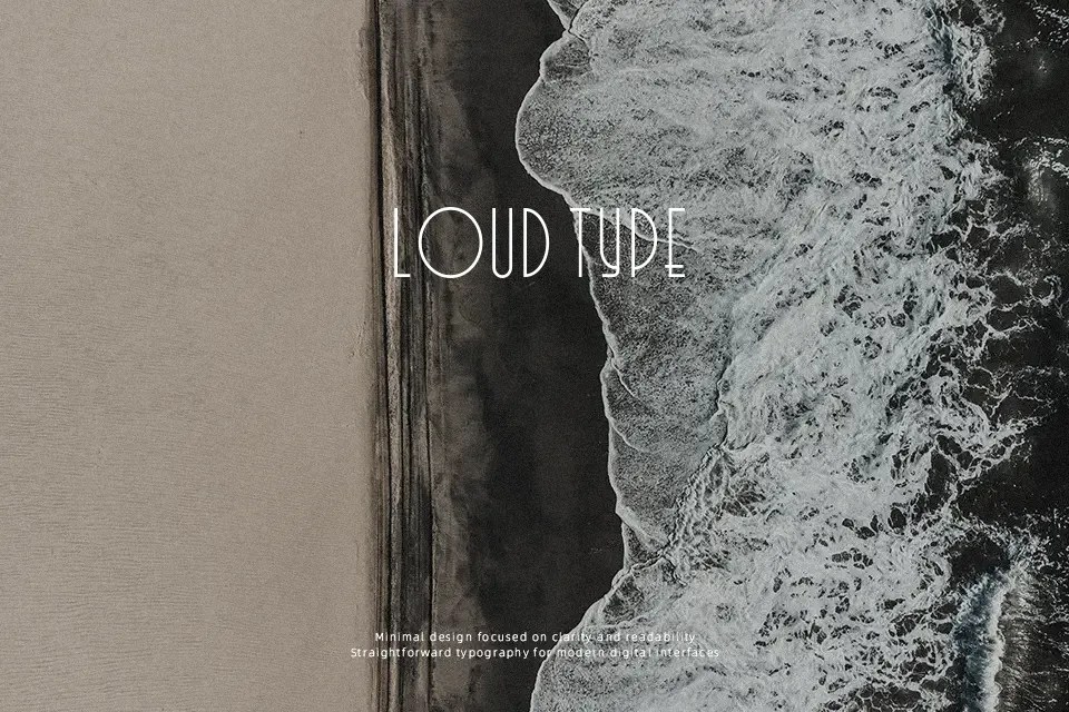
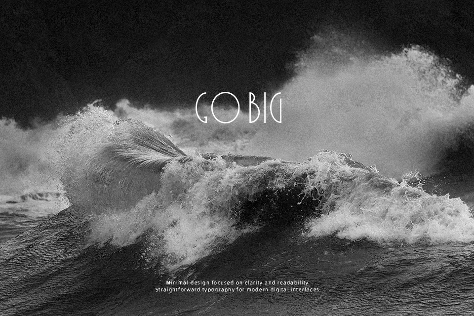
Visually defined by extreme vertical proportions and rigid geometric structures, Quincento Font alternates seamlessly between razor-sharp right angles and delicate curved strokes. The all-caps letterforms maintain a tight, condensed rhythm that creates a striking typographic presence in large display settings. This contrast in stroke construction captures a distinct 1920s Art Deco aesthetic, making the design well-suited for upscale restaurant logos, nostalgic posters, and glamorous invitation headers. The tight spacing helps maintain visual impact in larger headlines, but these decorative details become less effective at smaller sizes. Because of its extreme verticality and highly stylized uppercase-only nature, the typeface is not suitable for continuous paragraph text or dense layouts.
Best For:
upscale restaurant logos, vintage event posters, elegant invitation headers, striking editorial headlines
Not Ideal For:
long paragraph text, small interface labels, dense editorial layouts, spreadsheet data
Perfect for headline, invitation, and logo, with a classic and condensed style.
License
Gallery