Quand tu n’es pas là Font
Free for personal useAbout
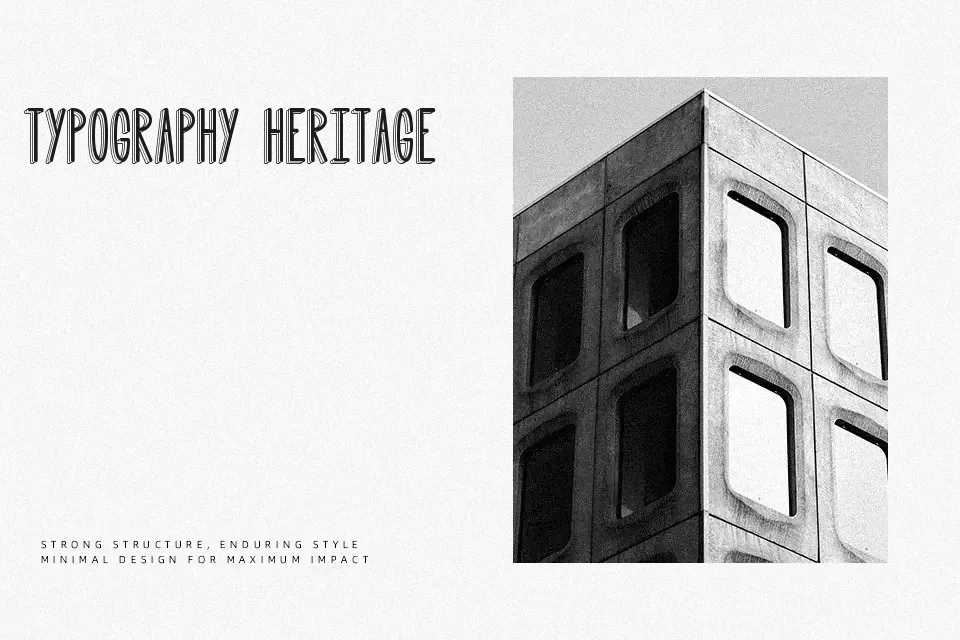
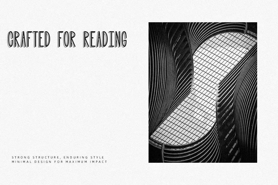
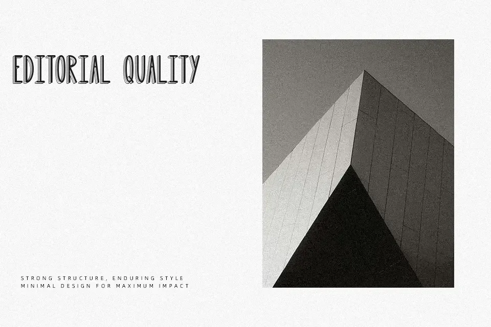
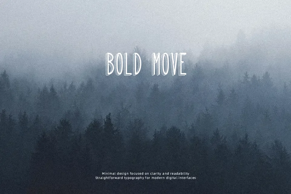
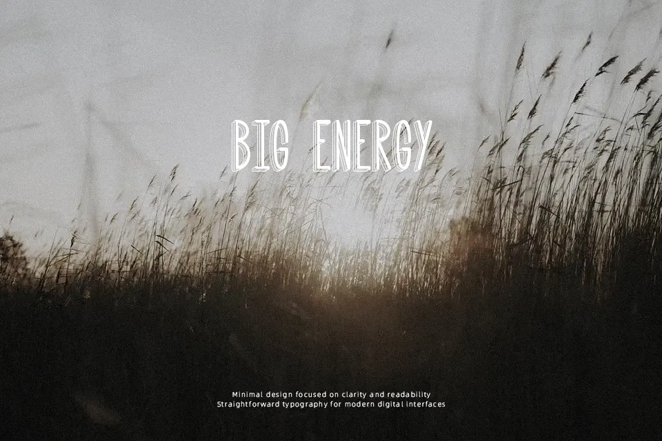
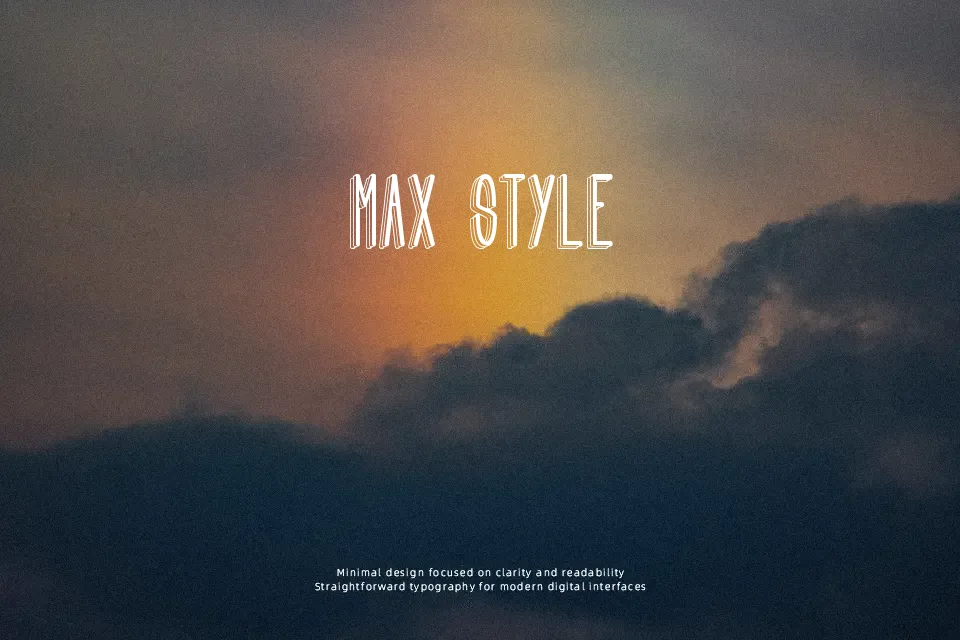
The structural design of Quand tu n’es pas là Font immediately stands out through its heavily shaded, three-dimensional letterforms. This bold display typeface features strong strokes, balanced spacing, and pronounced decorative shadows that give text a dynamic, pop-out effect on the page. The generous proportions allow the letters to carry visual weight without feeling entirely cluttered. The visual depth helps maintain clarity in larger headlines, ensuring the text remains legible from a distance. It excels in striking poster layouts, energetic apparel graphics, and creative packaging designs where high visual impact is required. However, the complex shaded forms reduce continuous reading comfort, making it far less suitable for dense editorial layouts or small interface labels.
Best For:
large festival posters
creative product packaging
bold website hero headlines
dynamic apparel graphics
Not Ideal For:
long paragraph text
small interface labels
dense editorial layouts
corporate reports
Perfect for 3d, headline, and poster, with a artistic and decorative style.
License
Gallery