Averia Serif Libre Font
Free for Commercial UseAbout
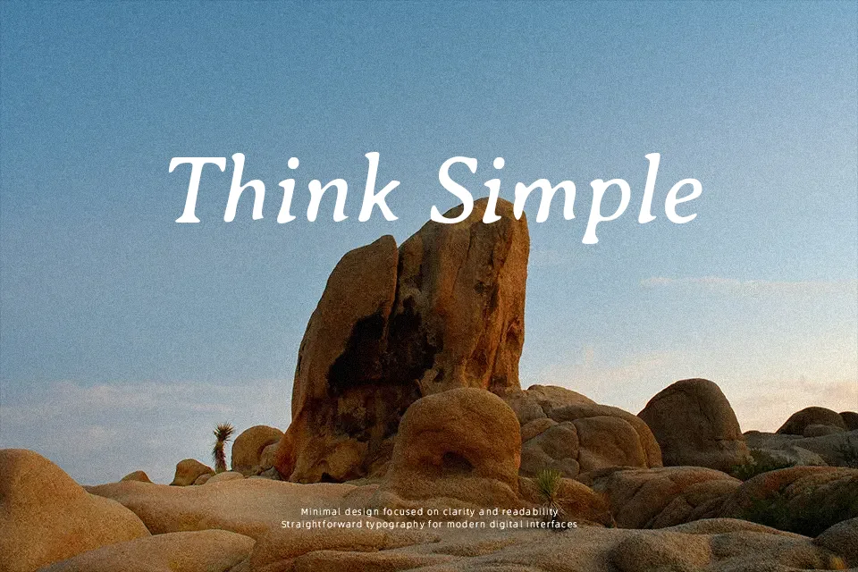
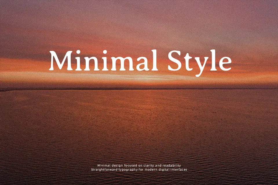
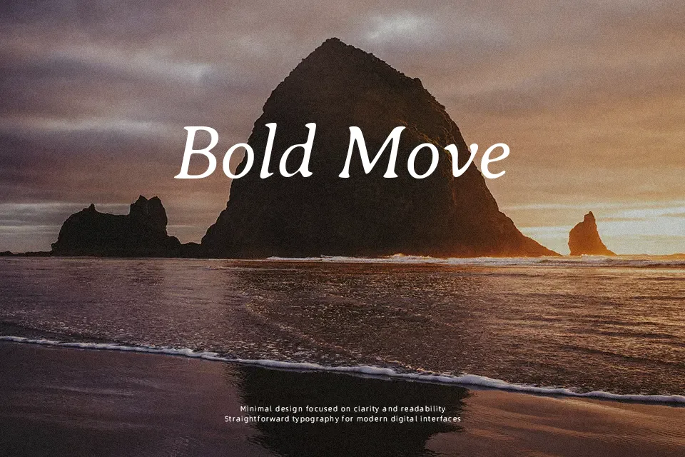
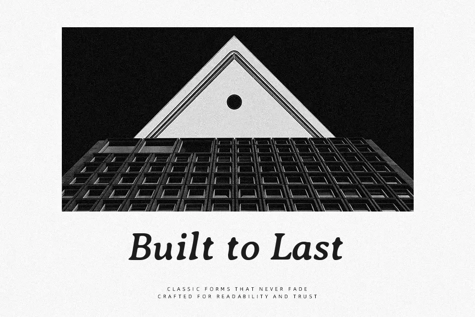
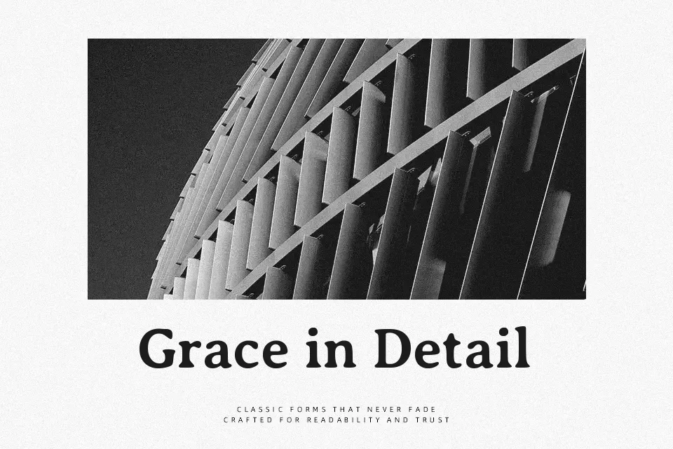
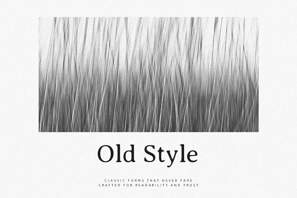
Averia Serif Libre comes from averaging hundreds of fonts together, so its letterforms feel subtly warped, with mixed serif and sans details, loose proportions, and a gentle wobble in the outlines. Strokes are moderate in weight, spacing is relaxed, and shapes often look a bit softened, which creates a hazy, almost photocopied texture at larger sizes. This gives titles, posters, indie book covers, and experimental UI headings an intentionally offbeat, handmade mood rather than a polished publishing vibe. However, that same blur and inconsistency can become tiring in dense body copy or serious corporate decks, where a cleaner serif or sans will read more crisply and feel more professional.
Best For:
expressive headlines
indie book and zine covers
experimental branding
art and music posters
Not Ideal For:
long-form body text
formal corporate documents
technical UI copy
highly legible signage
Perfect for branding, editorial, and headline, with a artistic and display style.
License
Gallery