Average Font
Free for Commercial UseAbout
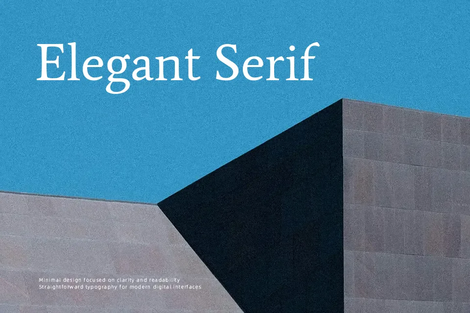
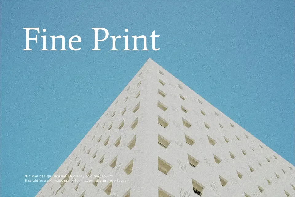
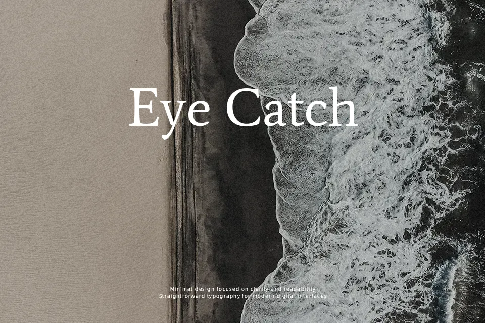
Average is a low-contrast serif with moderate x-height, relatively even stroke weight, and open counters, which helps text stay readable on screens and in small print. Its proportions feel restrained and somewhat bookish, giving paragraphs a neutral, steady rhythm rather than calling attention to individual letters. I tend to use this kind of font for content-heavy pages, reading apps, and documentation where you want typography to support the message quietly, not brand the experience. It pairs naturally with a cleaner sans for navigation or UI labels, similar to how a classic book serif sits beside a modern interface font. If you need dramatic display headlines or highly expressive branding, Average will likely feel too subdued.
Best For:
long-form articles
editorial layouts
reading-focused websites
documentation pages
Not Ideal For:
expressive logo wordmarks
high-impact posters
playful kids branding
ultra-formal certificates
Perfect for body text, editorial, and headline, with a clean and serif style.
License
Gallery