Pio Serif Font
Free for personal useAbout
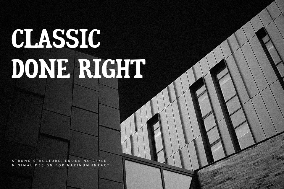
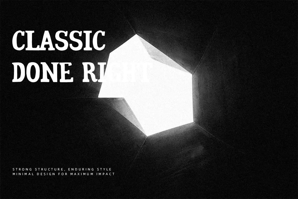
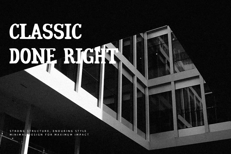
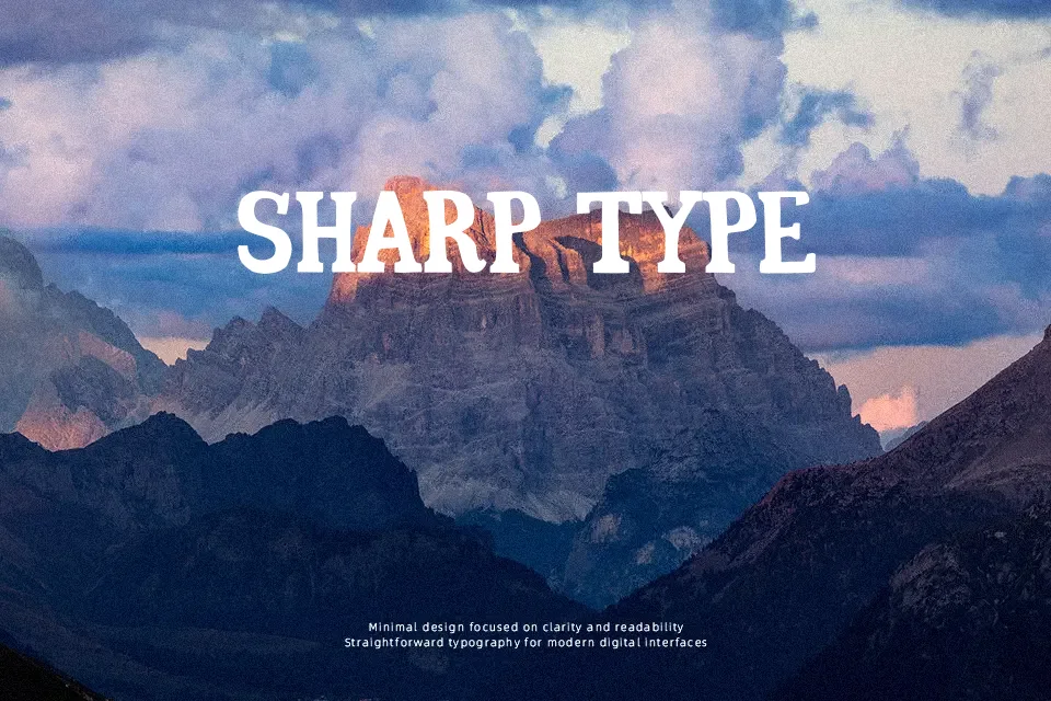
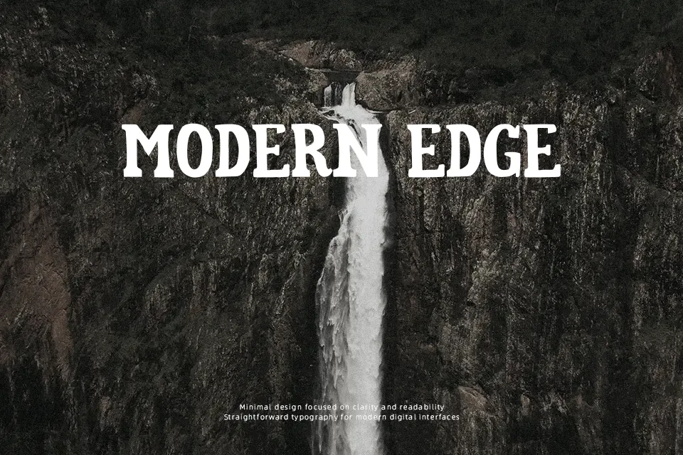
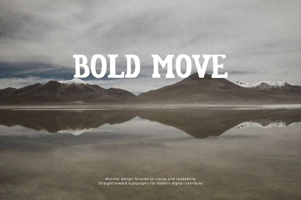
Pio Serif Font works best as a large-scale display face, using heavy serif forms, sharp interior shapes, and compact proportions to create a forceful rhythm. The uppercase letters appear consistently built, while the numerals retain the same dense visual weight. Spacing is relatively close, helping short words hold together in posters and label designs. The typeface remains recognizable in large headlines, particularly where a dark, structured word shape is useful. Its decorative construction becomes less comfortable in small text or lengthy copy, so it is better treated as an accent face than a general reading typeface.
Best For: poster headlines,product packaging labels,album cover titles,logo concepts
Not Ideal For: long paragraph text,small interface labels,technical manuals,dense editorial layouts
Perfect for headline, logo, and music, with a bold and decorative style.
License
Gallery