Peachy Keen Serif Font
Free for personal useAbout
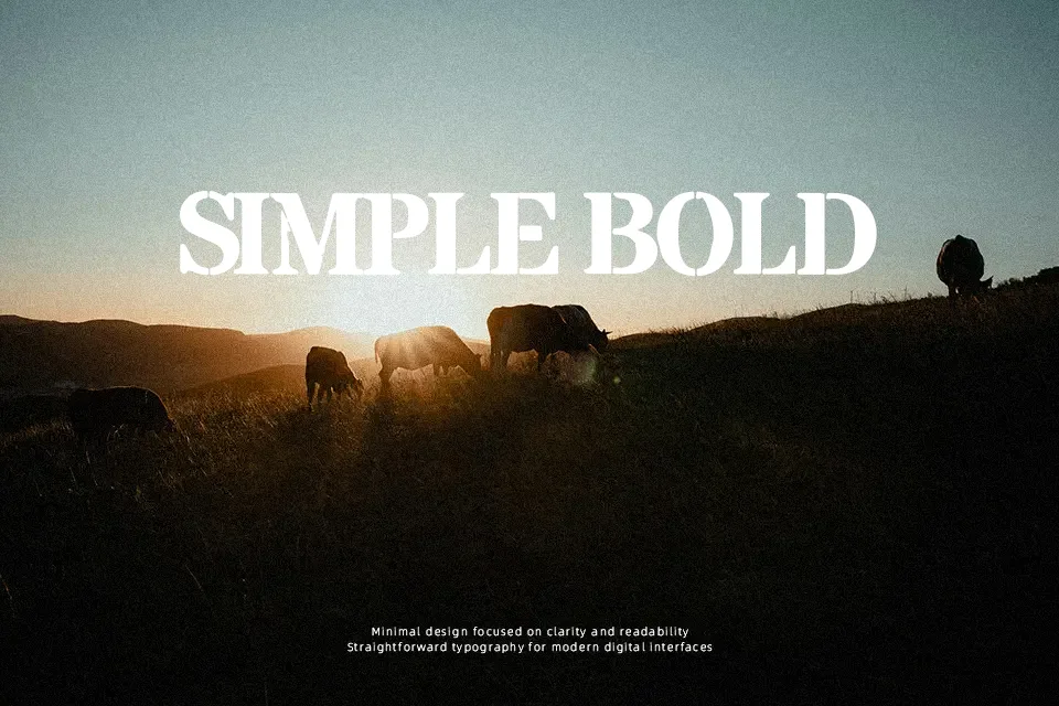
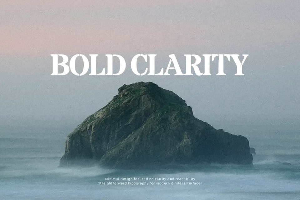
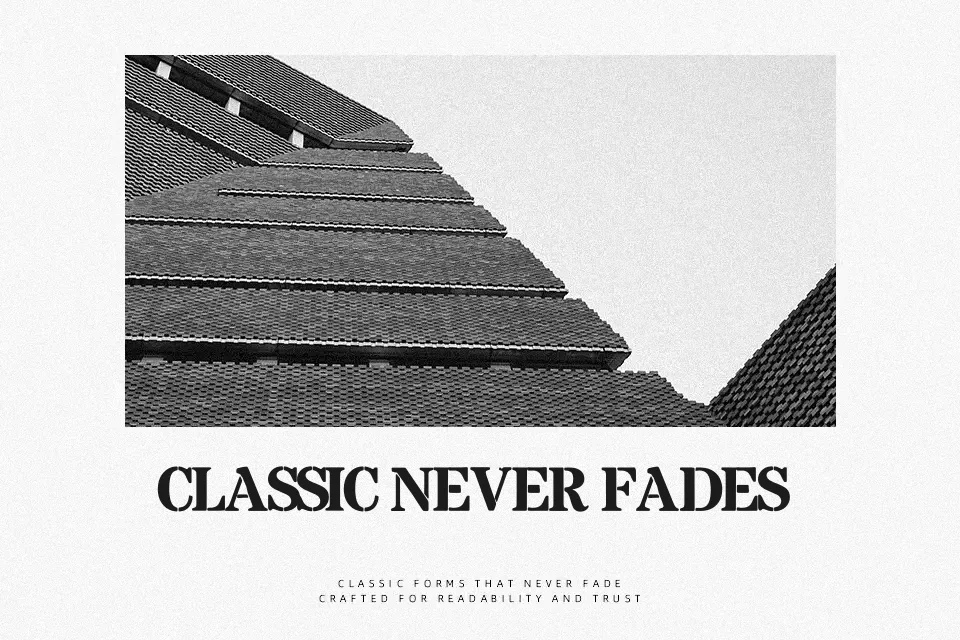
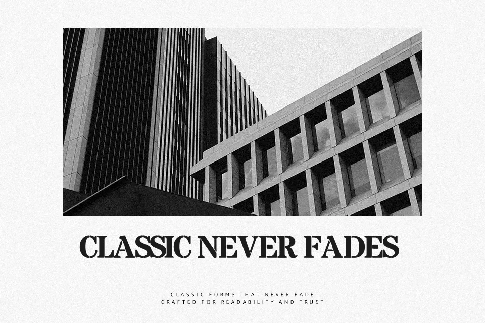
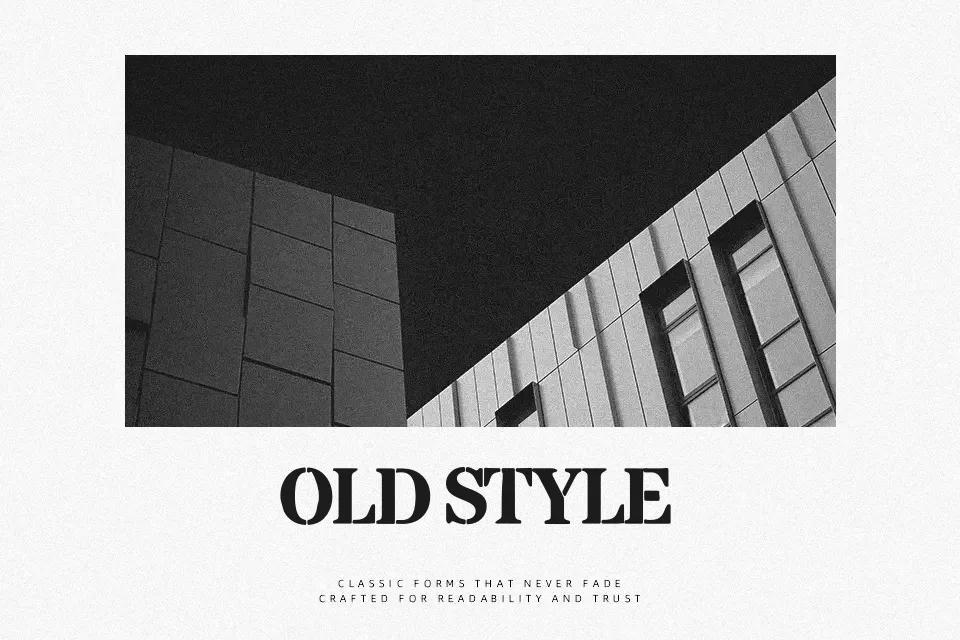
Built for statements rather than paragraphs, Peachy Keen Serif Font uses sturdy uppercase serif forms broken by deliberate stencil gaps. The characters have broad vertical strokes, sharp slab-like terminals, and compact, even proportions; repeated cut-outs give the alphabet a mechanical, poster-focused rhythm. Spacing appears controlled for short words and stacked headlines, while the visible numerals follow the same weighty construction. At larger sizes, the interrupted strokes remain clear and give the design a structured presence. In smaller captions, however, those internal breaks can reduce quick recognition, making it less comfortable for continuous reading.
Best For: vintage product labels,apparel graphics,poster headlines,short logo lettering
Not Ideal For: long paragraph text,small interface labels,legal documents,dense editorial layouts
Perfect for headline, logo, and packaging, with a bold and display style.
License
Gallery