Paradise Garden Font
Free for personal useAbout
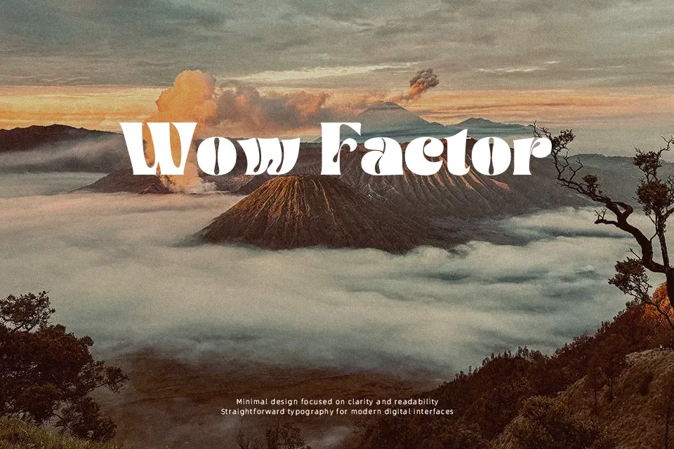
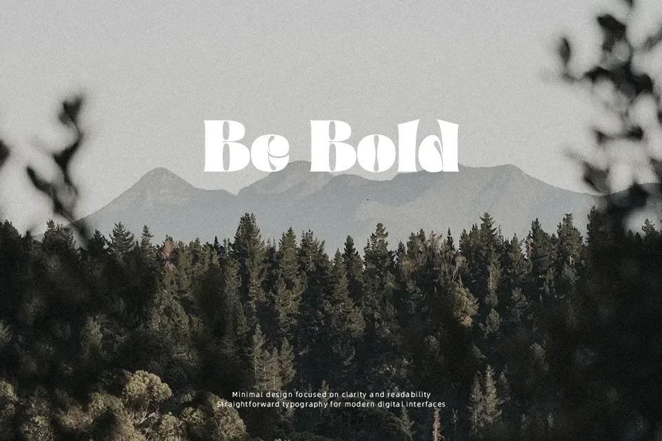
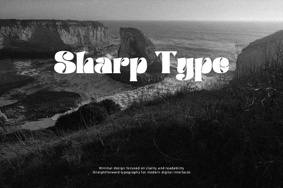
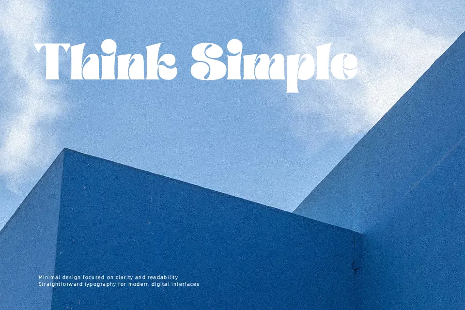
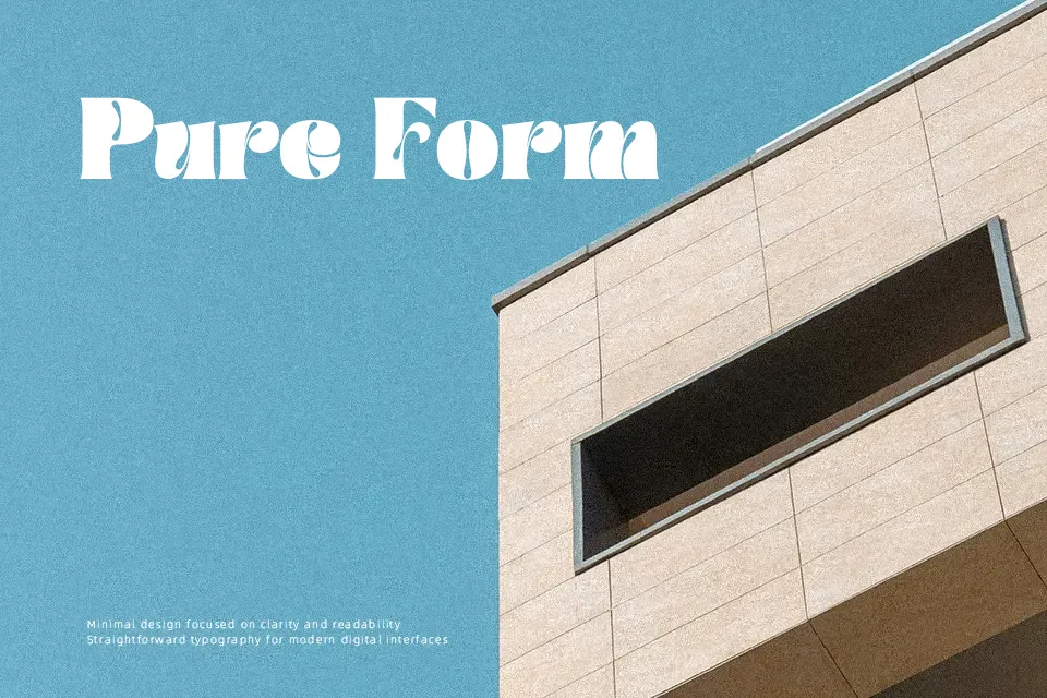
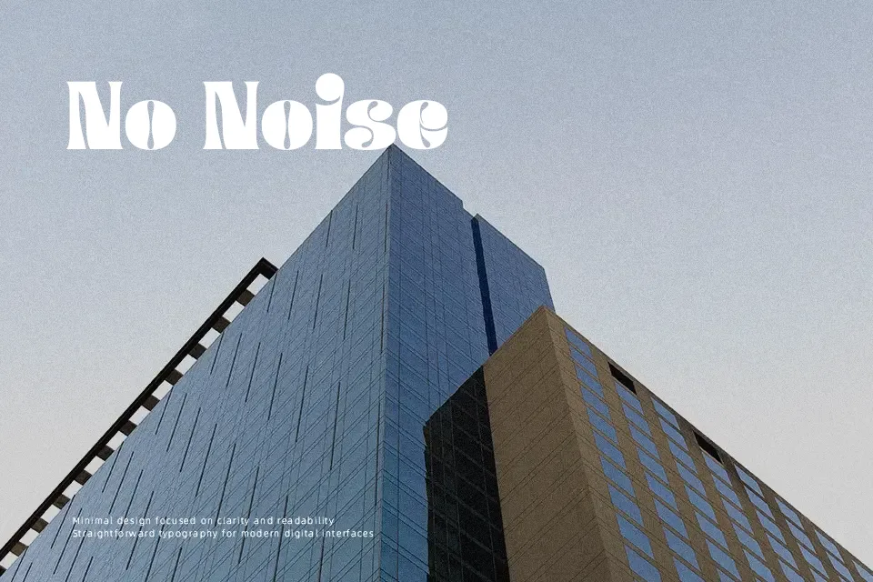
Paradise Garden Font works best when displayed at larger sizes, where its bold serif structure and weathered texture remain clear. The letterforms use heavy, slightly irregular strokes, broad proportions, and compact visual spacing that create an assertive rhythm across short words. Uppercase characters have the strongest impact, while the lowercase maintains the same rugged display character. Numerals and visible punctuation follow the weighty construction, helping headings feel consistent. It is a practical choice for dramatic titles and identity work, but its distressed details and dense forms make extended paragraphs or small labels less comfortable to read.
Best For: music event posters,album cover titles,themed product packaging,cinematic branding
Not Ideal For: long paragraph text,small interface labels,legal documents,dense editorial layouts
Perfect for branding, logo, and music, with a artistic and decorative style.
License
Gallery