Papa Sardine Font
Free for Commercial UseAbout
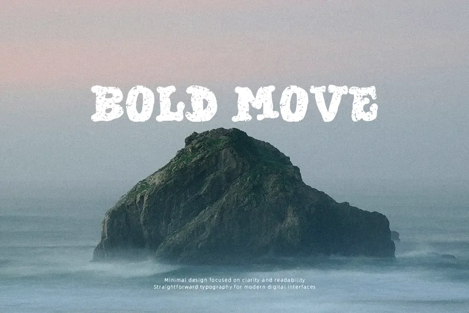
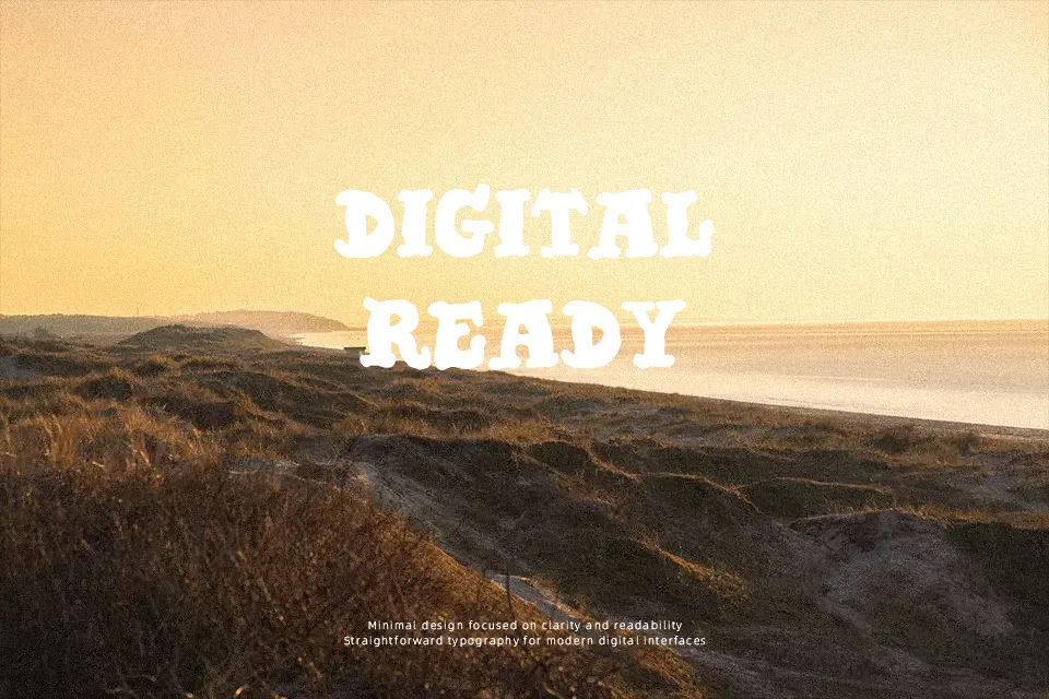
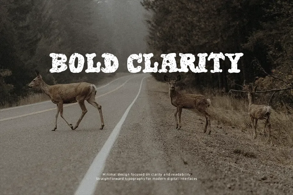
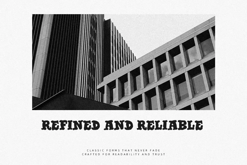
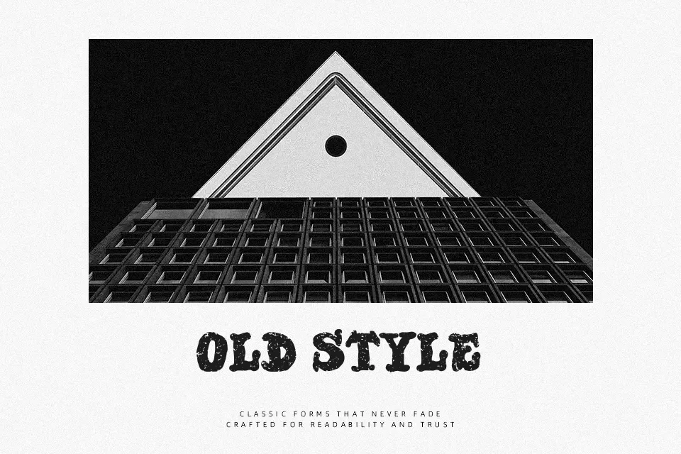
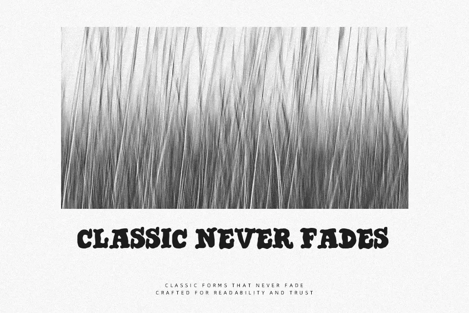
Papa Sardine Font works best as a prominent headline face, using weighty serif forms and visibly weathered edges to create a rough printed texture. Its broad proportions and sturdy strokes give uppercase and lowercase text a firm, old-fashioned rhythm, while the irregular surface keeps the design from feeling overly polished. Spacing remains most effective when text is kept short and generously sized. It suits labels, signage, and poster copy where a worn visual character is useful. The distressed detail supports strong display impact, but becomes less clear in small captions or extended reading.
Best For: vintage food packaging,restaurant signage,poster headlines,apparel graphics
Not Ideal For: long paragraph text,small interface labels,legal documents,dense editorial layouts
Perfect for headline, packaging, and poster, with a bold and decorative style.
License
Gallery