Painter Font
Free for personal useAbout
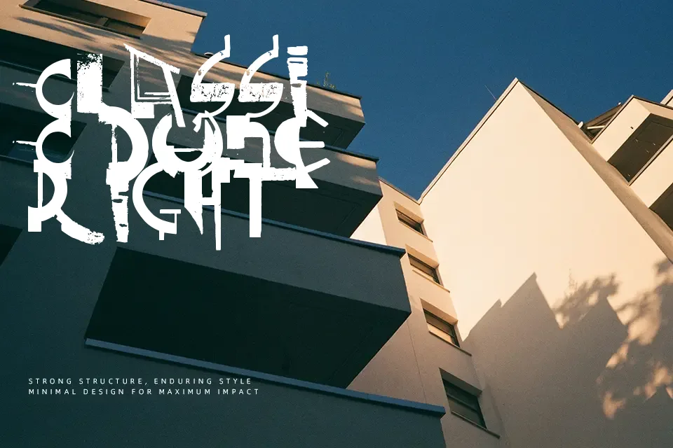
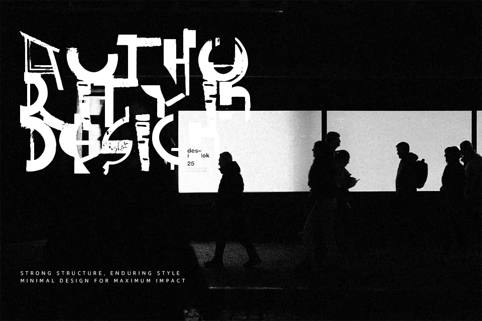
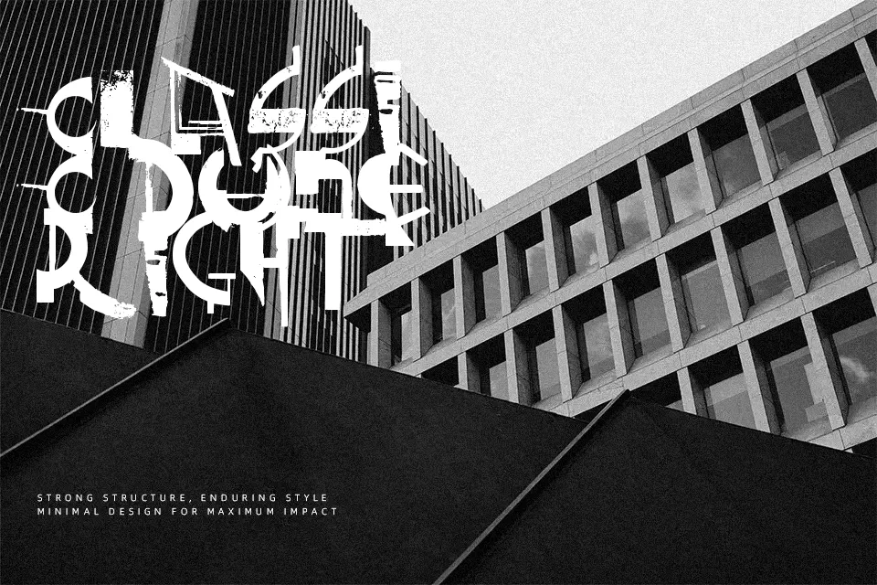
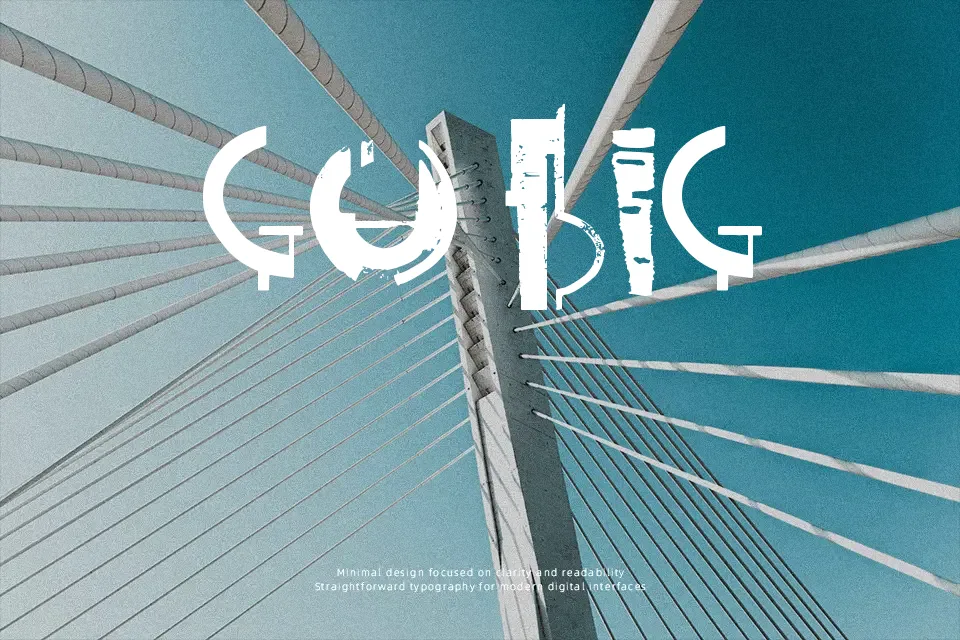
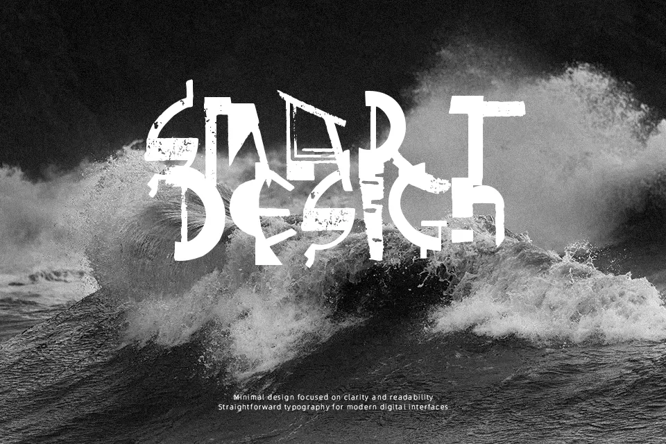
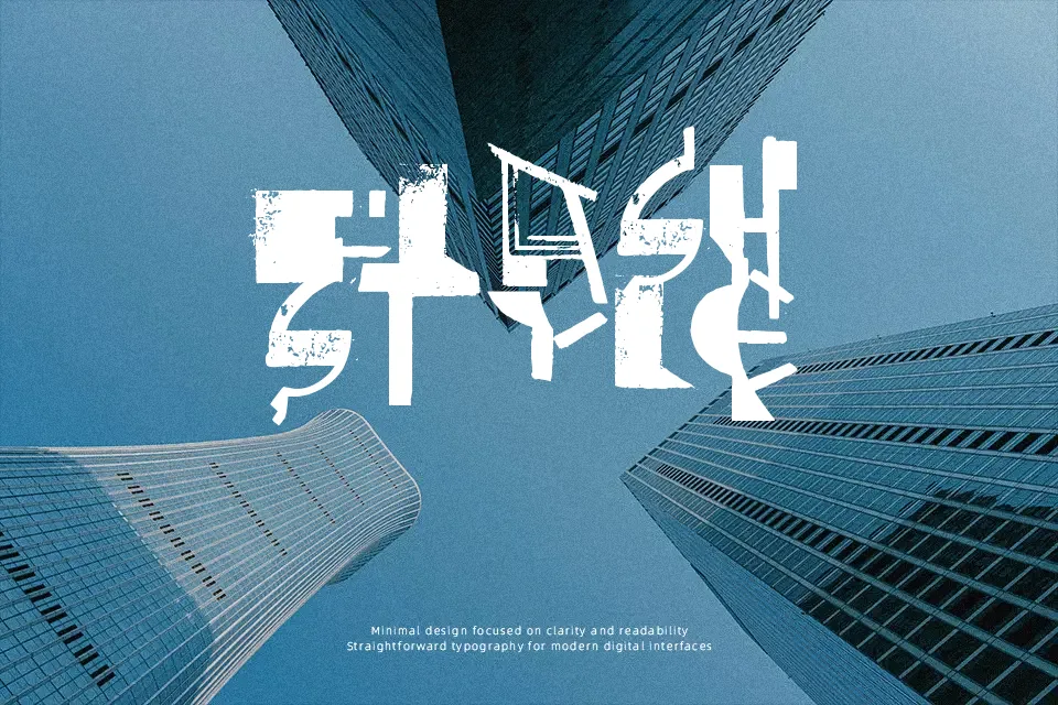
The visual structure of Painter Font relies on heavy, textured strokes that mimic the uneven ink distribution of a physical paintbrush. Its bold, energetic letterforms feature rough terminals and visible bristle marks, giving the typography a raw, organic rhythm. Because the character spacing is somewhat irregular and the internal counters are partially filled by the brush effect, this typeface performs best when displayed at larger sizes where its artistic details can truly shine. A short poster headline or street-style apparel graphic benefits greatly from its dynamic impact. However, the dense forms reduce comfort during extended reading, making it far less suitable for dense paragraphs. The rough styling ultimately sacrifices small-scale clarity for maximum decorative presence.
Best For:
street apparel graphics, bold event posters, urban branding, creative packaging
Not Ideal For:
long paragraph text, small interface labels, dense editorial layouts
Perfect for branding, headline, and packaging, with a artistic and brush style.
License
Gallery