Oregon Dry Font
Free for personal useAbout
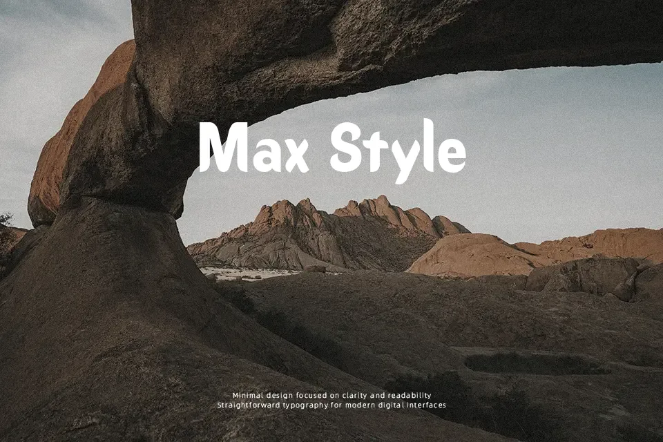
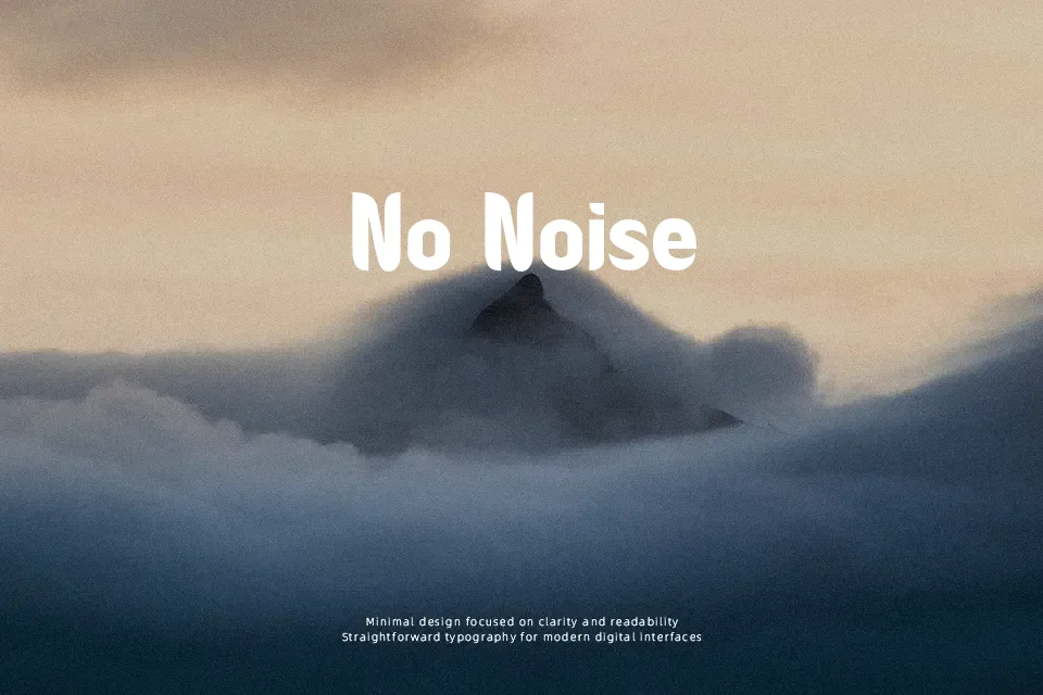
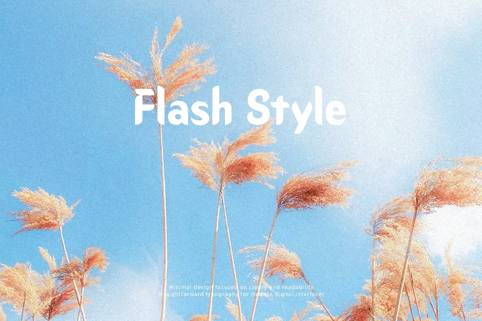
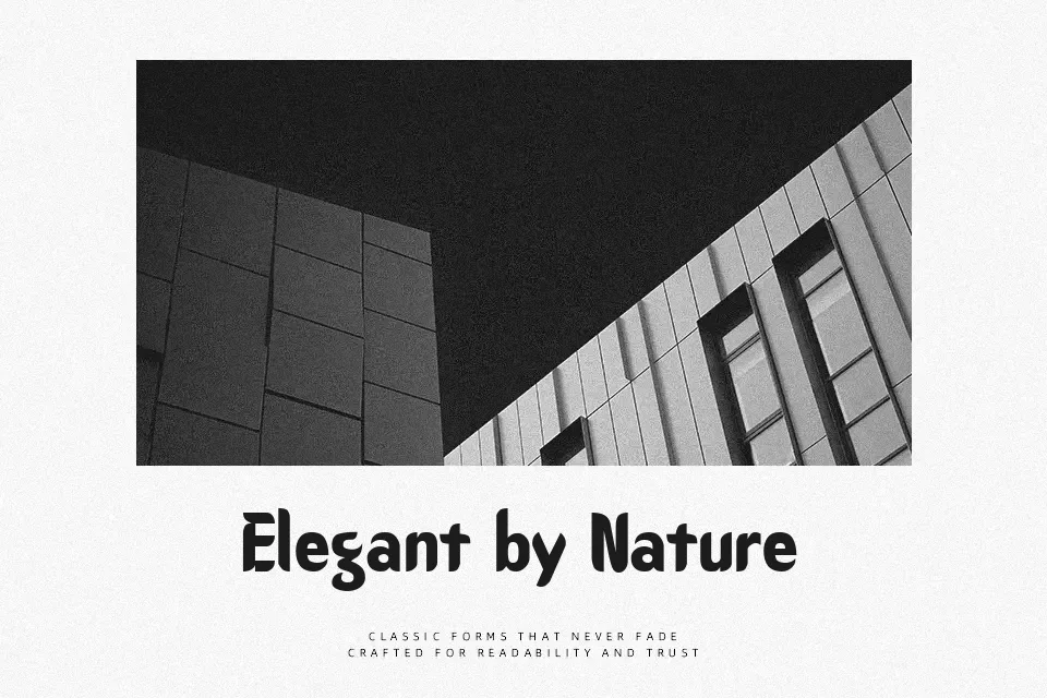
Oregon Dry Font works best at larger sizes, where its sturdy serif shapes and visibly worn outlines read as deliberate texture. The uppercase and lowercase letters use broad, fairly even proportions, with rough breaks across otherwise solid strokes and generally open internal spaces. Spacing appears measured rather than compressed, helping short words retain their silhouette in posters, labels, and signage. Numerals and punctuation follow the same distressed treatment, fitting concise display copy. The texture gives titles a weathered, rustic character, but the damaged edges become distracting in small text or extended passages. In practical use, it is most convincing when limited to a few prominent lines.
Best For: western-style posters,rustic product labels,restaurant signage,vintage event headlines
Not Ideal For: long paragraph text,small interface labels,technical manuals,dense editorial layouts
Perfect for headline, packaging, and poster, with a bold and decorative style.
License
Gallery