Older ST Font
Free for personal useAbout
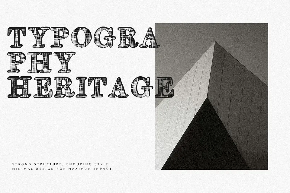
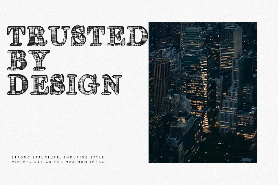
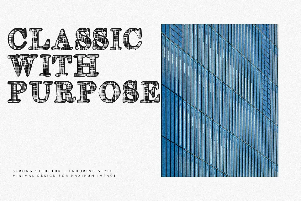
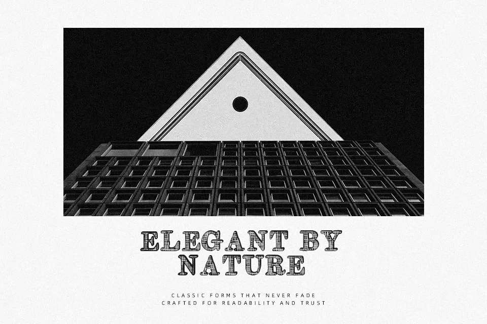
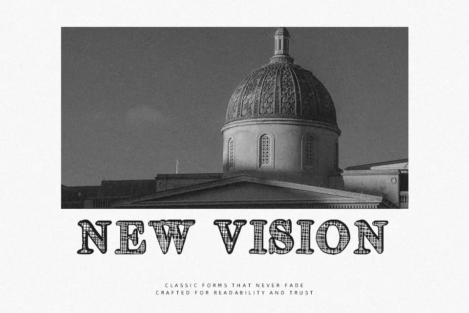
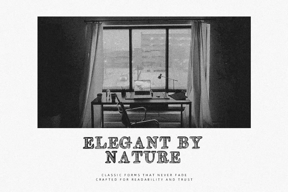
Older ST works best as prominent display lettering, using decorative serif-like forms, varied stroke weight, and compact proportions to create an ornamental visual rhythm. The character shapes are more expressive than neutral, so they hold attention in titles, labels, and short identity work rather than disappearing into a layout. Spacing appears most effective when given room at larger sizes, where the individual details remain easier to distinguish. The typeface can give a headline a period-inspired, artistic presence. Its dense decorative treatment is less comfortable for small copy or extended passages.
Best For: vintage product packaging,poster headlines,album cover titles,restaurant signage
Not Ideal For: long paragraph text,small interface labels,technical manuals,dense editorial layouts
Perfect for headline, logo, and music, with a artistic and decorative style.
License
Gallery