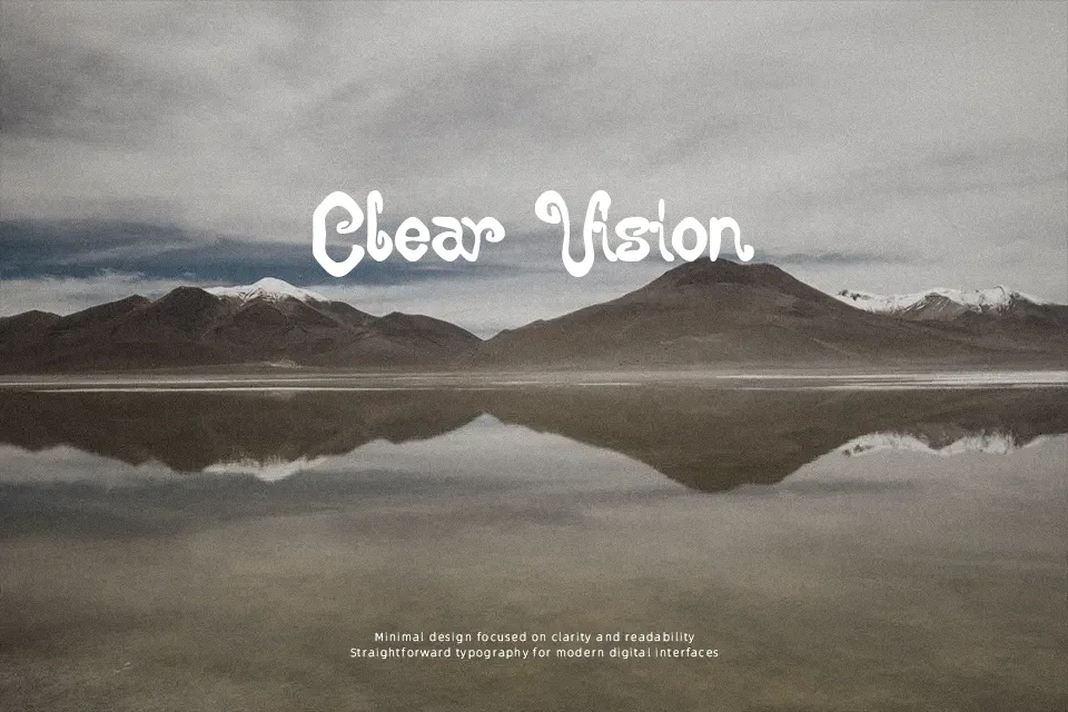
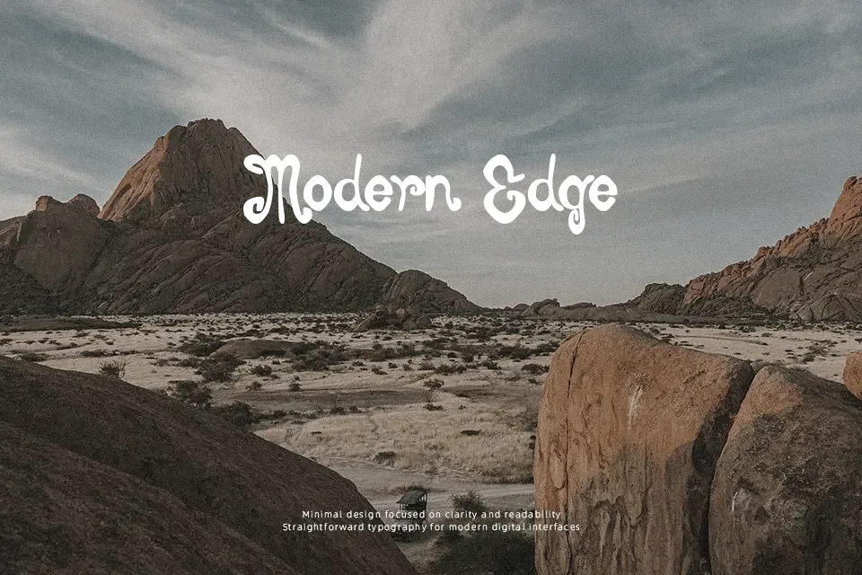
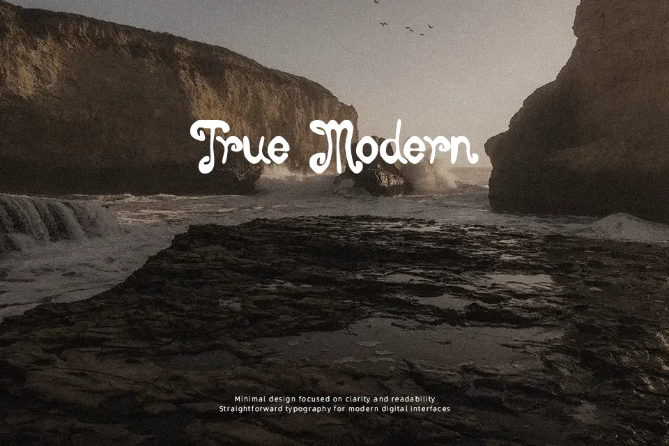
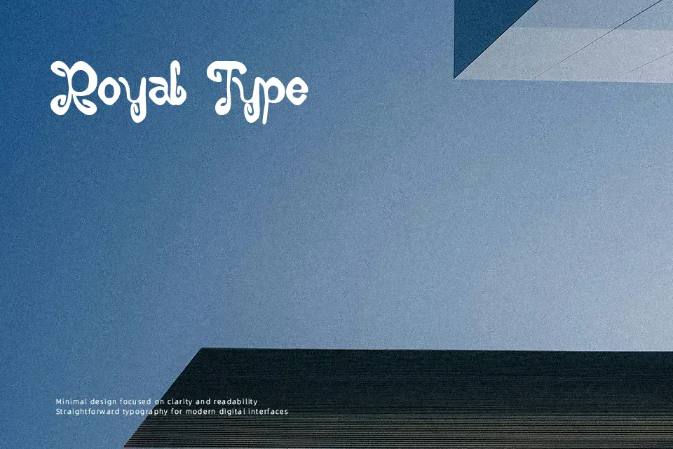
Burton Brothers Font
Free for personal useAbout
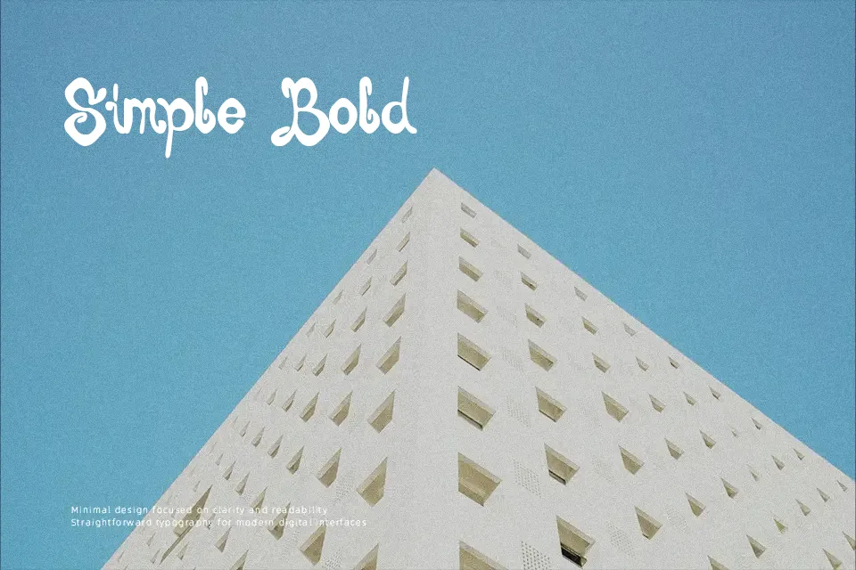
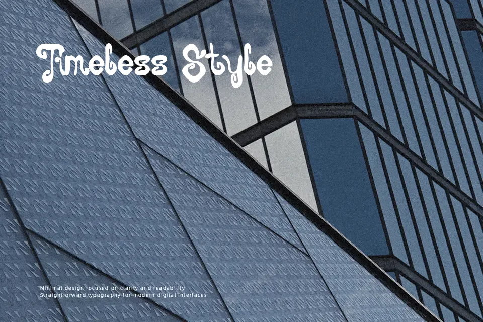
Burton Brothers leans into a curly, woodcut-style display look, with chunky strokes, uneven curves, and tight, lively shapes that feel drawn rather than engineered. The letters have a slightly rough edge and compact spacing, which pushes them toward loud, attention-grabbing titles instead of long paragraphs. Visually it reads as fun and a bit theatrical, somewhere between vintage sign painting and fantasy movie titling. I reach for this font when a project needs personality—think themed posters, event graphics, or branding with a story angle—but I avoid it for small text, minimalist interfaces, or anything that demands strict readability and restraint.
Best For:
themed event posters and flyers with a fantasy or circus twist
logos or wordmarks for playful brands, games, or themed cafes
short headlines on packaging or merch needing loud character
Not Ideal For:
body text, captions, or UI where clean readability matters
formal corporate branding or serious editorial layouts
very small sizes or dense paragraphs of copy
Perfect for branding, film, and gaming, with a artistic and decorative style.
License
Gallery