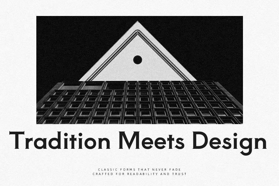
Aoboshi One Font
Free for Commercial UseAbout
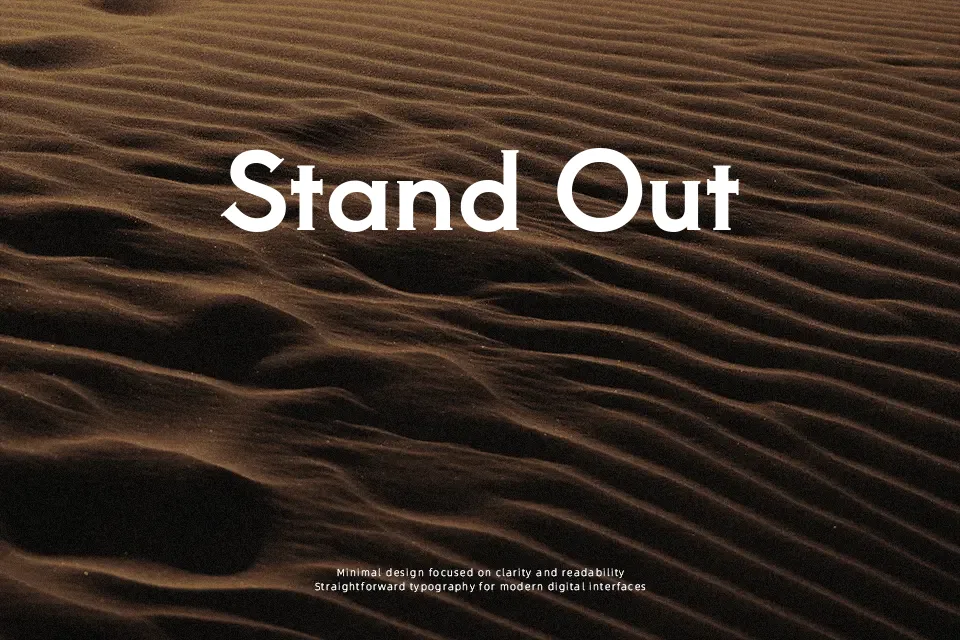
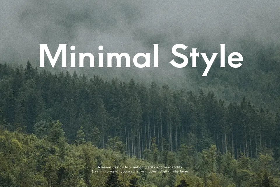
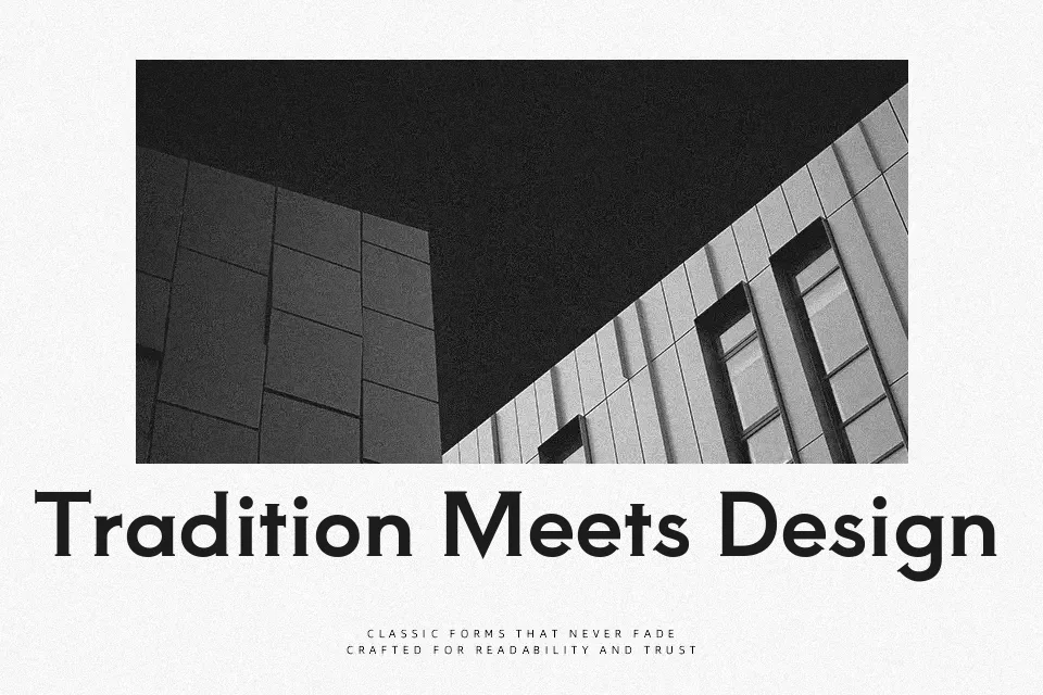
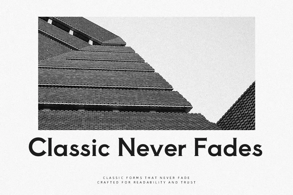
Aoboshi One is a single-weight serif with thick stems, compact counters, and crisp, squared-off terminals that echo Copperplate Gothic while still feeling distinctly Japanese. The proportions are solid and slightly heavy, so letterforms carry real visual weight without looking clumsy. It works especially well for signage-style wordmarks, poster titles, YouTube cover text, and UI headers where you want a strong, engraved-like tone. Because of its rigidity and boldness, it can feel tiring in dense paragraphs or highly formal editorial layouts, where a softer text serif would read more comfortably. If you like the presence of Copperplate-style display faces but need Japanese and Latin coverage in one family, this is a practical option.
Best For:
display headlines
branding lockups
poster titles
UI or app headers
Not Ideal For:
long body paragraphs
highly formal reports
tiny caption text
Perfect for branding, headline, and logo, with a bold and display style.
License
Gallery