Brisk Font
Free for personal useAbout
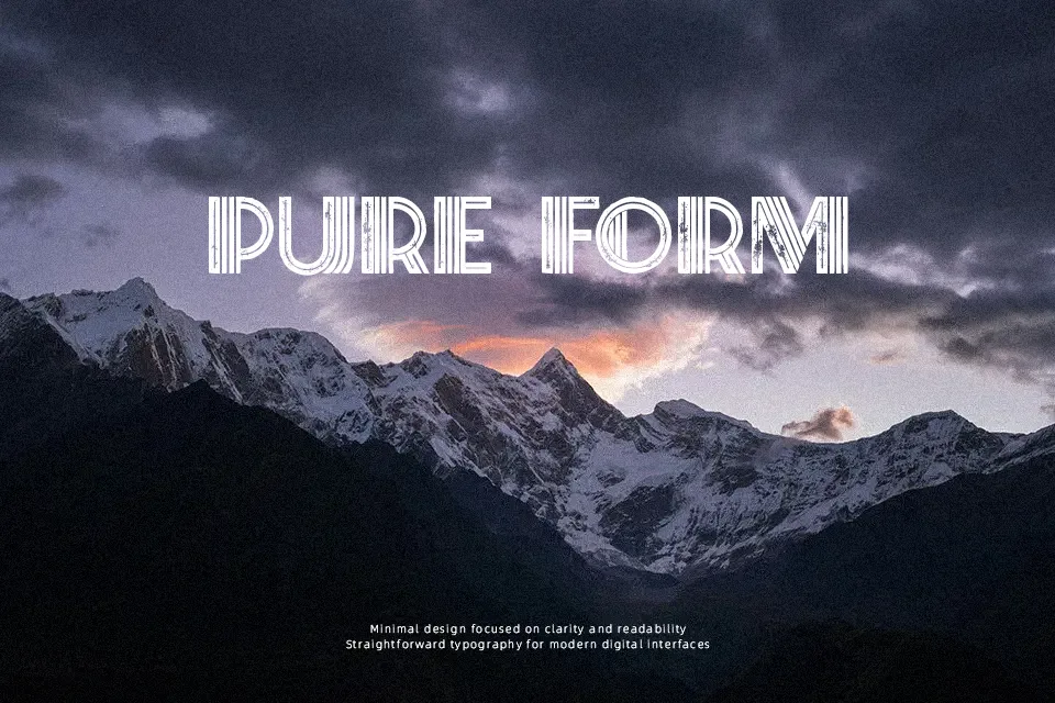
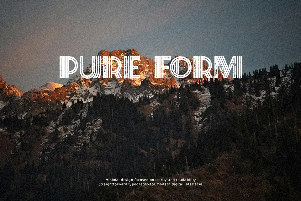
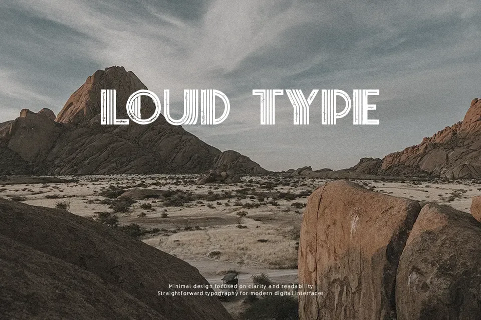
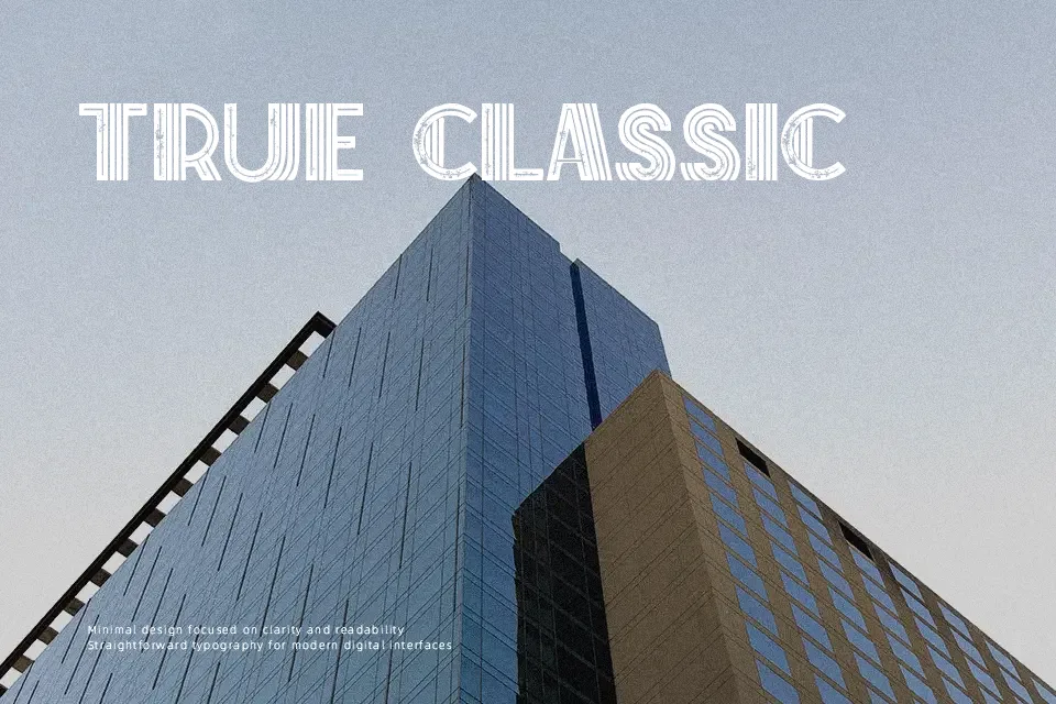
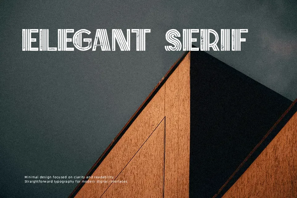
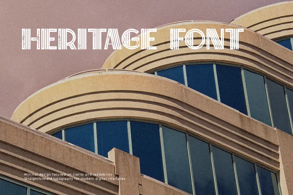
Brisk Font combines rigid vertical strokes, tight curves, and stepped corners to create a structured art deco display look that feels both nostalgic and contemporary. Letters are fairly compact with consistent weight, so lines feel dense and graphic rather than airy. This gives titles and logos a strong, constructed presence, especially when used big or in short words. It shines in branding, posters, and social graphics where you need a decorative but still legible face, and it can pair nicely with a neutral sans serif for body copy. On the downside, its stylized shapes make it tiring for long paragraphs or small UI labels, and it can feel too ornamental for strict corporate or minimalist interfaces.
Best For:
Short headlines with deco flair
Branding experiments and logos
Posters and cover layouts
Not Ideal For:
Long body text or reading-heavy pages
Tiny captions and UI labels
Strictly minimal or corporate documents
Perfect for branding, headline, and logo, with a artistic and decorative style.
License
Gallery