BrentonscrawlType Font
Free for Commercial UseAbout
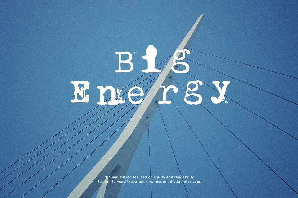
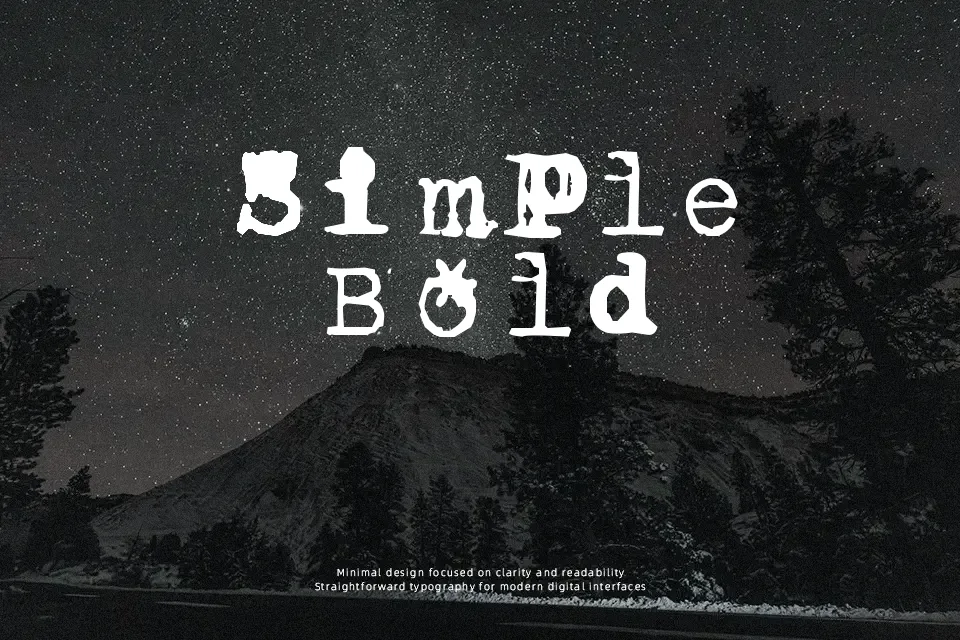
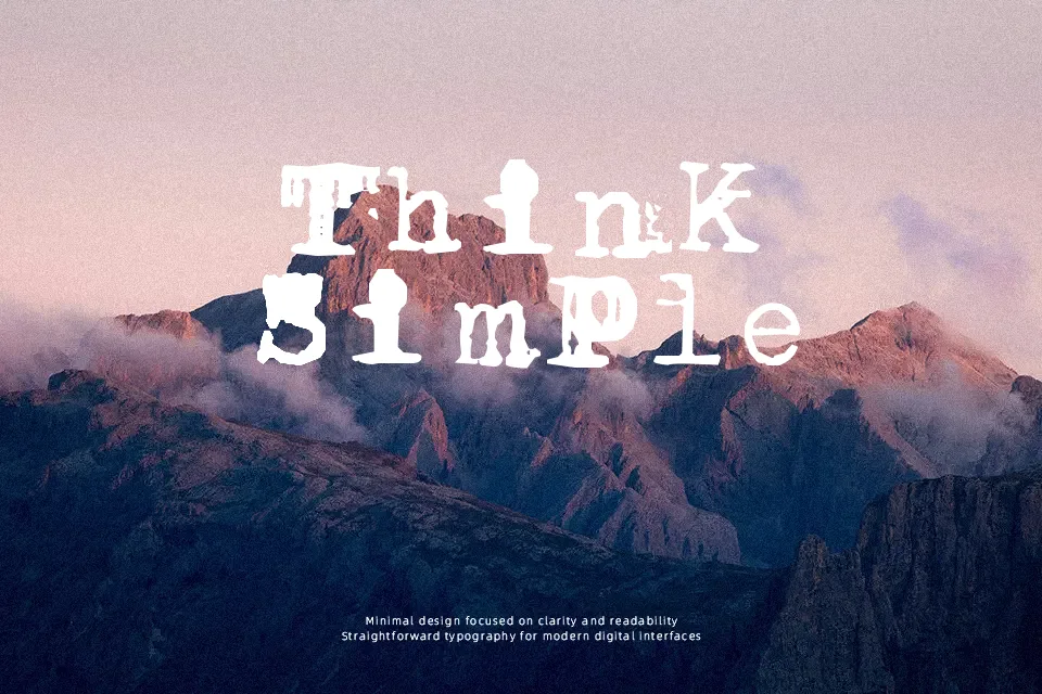
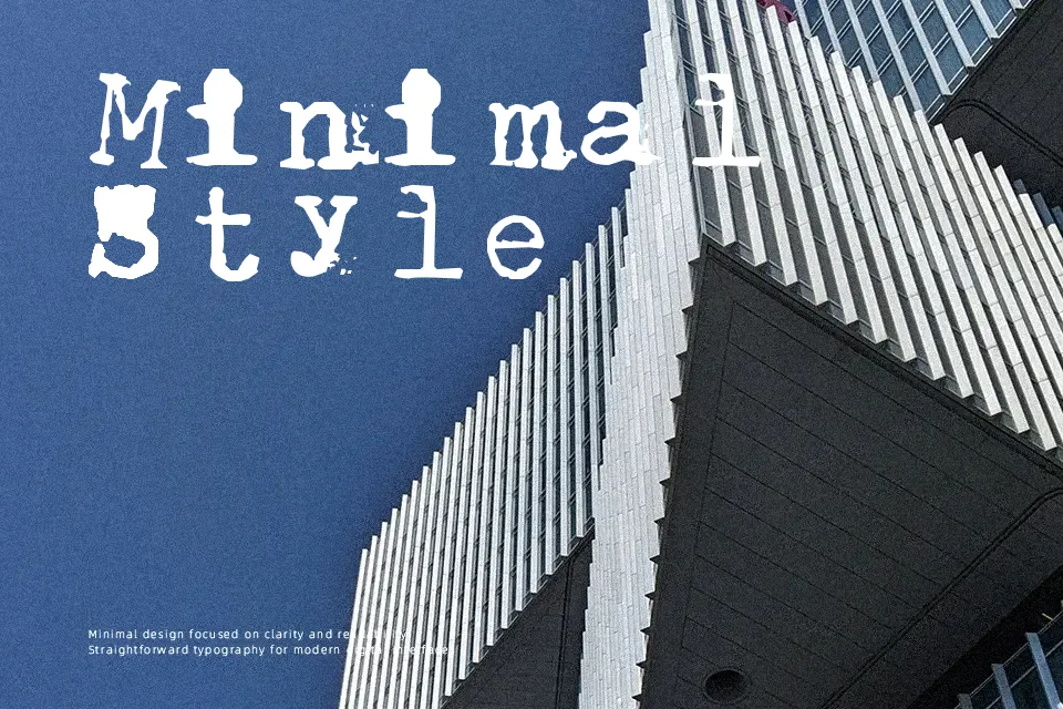
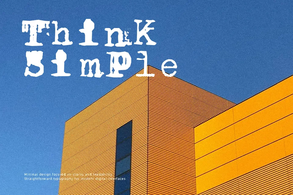
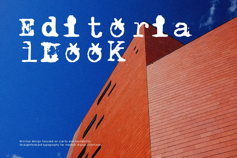
BrentonscrawlType has thin, wiry strokes that wobble and overlap, giving each letter a jittery, scrawled look. Spacing is irregular on purpose, so words feel a bit chaotic, almost like they were scratched onto a wall or a notebook in a hurry. The overall impression is informal, messy, and slightly aggressive, which works nicely for grunge posters, underground music flyers, horror‑flavored headers, or handmade-looking graphics that need attitude rather than refinement. It tends to fall apart in long paragraphs or small UI labels, so it’s better reserved for short headlines, accent words, and experimental layouts where legibility can take a back seat to texture.
Best For:
Grunge or horror-themed poster titles
DIY zines and underground music flyers
Edgy social media graphics needing a scratchy accent
Experimental headline treatments in art projects
Not Ideal For:
Body text or long paragraphs
Corporate or highly polished branding
Small-size UI labels or navigation
Formal editorial layouts
Perfect for film, gaming, and headline, with a artistic and display style.
License
Gallery