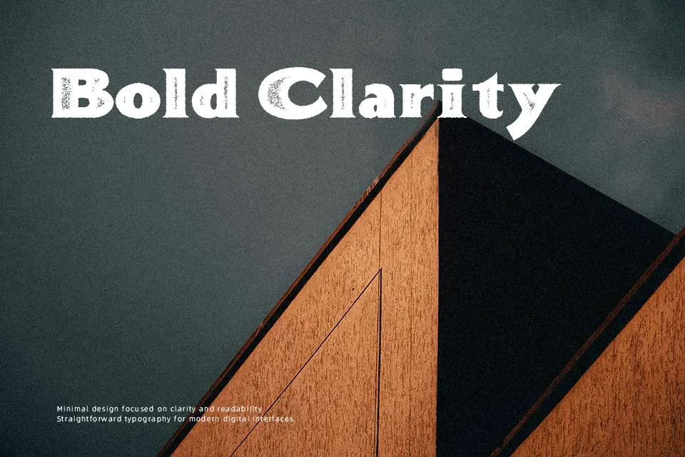
Bonneville Co. Font
Free for personal useAbout
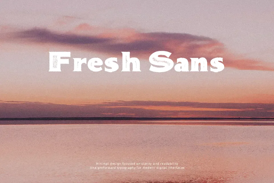
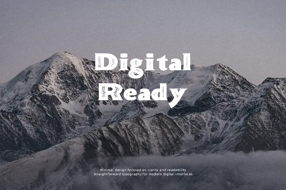
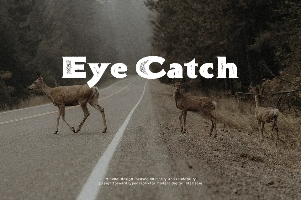
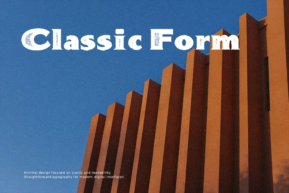
Bonneville Co. Font delivers a chunky, slab serif structure with roughened edges and an uneven texture that reads like aged print pulled from an old letterpress poster. The weight is solid and blocky, with fairly tight spacing that keeps headlines compact and visually dense, so small body text is not its strength. It brings a distinctly western, roadside-sign vibe that suits bar logos, craft beer cans, rodeo flyers, and throwback sports graphics where a bit of grit feels honest rather than gimmicky. Compared with clean slab serifs, this one leans much more decorative and noisy, which is exactly the charm—but also the reason it can overpower minimalist layouts or long reading copy.
Best For:
Vintage western-style headlines and title graphics
Rustic branding for bars, grills, or craft beverages
Posters, signage, and merch with a distressed Americana look
Not Ideal For:
Long paragraphs or small-size body text
Clean, minimalist corporate identities
Interfaces or UI elements needing high legibility
Projects requiring a neutral, low-texture serif
Perfect for advertising, branding, and headline, with a artistic and decorative style.
License
Gallery