Berolina Font
Free for Commercial UseAbout
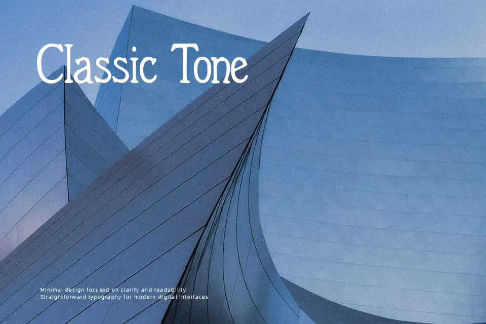
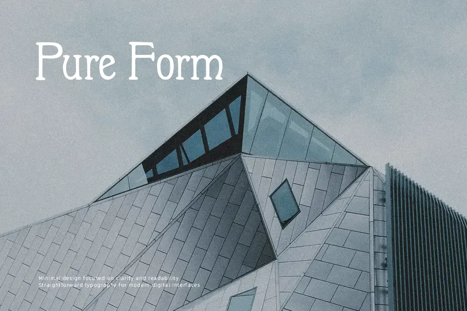
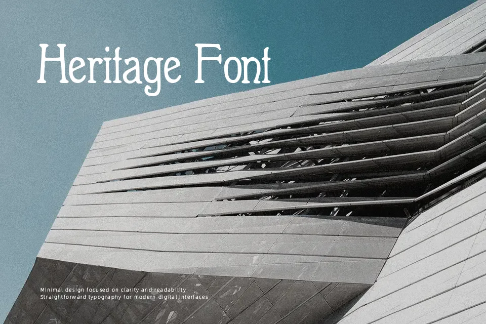
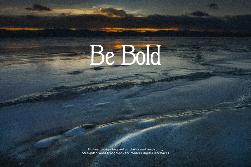
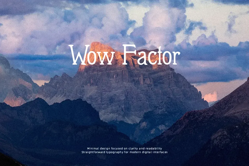
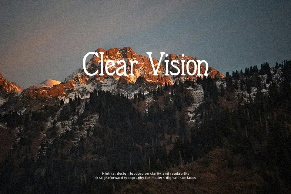
Rooted in early 20th-century Berlin, Berolina carries the structural DNA of Jugendstil typography — freeform serifs, semi-light strokes, and letterforms with a slightly irregular rhythm that feel hand-cut rather than mechanical. The medium-width glyphs sit with restrained elegance, evoking fin-de-siècle European print culture without tipping into full-on historical pastiche. It reads best at display sizes, where the subtle bracketed serifs and organic structure can breathe. Works well for vintage restaurant menus, heritage product packaging headers, or period editorial titles. It does not hold up well in small sizes or dense body text — the semi-light weight and freeform structure lose legibility quickly. If your project demands a very clean, geometrically consistent serif, this will feel too loosely constructed.
Best For:
– Vintage editorial and magazine section headers
– Heritage brand identities and period-accurate packaging labels
– Art Nouveau themed poster titles
– Wine, café, or artisan product lettering
Not Ideal For:
– Body copy or long-form readable text
– Corporate or legal documents requiring neutral tone
– UI interfaces or small-size digital labels
– Projects needing consistent, geometric serif structure
Perfect for branding, editorial, and packaging, with a artistic and decorative style.
License
Gallery