Bee Ridge Vintage Font
Free for personal useAbout
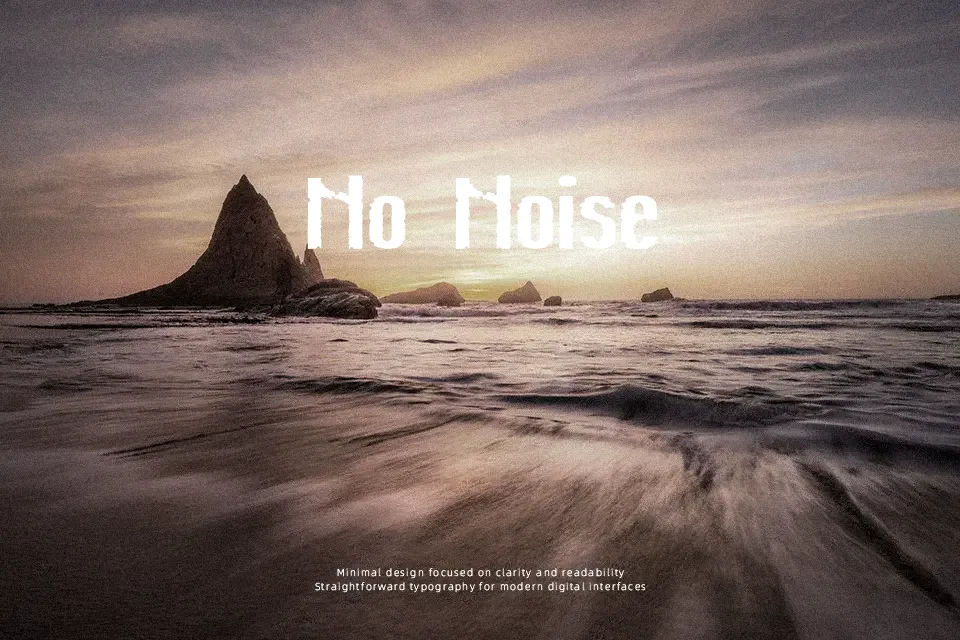
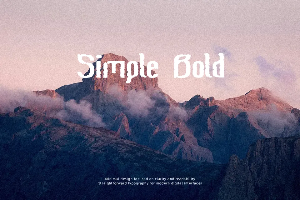
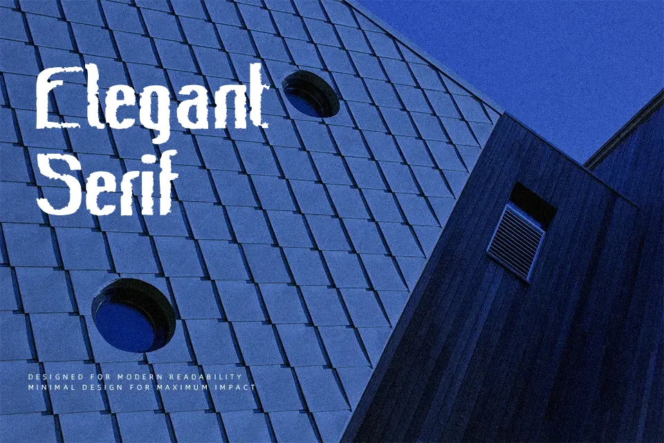
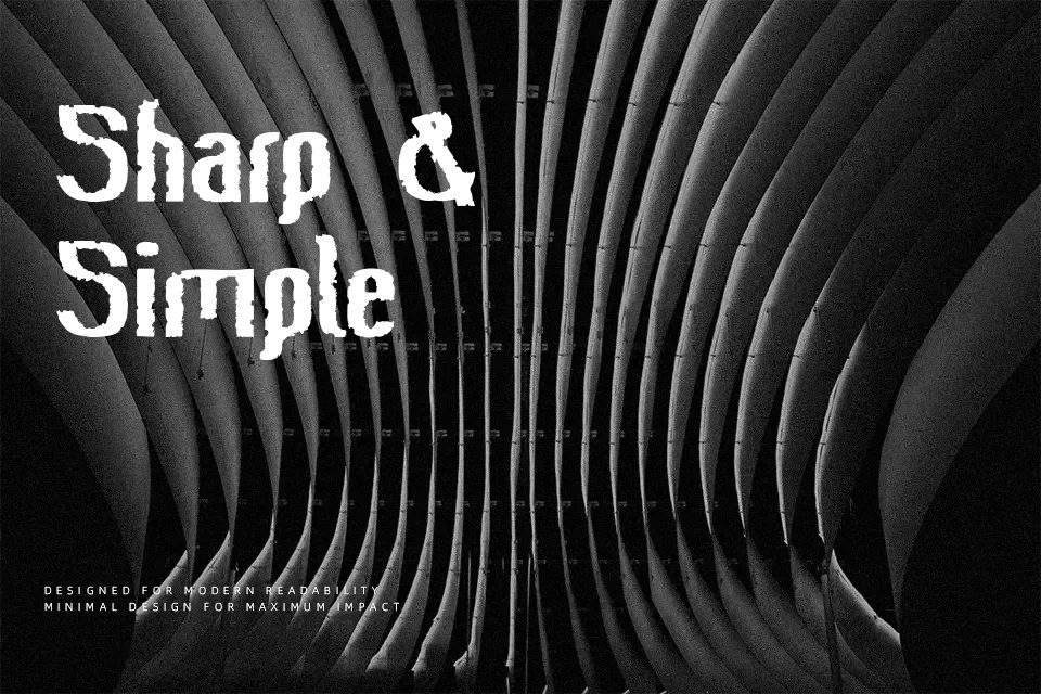
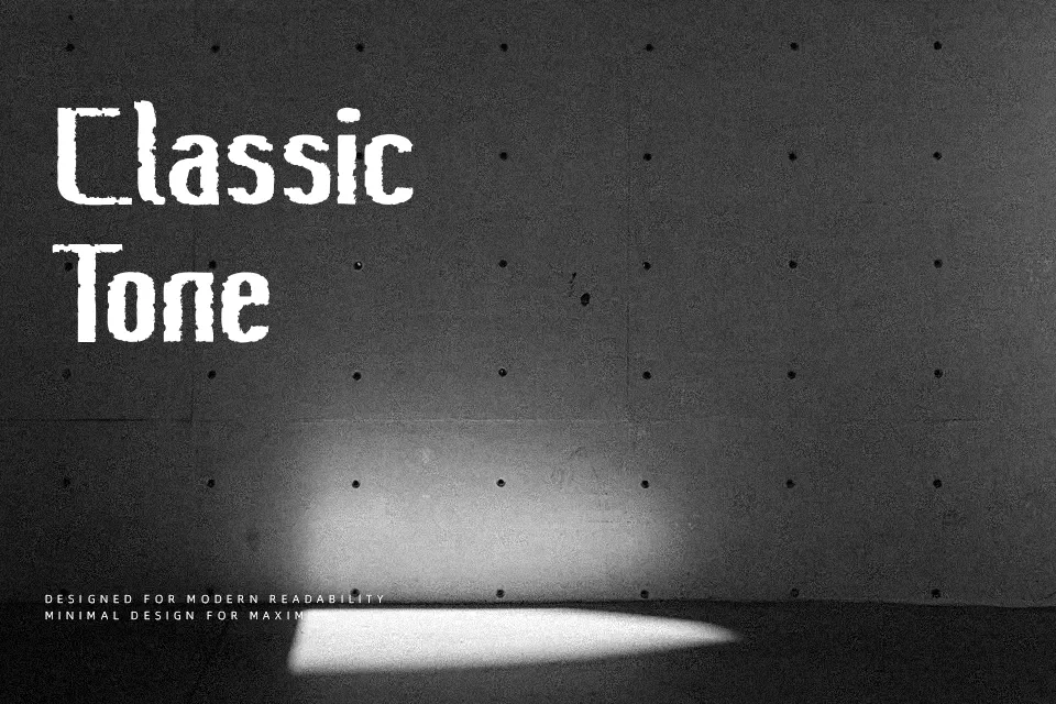
The strokes on Bee Ridge Vintage carry a deliberate roughness — eroded edges, uneven texture, and a semi-condensed structure that pulls letters slightly inward without feeling cramped. It reads as bold and weathered, somewhere between old signage and stone-cut lettering. That worn quality makes it a natural fit for craft brewery branding, vintage tour posters, or rustic packaging where the “aged” look needs to feel earned, not faked. The semi-condensed proportions help it hold up in header-sized layouts without bleeding into surrounding space. One real limitation: the erosion effect breaks down fast at small sizes — fine for display use, but below 18pt, legibility drops noticeably. If clean readability across sizes matters to your project, a smoother condensed sans will serve you better.
Best For:- Craft brewery or distillery label headers
– Vintage concert or festival poster titles
– Rustic product packaging and tags
– Retro-themed logo lockups
Not Ideal For:- Body text or long-form reading at small sizes
– Digital UI interfaces requiring clean legibility
– Corporate or formal brand identities
– Multilingual layouts requiring extended character sets
Perfect for advertising, branding, and headline, with a bold and condensed style.
License
Gallery