Bambina Font
Free for personal useAbout
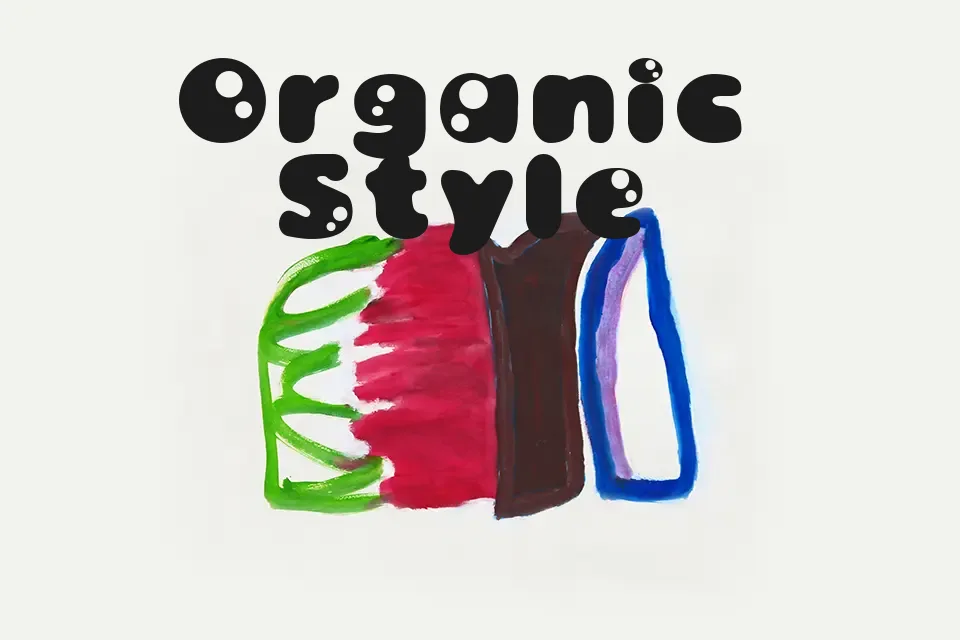
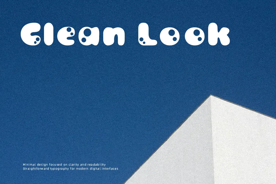
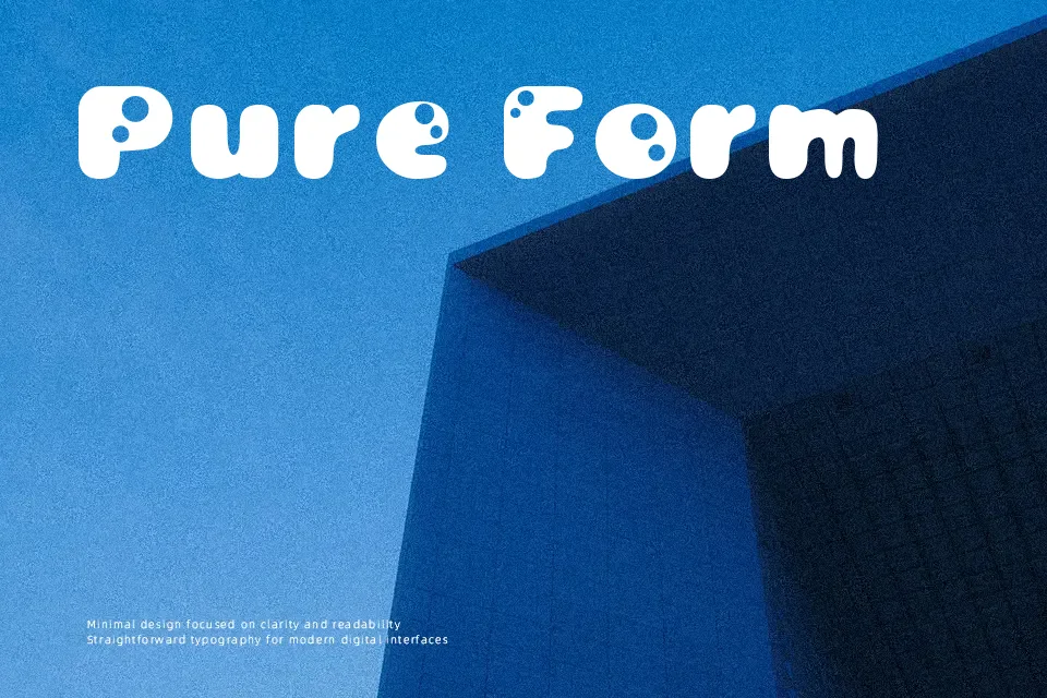
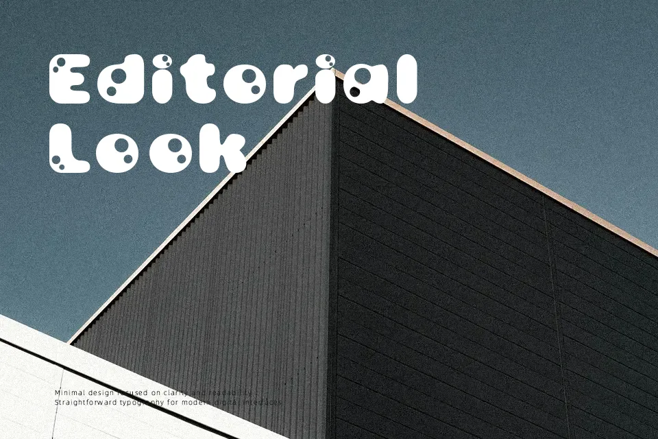
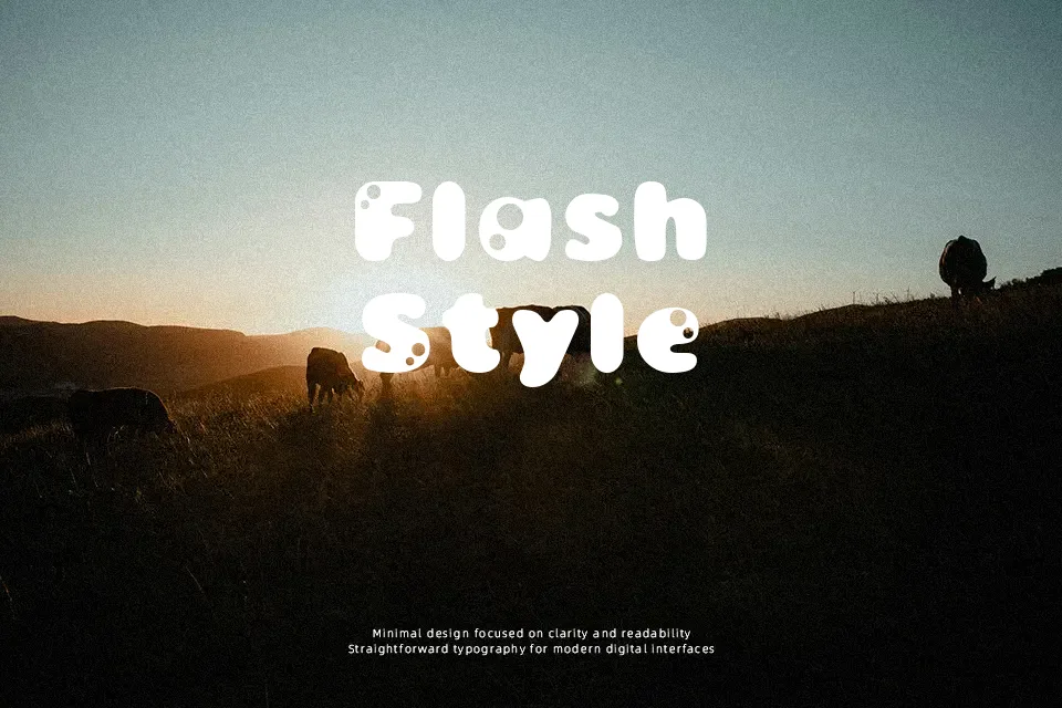
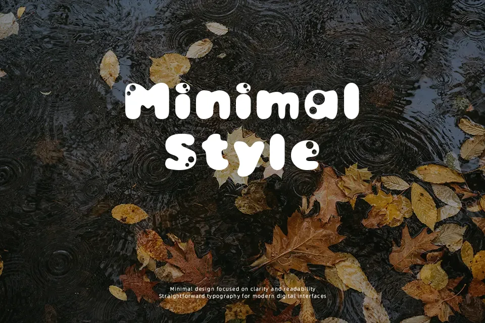
The letterforms feature wide, rounded strokes with exaggerated curves that create a bouncing, organic rhythm across the baseline. This decorative approach gives each character a thick, bubbly appearance that feels casual rather than refined. The font works effectively for retro poster designs where nostalgia outweighs legibility concerns, and it can anchor vintage branding projects that need immediate 1970s recognition. However, the extreme decorative styling becomes problematic in smaller sizes—text below 24pt loses clarity as the rounded terminals and thick strokes merge visually. The font also struggles in contexts requiring professionalism or modern minimalism, since the playful groovy aesthetic reads as informal and dated rather than contemporary. While it delivers authentic period flavor for music packaging or festival graphics, designers should recognize it’s built for impact at display sizes, not versatility.
Best For:
– retro music album covers
– vintage festival posters
– 1970s themed branding materials
– nostalgic social media headers
Not Ideal For:
– body text or paragraphs
– corporate presentations
– modern minimalist designs
– small font sizes below 24pt
Perfect for branding, logo, and music, with a groovy and decorative style.
License
Gallery