Bakruv Font
Free for personal useAbout
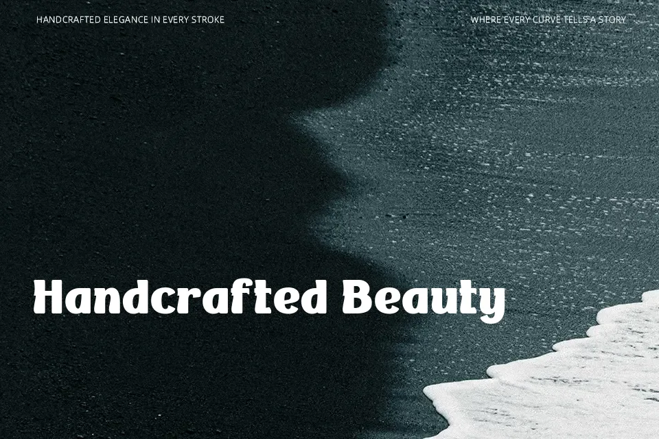
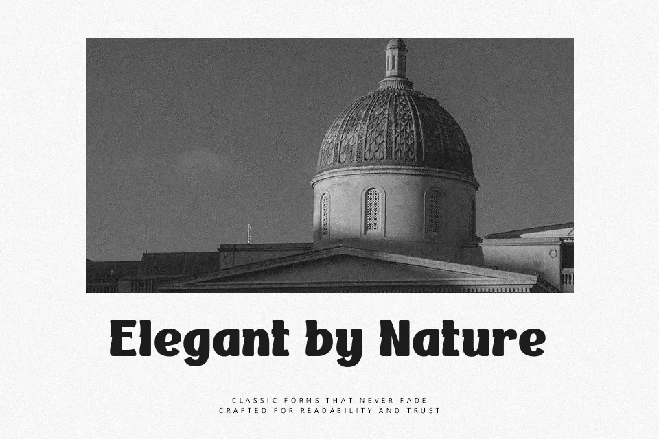
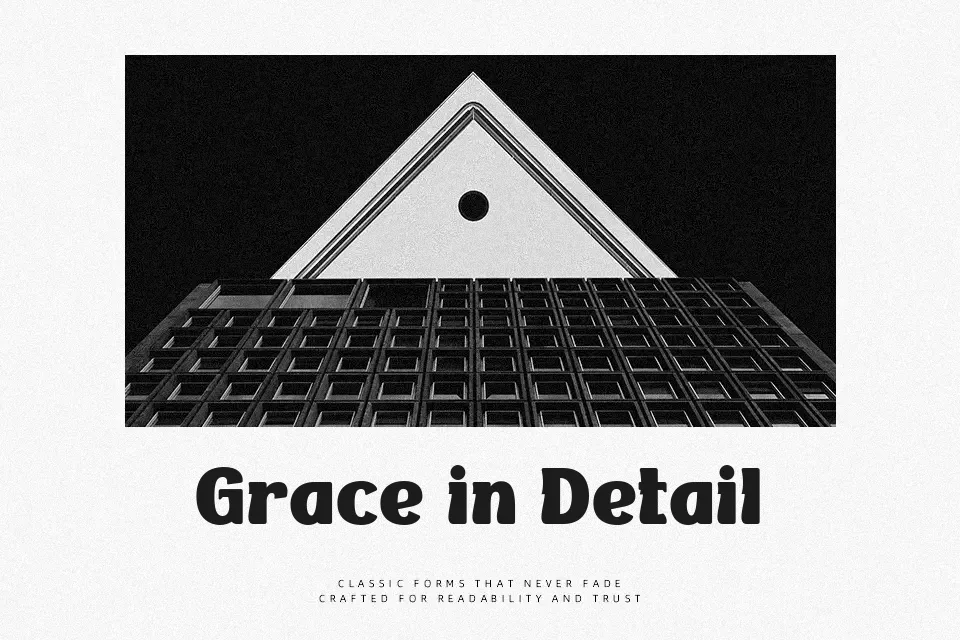
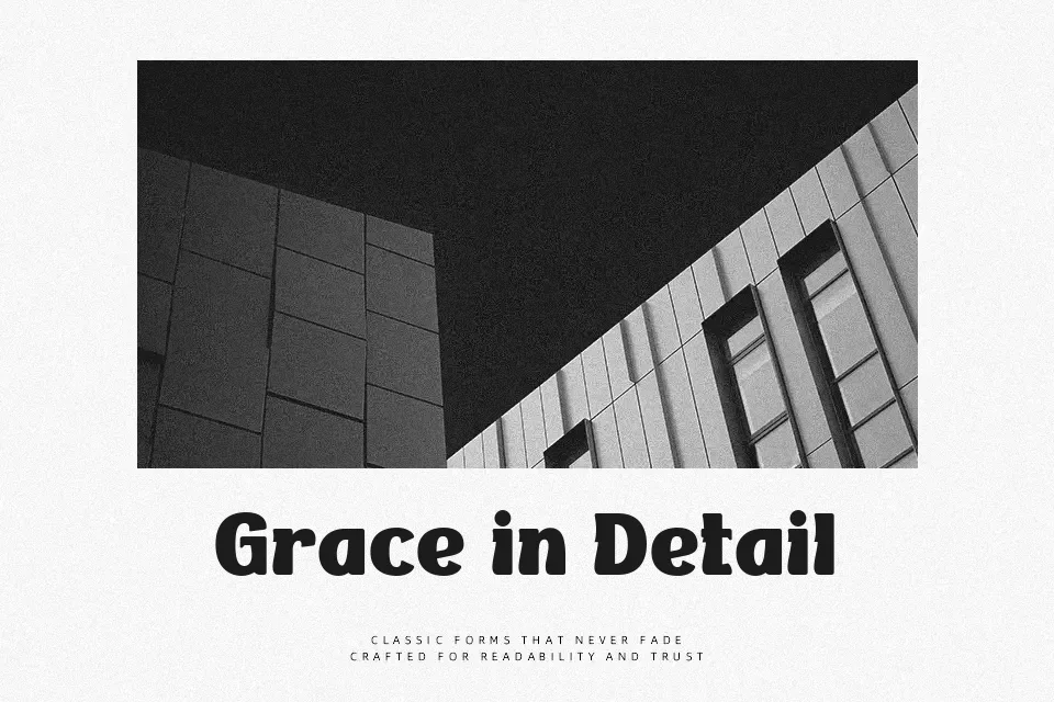
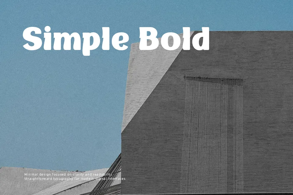
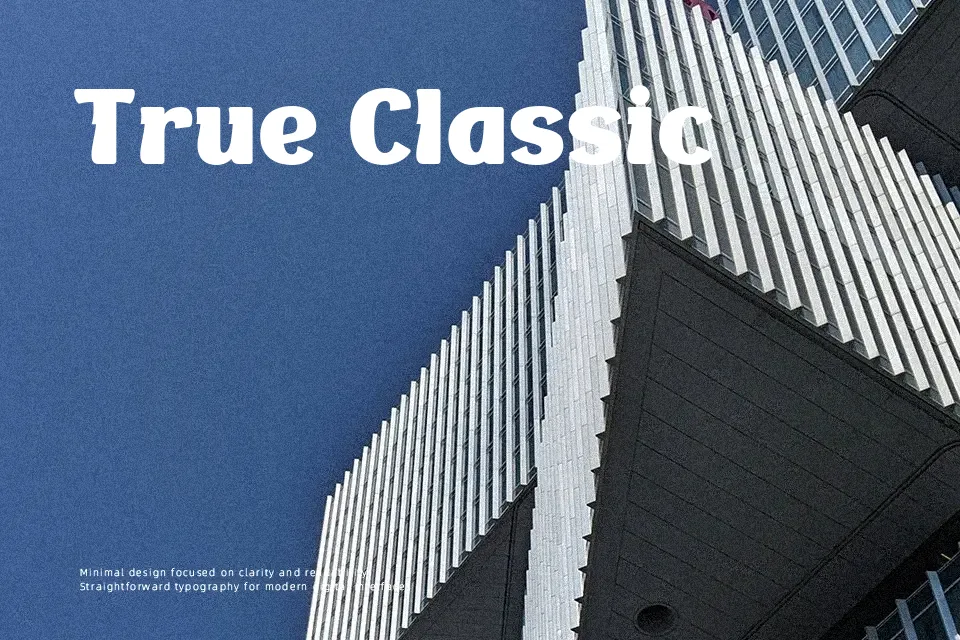
Bakruv draws attention immediately with its thick, uniform stroke weight and condensed vertical proportions. The serif structure follows classical conventions, but the weight distribution leans toward contemporary display typography rather than traditional book faces. This creates visual tension that works well in fashion branding, editorial headlines, and premium product labels where contrast and boldness are priorities. The condensed spacing allows designers to fit more letters into tight horizontal spaces without losing legibility at large sizes. However, the extra-bold weight reduces readability when scaled down or used in paragraphs — letterforms merge visually and create cognitive strain. It also lacks the subtle weight variation needed for long-form reading. Bakruv performs best when used sparingly at display sizes above 36pt, where its geometric confidence and classical touches can dominate without overwhelming.
Best For:
– luxury brand logos and wordmarks
– magazine cover headlines
– product label typography
– fashion campaign posters
Not Ideal For:
– body text or paragraph content
– mobile app interfaces
– technical documentation
– websites requiring extensive reading
Perfect for branding, editorial, and fashion, with a bold and condensed style.
License
Gallery